Category Archives: Apps

New SharePoint 2010 & 2013, Online Connector for Outlook available!!

SharePoint Connector  For Outlook makes it easier for office users to upload emails to SharePoint and attach SharePoint documents to an email message .


Please contact me through my blog or at tomas.floyd@outlook.com for more information on pricing, licensing and trials.


   SharePointOutlookConnectorAttachingSharePointOutlookExplorer_2

FEATURES

  • Workflow integration
  • Attach items as attachments into email item functionality
  • Multiple site configuration
  • Check Out/Check In functionality
  • Drag & Drop files(attachments) into a folder
  • Copy, delete and open item/document functionalities
  • Version History for files
  • Saving email meta data to SharePoint document item (title, to, from etc) functionality
  • Works with all SharePoint versions
  • Saving email message as list item and attachments as attachment of the list item functionality
  • Template based search functionality
  • Windows explorer right click upload
  • Editing metadata on uploading document
  • Multiple site configuration
  • File System Integration has been added. (This allows you to integrate live mesh folders into outlook)
  • Attach items as attachments into email item functionality
  • Advanced Alert System
  • Library Content Viewer
  • Saving email message as list item and attachments as attachment of the list item functionality

Free Code to Create Cross-site Publishing Apps for SharePoint Online

Cross-site publishing is one of the powerful new capabilities in SharePoint 2013.  It enables the separation of data entry from display and breaks down the container barriers that have traditionally existed in SharePoint (ex: rolling up information across site collections). 

 IC648720[1]

Cross-site publishing is delivered through search and a number of new features, including list/library catalogs, catalog connections, and the content search web part.  Unfortunately, SharePoint Online/Office 365 doesn’t currently support these features.  Until they are added to the service (possibly in a quarterly update), customers will be looking for alternatives to close the gap.  In this post, I will outline several alternatives for delivering cross-site and search-driven content in SharePoint Online and how to template these views for reuse

I’m a huge proponent of SharePoint Online.  After visiting several Microsoft data centers, I feel confident that Microsoft is better positioned to run SharePoint infrastructure than almost any organization in the world.  SharePoint Online has very close feature parity to SharePoint on-premise, with the primary gaps existing in cross-site publishing and advanced business intelligence.  Although these capabilities have acceptable alternatives in the cloud (as will be outlined in this post), organizations looking to maximize the cloud might consider SharePoint running in IaaS for immediate access to these features.


Apps for SharePoint

The new SharePoint app model is fully supported in SharePoint Online and can be used to deliver customizations to SharePoint using any web technology.  New SharePoint APIs can be used with the app model to deliver an experience similar to cross-site publishing.  In fact, the content search web part could be re-written for delivery through the app model as an “App Part” for SharePoint Online. 
Although the app model provides great flexibility and reuse, it does come with some drawbacks.  Because an app part is delivered through a glorified IFRAME, it would be challenging to navigate to a new page from within the app part.  A link within the app would only navigate within the IFRAME (not the parent of the IFRAME).  Secondly, there isn’t a great mechanism for templating a site to automatically leverage an app part on its page(s).  Apps do not work with site templates, so a site that contains an app cannot be saved as a template.  Apps can be “stapled” to sites, but the app installed event (which would be needed to add the app part to a page) only fires when the app is installed into the app catalog.

REST APIs and Script Editor

The script editor web part is a powerful new tool that can help deliver flexible customization into SharePoint Online.  The script editor web part allows a block of client-side script to be added to any wiki or web part page in a site.  Combined with the new SharePoint REST APIs, the script editor web part can deliver mash-ups very similar to cross-site publishing and the content search web part.  Unlike apps for SharePoint, the script editor isn’t constrained by IFRAME containers, app permissions, or templating limitations.  In fact, a well-configured script editor web part could be exported and re-imported into the web part gallery for reuse.

Cross-site publishing leverages “catalogs” for precise querying of specific content.  Any List/Library can be designated as a catalog.  By making this designation, SharePoint will automatically create managed properties for columns of the List/Library and ultimately generate a search result source in sites that consume the catalog.  Although SharePoint Online doesn’t support catalogs, it support the building blocks such as managed properties and result sources.  These can be manually configured to provide the same precise querying in SharePoint Online and exploited in the script editor web part for display.

Calling Search REST APIs

<div id=”divContentContainer”></div>
<script type=”text/javascript”>
    $(document).ready(function ($) {
        var basePath = “https://tenant.sharepoint.com/sites/somesite/_api/&#8221;;
        $.ajax({
            url: basePath + “search/query?Querytext=’ContentType:News'”,
            type: “GET”,
            headers: { “Accept”: “application/json;odata=verbose” },
            success: function (data) {
                //script to build UI HERE
            },
            error: function (data) {
                //output error HERE
            }
        });
    });
</script>


An easier approach might be to directly reference a list/library in the REST call of our client-side script.  This wouldn’t require manual search configuration and would provide real-time publishing (no waiting for new items to get indexed).  You could think of this approach similar to a content by query web part across site collections (possibly even farms) and the REST API makes it all possible!

List REST APIs

<div id=”divContentContainer”></div>
<script type=”text/javascript”>
    $(document).ready(function ($) {
        var basePath = “https://tenant.sharepoint.com/sites/somesite/_api/&#8221;;
        $.ajax({
            url: basePath + “web/lists/GetByTitle(‘News’)/items/?$select=Title&$filter=Feature eq 0”,
            type: “GET”,
            headers: { “Accept”: “application/json;odata=verbose” },
            success: function (data) {
                //script to build UI HERE
            },
            error: function (data) {
                //output error HERE
            }
        });
    });
</script>


The content search web part uses display templates to render search results in different arrangements (ex: list with images, image carousel, etc).  There are two types of display templates the content search web part leverages…the control template, which renders the container around the items, and the item template, which renders each individual item in the search results.  This is very similar to the way a Repeater control works in ASP.NET.  Display templates are authored using HTML, but are converted to client-side script automatically by SharePoint for rendering.  I mention this because our approach is very similar…we will leverage a container and then loop through and render items in script.  In fact, all the examples in this post were converted from display templates in a public site I’m working on. 

Item display template for content search web part

<!–#_
var encodedId = $htmlEncode(ctx.ClientControl.get_nextUniqueId() + “_ImageTitle_”);
var rem = index % 3;
var even = true;
if (rem == 1)
    even = false;

var pictureURL = $getItemValue(ctx, “Picture URL”);
var pictureId = encodedId + “picture”;
var pictureMarkup = Srch.ContentBySearch.getPictureMarkup(pictureURL, 140, 90, ctx.CurrentItem, “mtcImg140”, line1, pictureId);
var pictureLinkId = encodedId + “pictureLink”;
var pictureContainerId = encodedId + “pictureContainer”;
var dataContainerId = encodedId + “dataContainer”;
var dataContainerOverlayId = encodedId + “dataContainerOverlay”;
var line1LinkId = encodedId + “line1Link”;
var line1Id = encodedId + “line1”;
 _#–>
<div style=”width: 320px; float: left; display: table; margin-bottom: 10px; margin-top: 5px;”>
   <a href=”_#= linkURL =#_”>
      <div style=”float: left; width: 140px; padding-right: 10px;”>
         <img src=”_#= pictureURL =#_” class=”mtcImg140″ style=”width: 140px;” />
      </div>
      <div style=”float: left; width: 170px”>
         <div class=”mtcProfileHeader mtcProfileHeaderP”>_#= line1 =#_</div>
      </div>
   </a>
</div>


Script equivalent

<div id=”divUnfeaturedNews”></div>
<script type=”text/javascript”>
    $(document).ready(function ($) {
        var basePath = “https://richdizzcom.sharepoint.com/sites/dallasmtcauth/_api/&#8221;;
        $.ajax({
            url: basePath + “web/lists/GetByTitle(‘News’)/items/?$select=Title&$filter=Feature eq 0”,
            type: “GET”,
            headers: { “Accept”: “application/json;odata=verbose” },
            success: function (data) {
                //get the details for each item
                var listData = data.d.results;
                var itemCount = listData.length;
                var processedCount = 0;
                var ul = $(“<ul style=’list-style-type: none; padding-left: 0px;’ class=’cbs-List’>”);
                for (i = 0; i < listData.length; i++) {
                    $.ajax({
                        url: listData[i].__metadata[“uri”] + “/FieldValuesAsHtml”,
                        type: “GET”,
                        headers: { “Accept”: “application/json;odata=verbose” },
                        success: function (data) {
                            processedCount++;
                            var htmlStr = “<li style=’display: inline;’><div style=’width: 320px; float: left; display: table; margin-bottom: 10px; margin-top: 5px;’>”;
                            htmlStr += “<a href=’#’>”;
                            htmlStr += “<div style=’float: left; width: 140px; padding-right: 10px;’>”;
                            htmlStr += setImageWidth(data.d.PublishingRollupImage, ‘140’);
                            htmlStr += “</div>”;
                            htmlStr += “<div style=’float: left; width: 170px’>”;
                            htmlStr += “<div class=’mtcProfileHeader mtcProfileHeaderP’>” + data.d.Title + “</div>”;
                            htmlStr += “</div></a></div></li>”;
                            ul.append($(htmlStr))
                            if (processedCount == itemCount) {
                                $(“#divUnfeaturedNews”).append(ul);
                            }
                        },
                        error: function (data) {
                            alert(data.statusText);
                        }
                    });
                }
            },
            error: function (data) {
                alert(data.statusText);
            }
        });
    });

    function setImageWidth(imgString, width) {
        var img = $(imgString);
        img.css(‘width’, width);
        return img[0].outerHTML;
    }
</script>


Even one of the more complex carousel views from my site took less than 30min to convert to the script editor approach.

Advanced carousel script

<div id=”divFeaturedNews”>
    <div class=”mtc-Slideshow” id=”divSlideShow” style=”width: 610px;”>
        <div style=”width: 100%; float: left;”>
            <div id=”divSlideShowSection”>
                <div style=”width: 100%;”>
                    <div class=”mtc-SlideshowItems” id=”divSlideShowSectionContainer” style=”width: 610px; height: 275px; float: left; border-style: none; overflow: hidden; position: relative;”>
                        <div id=”divFeaturedNewsItemContainer”>
                        </div>
                    </div>
                </div>
            </div>
        </div>
    </div>
</div>
<script type=”text/javascript”>
    $(document).ready(function ($) {
        var basePath = “https://richdizzcom.sharepoint.com/sites/dallasmtcauth/_api/&#8221;;
        $.ajax({
            url: basePath + “web/lists/GetByTitle(‘News’)/items/?$select=Title&$filter=Feature eq 1&$top=4”,
            type: “GET”,
            headers: { “Accept”: “application/json;odata=verbose” },
            success: function (data) {
                var listData = data.d.results;
                for (i = 0; i < listData.length; i++) {
                    getItemDetails(listData, i, listData.length);
                }
            },
            error: function (data) {
                alert(data.statusText);
            }
        });
    });
    var processCount = 0;
    function getItemDetails(listData, i, count) {
        $.ajax({
            url: listData[i].__metadata[“uri”] + “/FieldValuesAsHtml”,
            type: “GET”,
            headers: { “Accept”: “application/json;odata=verbose” },
            success: function (data) {
                processCount++;
                var itemHtml = “<div class=’mtcItems’ id=’divPic_” + i + “‘ style=’width: 610px; height: 275px; float: left; position: absolute; border-bottom: 1px dotted #ababab; z-index: 1; left: 0px;’>”
                itemHtml += “<div id=’container_” + i + “‘ style=’width: 610px; height: 275px; float: left;’>”;
                itemHtml += “<a href=’#’ title='” + data.d.Caption_x005f_x0020_x005f_Title + “‘ style=’width: 610px; height: 275px;’>”;
                itemHtml += data.d.Feature_x005f_x0020_x005f_Image;
                itemHtml += “</a></div></div>”;
                itemHtml += “<div class=’titleContainerClass’ id=’divTitle_” + i + “‘ data-originalidx='” + i + “‘ data-currentidx='” + i + “‘ style=’height: 25px; z-index: 2; position: absolute; background-color: rgba(255, 255, 255, 0.8); cursor: pointer; padding-right: 10px; margin: 0px; padding-left: 10px; margin-top: 4px; color: #000; font-size: 18px;’ onclick=’changeSlide(this);’>”;
                itemHtml += data.d.Caption_x005f_x0020_x005f_Title;
                itemHtml += “<span id=’currentSpan_” + i + “‘ style=’display: none; font-size: 16px;’>” + data.d.Caption_x005f_x0020_x005f_Body + “</span></div>”;
                $(‘#divFeaturedNewsItemContainer’).append(itemHtml);

                if (processCount == count) {
                    allItemsLoaded();
                }
            },
            error: function (data) {
                alert(data.statusText);
            }
        });
    }
    window.mtc_init = function (controlDiv) {
        var slideItems = controlDiv.children;
        for (var i = 0; i < slideItems.length; i++) {
            if (i > 0) {
                slideItems[i].style.left = ‘610px’;
            }
        };
    };

    function allItemsLoaded() {
        var slideshows = document.querySelectorAll(“.mtc-SlideshowItems”);
        for (var i = 0; i < slideshows.length; i++) {
            mtc_init(slideshows[i].children[0]);
        }

        var div = $(‘#divTitle_0’);
        cssTitle(div, true);
        var top = 160;
        for (i = 1; i < 4; i++) {
            var divx = $(‘#divTitle_’ + i);
            cssTitle(divx, false);
            divx.css(‘top’, top);
            top += 35;
        }
    }

    function cssTitle(div, selected) {
        if (selected) {
            div.css(‘height’, ‘auto’);
            div.css(‘width’, ‘300px’);
            div.css(‘top’, ’10px’);
            div.css(‘left’, ‘0px’);
            div.css(‘font-size’, ’26px’);
            div.css(‘padding-top’, ‘5px’);
            div.css(‘padding-bottom’, ‘5px’);
            div.find(‘span’).css(‘display’, ‘block’);
        }
        else {
            div.css(‘height’, ’25px’);
            div.css(‘width’, ‘auto’);
            div.css(‘left’, ‘0px’);
            div.css(‘font-size’, ’18px’);
            div.css(‘padding-top’, ‘0px’);
            div.css(‘padding-bottom’, ‘0px’);
            div.find(‘span’).css(‘display’, ‘none’);
        }
    }

    window.changeSlide = function (item) {
        //get all title containers
        var listItems = document.querySelectorAll(‘.titleContainerClass’);
        var currentIndexVals = { 0: null, 1: null, 2: null, 3: null };
        var newIndexVals = { 0: null, 1: null, 2: null, 3: null };

        for (var i = 0; i < listItems.length; i++) {
            //current Index
            currentIndexVals[i] = parseInt(listItems[i].getAttribute(‘data-currentidx’));
        }

        var selectedIndex = 0; //selected Index will always be 0
        var leftOffset = ”;
        var originalSelectedIndex = ”;

        var nextSelected = ”;
        var originalNextIndex = ”;

        if (item == null) {
            var item0 = document.querySelector(‘[data-currentidx=”‘ + currentIndexVals[0] + ‘”]’);
            originalSelectedIndex = parseInt(item0.getAttribute(‘data-originalidx’));
            originalNextIndex = originalSelectedIndex + 1;
            nextSelected = currentIndexVals[0] + 1;
        }
        else {
            nextSelected = item.getAttribute(‘data-currentidx’);
            originalNextIndex = item.getAttribute(‘data-originalidx’);
        }

        if (nextSelected == 0) { return; }

        for (i = 0; i < listItems.length; i++) {
            if (currentIndexVals[i] == selectedIndex) {
                //this is the selected item, so move to bottom and animate
                var div = $(‘[data-currentidx=”0″]’);
                cssTitle(div, false);
                div.css(‘left’, ‘-400px’);
                div.css(‘top’, ‘230px’);

                newIndexVals[i] = 3;
                var item0 = document.querySelector(‘[data-currentidx=”0″]’);
                originalSelectedIndex = item0.getAttribute(‘data-originalidx’);

                //annimate
                div.delay(500).animate(
                    { left: ‘0px’ }, 500, function () {
                    });
            }
            else if (currentIndexVals[i] == nextSelected) {
                //this is the NEW selected item, so resize and slide in as selected
                var div = $(‘[data-currentidx=”‘ + nextSelected + ‘”]’);
                cssTitle(div, true);
                div.css(‘left’, ‘-610px’);

                newIndexVals[i] = 0;

                //annimate
                div.delay(500).animate(
                    { left: ‘0px’ }, 500, function () {
                    });
            }
            else {
                //move up in queue
                var curIdx = currentIndexVals[i];
                var div = $(‘[data-currentidx=”‘ + curIdx + ‘”]’);

                var topStr = div.css(‘top’);
                var topInt = parseInt(topStr.substring(0, topStr.length – 1));

                if (curIdx != 1 && nextSelected == 1 || curIdx > nextSelected) {
                    topInt = topInt – 35;
                    if (curIdx – 1 == 2) { newIndexVals[i] = 2 };
                    if (curIdx – 1 == 1) { newIndexVals[i] = 1 };
                }

                //move up
                div.animate(
                    { top: topInt }, 500, function () {
                    });
            }
        };

        if (originalNextIndex < 0)
            originalNextIndex = itemCount – 1;

        //adjust pictures
        $(‘#divPic_’ + originalNextIndex).css(‘left’, ‘610px’);
        leftOffset = ‘-610px’;

        $(‘#divPic_’ + originalSelectedIndex).animate(
            { left: leftOffset }, 500, function () {
            });

        $(‘#divPic_’ + originalNextIndex).animate(
            { left: ‘0px’ }, 500, function () {
            });

        var item0 = document.querySelector(‘[data-currentidx=”‘ + currentIndexVals[0] + ‘”]’);
        var item1 = document.querySelector(‘[data-currentidx=”‘ + currentIndexVals[1] + ‘”]’);
        var item2 = document.querySelector(‘[data-currentidx=”‘ + currentIndexVals[2] + ‘”]’);
        var item3 = document.querySelector(‘[data-currentidx=”‘ + currentIndexVals[3] + ‘”]’);
        if (newIndexVals[0] != null) { item0.setAttribute(‘data-currentidx’, newIndexVals[0]) };
        if (newIndexVals[1] != null) { item1.setAttribute(‘data-currentidx’, newIndexVals[1]) };
        if (newIndexVals[2] != null) { item2.setAttribute(‘data-currentidx’, newIndexVals[2]) };
        if (newIndexVals[3] != null) { item3.setAttribute(‘data-currentidx’, newIndexVals[3]) };
    };
</script>


End-result of script editors in SharePoint Online

Separate authoring site collection

Final Thoughts

Windows 8.1 Updated Reources and Tools

With Windows 8.1 also come lots of updates to the tools and templates that you can use to create Windows Store apps. These updates can help cut down the work in your development and test cycles.


Get the updated tools described below at our Windows 8.1 page.

 w81_intro_2

New or updated in Windows 8.1

General updates

Area Description of update
Support for updating your Windows Store apps to Windows 8.1. Migrate your Windows 8 app to Windows 8.1. This may first require updating your app code for Windows 8.1.
Windows Store app templates We’ve updated all templates for Windows 8.1, and we’ve added a new Hub template too.
Azure Mobile Services and push notification wizards
  • The Services Manager makes it easy to connect your app to Azure Mobile Services or Microsoft Advertising.
  • The push notification wizard makes it easy to set up a Azure Mobile Service to send push notifications to your app.
App bundle support Now you can combine resource packages (like multiple scales, languages, or Microsoft Direct3D feature levels) into a single .appxbundle file for submission to the Windows Store. For your customers, this means that your app is only deployed with the resources they need for their device and locale.
App validation on a remote device The Create App Package Wizard in Microsoft Visual Studio 2013 now makes it easy to validate your app using Windows App Certification Kit 3.0 on a remote device (such as Windows RT PCs).
Create coded UI tests using XAML Write automated functional tests for testing Windows Store apps using XAML and the cross-hair tool.

Note  Touch interactions are now supported for controls.

New Visual Studio theme/ and Visual Design We’ve added a third theme, Blue, to the existing Light and Dark themes. The Blue theme offers a mid-range color scheme reminiscent of Microsoft Visual Studio 2010.

Also, based on user feedback, we’ve enhanced all themes with additional color and clarity in icons, revised icons, more contrast across the development environment , and clearer segmentation of regions within the environment.


Diagnostics

Area Description of update
Mixed-language debugging For Windows Store apps that use JavaScript and C++, the debugger now lets you set breakpoints in either language and provides a call stack with both JavaScript and C++ functions.
Managed app debugging The debugger now displays return values. You can use Edit and Continue in 64-bit managed apps. Exceptions that come from Windows Store apps preserve information about the error, even across language boundaries.
Asynchronous debugging improvements The call-stack window now includes the creation stack if you stop in an asynchronous method.
Native “Just My Code” For native code, the call stack simplifies debugging by displaying only the code that you’ve created.
DOM Explorer
  • The Cascading Style Sheets (CSS) editor supports improved editing, Microsoft IntelliSense, inline style support, shorthand, specificity, and notification of invalid properties.
  • The Computed and Styles panes have been enhanced.
  • The DOM Explorer supports search, editing as HTML, IntelliSense, and undo stacks.
JavaScript Console The console now supports object preview and visualization, new APIs, multiline function support, IntelliSense, evaluation of elements as objects or HTML, and legacy document modes.
JavaScript Memory Profiler
  • Dominators view shows memory allocation retained by each object.
  • The profiler notifies you of potential memory leaks caused by detached or disconnected DOM nodes.
JavaScript UI Responsiveness
  • The Details pane includes hyperlinks to event source locations, plus a chart showing the percentage of time that each child event contributed to the selected event’s overall duration.
  • You can now expand instances of Layout and Style calculation events to display the HTML elements that were affected by the operation.
XAML UI Responsiveness For C#/VB/C++ XAML-based Windows Store apps, the XAML UI Responsiveness tool allows you to diagnose performance issues related to app startup and page navigation, panning and scrolling, and input responsiveness in general.


JavaScript editor

Area Description of update
Completion of enclosing character pairs The editor automatically inserts the closing character when you type a left brace (“{“), parenthesis (“(“), bracket (“[“), single quotation mark (“`”), or (“””). A smart auto-format and indent of your source is also made as it auto-completes.
Editor navigation bar This new UI feature helps you identify and move through the important elements in your source code. New for JavaScript developers, the navigation bar will highlight important functions and objects in your source.
Deprecation notes in IntelliSense. If a Windows API element has been deprecated in Windows 8.1, IntelliSense tooltips identify it as “[deprecated]”.
Go To Definition for namespaces You can right-click a namespace you use in your code (such as WinJS.UI) and then click Go To Definition to be taken to the line where that namespace is defined.
Identifier highlighting Select an identifier (for example, a variable, parameter, or function name) in your source and any uses of that identifier will be highlighted in your source code.


C++ development

Area Description of update
Windows Store app development for Windows 8.1
  • Boxed types in value structs

    You can now define value types by using fields that can be null—for example, IBox<int>^ as opposed to int. This means that the fields can either have a value, or be equal to nullptr.

  • Richer exception information

    C++/CX supports the new Windows error model that enables the capture and propagation of rich exception information across the Application Binary Interface (ABI); this includes call stacks and custom message strings.

  • Object::ToString is now virtual

    You can now override ToString() in user-defined Windows Runtime ref types.

C++11 standard compliance Compiler support for ISO C++11 language features

  • Default template arguments for function templates
  • Delegating constructors
  • Explicit conversion operators
  • Initializer lists and uniform initialization
  • Raw string literals
  • Variadic templates

Updated Standard Template Library (STL) to use the latest C++11 features Improvements to C99 libraries

  • C99 functionality added to
  • Complex math functions in new header, <complex.h>
  • Integer type support in new header, ; includes format string support for “hh”
  • Support for variable-argument scanf forms in . C99 variants of vscanf, strtoll, vwscanf/wcstoll, and isblank/iswblank are implemented.
  • New conversion support for long long and long double in <stdlib.h>
C++ REST SDK Modern C++ implementation of Representational State Transfer (REST) services. For more info see C++ REST SDK (codename “Casablanca”).
C++ Azure Mobile Services SDK The shortest path to a connected C++ app with a Azure backend.
C++ AMP SxS CPU/GPU debugging (for WARP accelerator), enhanced texture support (mipmaps and new sampling modes), and improved diagnostics and exceptions.
IDE productivity features
  • Improved code formatting.
  • Brace completion.
  • Auto-generation of event handler code in C++/CX and C++/CLI.
  • Context-based member list filtering.
  • Parameter help scrolling.
  • Toggle header/code file.
  • Resizable C++ project-properties window.
  • Faster builds. Numerous optimizations and multi-core utilization make builds faster, especially for large projects. Incremental builds for C++ apps that have references to C++ WinMD are also much faster.
App performance
  • Pass vector type arguments by using the __vectorcall calling convention to use vector registers.
  • Reduction or elimination of CPU/GPU data transfer in C++ AMP.
  • Auto-vectorization improvements.
  • C++/CX optimizations in allocations and casting.
  • Performance tuning of C++ AMP runtime libraries.
  • New: PGO for Windows Store app development.
Build-time performance enhancements Compiler throughput improvements for highly parallel builds.


HTML design tools

Area Description of update
CSS animation The timeline editor helps you create CSS animations.
JavaScript behaviors Add JavaScript event listeners to any element without writing code. Choose from a list of supplied event handlers or create your own.
Custom font embedding Create a branded experience by using custom fonts for HTML text.
Data binding Set the data binding for any template.
Rules and guides Create custom guides.
Border radius Easy-to-use handles on each element help you create rounded corners and ellipses.
Searching and setting CSS properties The search box lets you set CSS property values directly and quickly.
Finding elements with CSS syntax The live DOM search now supports CSS syntax. For example, you can automatically select all elements with class “myclass” by searching for “.myclass”.


XAML design tools

Area Description of update
XAML editor improvements The XAML editor in Visual Studio 2013 includes IntelliSense for data bindings and resources, smart commenting, and Go To Definition.
Rulers and guides Create custom guides.
Better style editing support Edit styles and templates in the context of the document where they’re used, even if they’re actually defined in another, shared location.
Sample data support The data panel enhances sample data support in XAML projects for the Windows Store. This includes the ability to create sample data from JSON content. For an example of how to set this up, see the updated Windows Store app project templates for XAML.
View state authoring The device panel in Blend for Microsoft Visual Studio 2013 and Visual Studio 2013 supports updated view states properties and requirements to support variable minimum widths.


Windows App Certification Kit 3.0

Use the latest version of the Windows App Certification Kit to test the readiness of Windows Store apps for Windows 8 and Windows 8.1 before on-boarding, and for the Windows 7, Windows 8, and Windows 8.1 Windows Desktop App Certification.

We’ve also updated the Windows App Certification Kit to give you a smooth experience. For example, you can now run tests in parallel to save time, and you have more flexibility in selecting the tests you run.

New validation tests

As with previous releases of Windows, we’ve revised the kit content to include more validation, helping to make sure that Windows apps running on the latest update are well behaved. Here’s a high-level breakdown of the new tests.

Test Description
Direct3D additional check Validates apps for compliance with Direct3D requirements, and ensures that apps using C++ and XAML are calling a new Trim method upon their suspend callback.
Supported directory structure Ensures that apps don’t create a structure on disk that results in files longer than MAX_PATH (260 characters).
File extensions and protocols Limits the number of file extensions and protocols that an app can register.
Platform appropriate files Checks for packages that contain cross-architecture binaries.
Banned file check Checks apps for use of outdated or prerelease components known to have security vulnerabilities.
JavaScript background tasks Verifies that apps that use JavaScript have the proper close statement in the background task, so the app doesn’t consume battery power unnecessarily.
Framework dependency rules Ensures that apps are taking the right framework dependencies for Windows 8 and Windows 8.1.


Test reports

We’ve made a number of changes to the test report generated by the Windows App Certification Kit. These reports include new information, are easier to read, and provide more links to resources that can help you resolve issues. Significant additions and updates include:

  • Expanded error-message details.
  • Actionable info for supported and deprecated APIs.
  • Details about the configuration of the current test device.
  • A language toggle (if the report is localized).

For more information on how to use this kit, see Using the Windows App Certification Kit.

How To : Peel back the layers of data and information and reveal meaningful BI with SharePoint

Business Intelligence (BI) often takes on the mantel of exotic, rare, and almost unattainable technology. But at its core, business intelligence is simply a method of reporting on what happened.

Image


Granted it is a type of reporting that reaches beyond an ordinary peek into the rearview mirror of past business events; business intelligence helps to spot future trends, make informed go/no-go decisions, or identify potential threats. BI technology is strongest when it rests on a large supply of valid, diverse and current data, and can leverage the proper tools to help users understand and visualize queries about that data.

This blog post is about how SharePoint 2013 can help users solve practical business information problems, even though they don’t have the time or the budget to custom build an enterprise-scale BI system. The underlying premise of this blog is – show how SharePoint 2013 can provide a reasonable cost-benefit ratio and justify investing in BI technology.


Before we jump into SharePoint 2013 and its capabilities, let’s take a high-level look at Business Intelligence.

What Problems Can BI Solve?


If the only tool you have in your toolbox is a hammer, then every problem might look like a nail. The fact is, most businesses are able to solve most problems without spending a dime on more technology. In other words, the ‘hammer’ most businesses have been using works just fine, because most of their problems look like nails. The challenge they face only comes into focus when their competition is able to solve the same type of problems, but they do it faster, cheaper, and with less effort. Obviously, this can be a doomsday scenario for the company falling behind, technologically speaking.

That said; Business Intelligence is a great tool…but what problems will it solve? Perhaps a better question would be…how do I figure out if BI can help my company? You are not alone in asking these questions. Just because we have the tools to do something amazing like BI, doesn’t mean you need it or can afford it. But it certainly would be beneficial for you to find out if and how a Business Intelligence capability would help your business.

The starting-line to find out if BI makes sense for your organization runs right through your own conference room. You need to sit down with your senior executives and managers and talk to them about the information they rely on to run their part of the business. What information do they need, when do they need it, what do they do with it, what information are they missing, and so on? Initiate this type of conversation and you will, undoubtedly, open up a window of opportunity to discuss the merits of Business Intelligence.

SharePoint 2013 and Business Intelligence

Assuming that you see value in establishing BI capabilities in your organization, a very good first step would be to evaluate Microsoft’s SharePoint 2013. Because Microsoft products are generally used throughout both the back-office and front-office of most businesses, SharePoint 2013 is a very powerful tool to integrate the data with the technical systems required to build BI capabilities.

The main theme for BI is aggregation of data from multiple sources and then making that data available when, where, and how it is needed. BI must also be in complete alignment with all corporate goals while it supports the needs of individual managers who are responsible for achieving those goals. SharePoint 2013 is designed to access information and put it in the hands of employees when and where they need it. Because of SharePoint 2013’s capabilities to enable collaboration and teamwork, its very nature aligns the goals of the business with the goals of the employees.

Data Warehousing Measures and Dimensions

Perhaps the most fundamental requirement of BI is the need for information or data. Often this data is distributed throughout multiple databases and must be aggregated in some form.

In data warehousing, which is the term used to describe the functions necessary to aggregate, store and access data for the purpose of Business Intelligence and analytics, the data is often loaded into Online Analytical Processing (OLAP) cubes. The data stored in a cube can be sorted and filtered based on measures and dimensions. This technique lets users query the cube based on practical business categories which enable calculations to be made such as sum, count, average, min/max, etc. This is called a measure.

The other characteristic used in a cube is called a dimension. Dimensions are a collection of information or references about a measureable event. Each dimension can be measured.
For example, let’s say you wanted to run a report that gives you an up-to-the-minute total on sales volume and the number of units sold for each region of your company. In this example, the regions would be the dimensions and the sales volume and number of units are the measures.

SharePoint is designed to access cubes and work with the data stored in the cube, based on the available measures and dimensions.

Key Performance Indicators Business Intelligence enables visualization of raw data in the form of charts, graphs, pictures, etc. Typically Key Performance Indicators (KPIs), Score Cards, and Dashboards use the raw data and turn it into something that can be easily consumed by a viewer. For example, a project status KPI is commonly displayed as green, yellow or red lights to indicate that the project is on target/no issues, there are minor issues, or the project is in trouble. This BI technique is an easy way to visualize the data and cut through all the non-essential information and get to the point. This also allows the viewer to quickly gauge if the corporate goals are being met or are in jeopardy.

SharePoint 2013 Business Intelligence Solutions

SharePoint 2013 has several products that may be used as part of a BI system. The following is a list of commonly used MS components, all or just some of them can be used to create a practical and powerful BI system:

  • BI Data Services – MS SQL Server Data Services and Integration services (both used to extract, transform and load data from disparate sources)
  • BI Engine MS SQL Server Analysis Services (supports OLAP cubes by letting you design, create, and manage multidimensional structures that contain data aggregated from other data sources, such as relational databases.)
  • PowerShell (a Microsoft task automation framework, consists of a command-line shell and associated scripting language built on .NET technology)
  • PowerPivot for SharePoint (Analysis Servicess server running in SharePoint mode and provides server hosting of PowerPivot data)
  • Microsoft Excel (commonly used spreadsheet with Pivot Tables and Pivot Charts and can be used with SharePoint)
  • Microsoft Performance Point Designer (is integrated with SharePoint to create dashboards, score cards, and analytics.

Setting Up SharePoint 2013


When SharePoint 2013 is installed and configured, Central Administration (CA) is provisioned. Central Administration is where you control all the settings and features of SharePoint Product sites for Web applications, like Excel or Performance Point. CA is a convenient tool that helps in linking the applications and tools required by SharePoint to set up a BI system. You will also use Microsoft’s PowerShell to set up the infrastructure for SharePoint sites so they can run in a multi-tenant environment on a single physical server or virtual server.

Excel Services or Performance Point

You can use either or both of these tools to create dashboards. Either one will help you establish trusted locations (e.g. http:// links), data providers, libraries, and databases.
Excel is often the easiest and most familiar tool to display and analyze BI data. Since Excel has been around a long time and so many people are experienced when it comes to using Excel, it is a good choice as the front-end tool to put on your BI environment.

With Excel you can add measures and dimensions from a source data cube (created by Analysis Services) and then use the Pivot Chart capabilities in Excel to select the fields you want to display, such as sales amount, product categories, sales by geography, etc. You can also create Pivot Tables is you want to display a spreadsheet with multiple columns and rows, also using the fields from the cube.

SharePoint’s Practical Solution


Microsoft and SharePoint have all the tools you need to create a very robust and practical BI solution. It is probable that you currently own licenses to many of the components, if not all, that are required to build a solution. If you are interested in Business Intelligence and you would consider a Microsoft-based solution, you might find that you can be up and running in a matter of days with a minimal investment.

New Office 365 API VS.Net Add-In exposes Javascript Client model

You can now access the Office 365 APIs using libraries available for .NET and JavaScript. These libraries make it easier to interact with the REST APIs from the device or platform of your choice.


Office365

The libraries are included in the latest update for Office 365 API Tools for Visual Studio Preview. Along with the libraries, this release also brings you some key updates to the tooling experience, making it easier to interact with Office 365 services.

Client libraries

Office 365 provides REST-based APIs that enable developers to access Office resources such as calendar, contacts, mail, files, and more.

The client libraries will let you:

  • Perform authentication and discovery
  • Use the Mail, Calendar and Contacts API
  • Use the My Files and Sites API (currently .NET only, with JavaScript coming soon)
  • Use the Users and Groups API


You can program directly against the REST APIs to interact with Office 365, but it requires you to write and maintain code around managing authentication tokens, constructing the right urls and queries for the API you wanted to access, and perform other tasks.

By using client libraries to access the Office 365 APIs, you can reduce the complexity of the code you need to write to access the APIs. We’re providing these libraries for .NET as well as JavaScript developers for use with the just-announced multi-device hybrid applications.

Here are some examples of how easy it is access the Office 365 APIs using these libraries.

.NET C# code to authenticate and get upcoming events from your Office 365 calendar:

// Shows UI to authenticate
Authenticator = newAuthenticator();
AuthenticationInfo result = await authenticator.AuthenticateAsync("https://outlook.office365.com");

The AuthenticateAsync method will prompt for a username and password and authenticate against the specified resource url, like outlook.office365.com in this case. Once you have the authentication information, you can create a client object that serves as the base for accessing all the APIs for Exchange:


// Create a client object
ExchangeClient client =
newExchangeClient(newUri("https://outlook.office365.com/ews/odata"),
result.GetAccessToken);

Because we’re using .NET here, we get to take advantage of the native language capabilities, like LINQ, so querying the Office 365 calendar is as simple as writing a LINQ query and executing it:

// Obtain calendar event data
var eventsResults = await (from i in client.Me.Events
where i.End >= DateTimeOffset.UtcNow
select i).Take(10).ExecuteAsync();

With just those four lines of code you can start making calls to the Office 365 APIs!

We wanted to make sure that you can reach multiple device and service platforms with a consistent API, so the client libraries are portable .NET libraries, which means they also work with Android and iOS devices through Xamarin. Because authentication needs to display a UI that is different on the various platforms, we also provide platform-specific authentication libraries, which can then be used with the portable ones to provide an end-to-end experience.

For developers creating multi-device hybrid applications that target multiple device platforms through JavaScript, we also have JavaScript versions of these libraries that provide a similar experience while adopting JavaScript’s patterns and practices, such as using the promises pattern instead of await.


Here is the same example to authenticate and get calendar events in JavaScript:

var authContext = new O365Auth.Context();
authContext.getIdToken('https://outlook.office365.com/')
.then((function (token) {
// authentication succeeded
var client = new Exchange.Client('https://outlook.office365.com/ews/odata',
token.getAccessTokenFn('https://outlook.office365.com'));
client.me.calendar.events.getEvents().fetch()
.then(function (events) {
// get currentPage of calendar events
var myevents = events.currentPage;
}, function (reason) {
// handle error
});
}).bind(this), function (reason) {
// authentication failed
});

The flow to authenticate and create a client object is similar across .NET and JavaScript, but you’re doing it in a way that should be natural to the language.

Along with the JavaScript files for these libraries, we are also including the TypeScript type definition (.d.ts)—in case you choose to develop your apps in TypeScript.

As you get started using these libraries, there are a few things to keep in mind. This is a very early preview release of the libraries that is meant to prove out the concept and get feedback on it. The libraries do not currently cover all the APIs provided by the services and some of the APIs in the library may not work. The APIs in the libraries themselves will definitely change in future updates.

Note that while we tend to call these “client” libraries, these also work with .NET server technologies like Asp.Net Web Forms and MVC, so you really get to target the breadth of the .NET platform.


Tooling updates

With today’s update of our Office 365 API Tools for Visual Studio 2013, the tool displays the available Office 365 services that you can add to your project. Once you’ve signed in with your Office 365 credentials, adding a service to your project is as easy as selecting the appropriate service and applying the required permissions.

dotnetvisualstudioupdate_01

Once you submit the changes, Visual Studio performs the following:

  1. Registers an application (if there isn’t an application registered yet) in Microsoft Azure Active Directory to consume Office 365 services.
  2. Adds the following to the project:
    1. Client libraries from Nuget for the configured services.
    2. Sample code files that use the Client Libraries.

Project types supported

With the broad reach of the client libraries, the Office 365 API tool is now available for a variety of project types (client, desktop, and web) in Visual Studio. Here’s are all the project types supported with the May update:

  • .NET Windows Store Apps
  • Windows Forms Application
  • WPF Application
  • ASP.NET MVC Web Application
  • ASP.NET Web Forms Application
  • Xamarin Android and iOS Applications
  • Multi-device hybrid apps

Installing the latest update

To install the latest update, you can either:

  • Check for updates within Visual Studio. To do so, follow these steps:
    1. In Visual Studio menu, click Tools->Extensions and Updates->Updates.
    2. You should see the update available for Office 365 API Tools.
    3. Click Update to update to the latest version.

–OR–

  • Download the extension and install it manually.

Once you’ve updated, you can invoke the Office 365 API tool as usual, that is, by going to your project node in the Solution Explorer and selecting Add->Connected Service from the context menu.

Looking forward to seeing your Apps out there when I visit the stores!!


MSDN references

Check also new SharePoint Online Solution Pack for branding and provisioning. This package contains also some examples, which originates from the AMS reference implementations. Here’s the direct links for the Solution Pack

You can find introduction to this SharePoint Online Solution Pack for branding and provisioning from following blog post – Introduction to SharePoint Online Solution Pack for branding and provisioning released.

The “Hybrid” SharePoint Online Model

Hybrid

The hybrid approach is not merging information from two different site collections into one. Or making sure an on-premise document library has the same content as the document library in an online environment. So what does hybrid technically mean then? It basically means we have two separate environments that act and operate completely independent of each other.

SharePointOnline
SharePointOnline


Even the SharePoint service applications such as the user profile service, managed metadata service, and search cannot be shared between the on-premises farm(s) and SharePoint Online environment. Instead, administrators should choose to either fully deploy a service application in only one location, or configure an instance of the service in each environment. But still there are ways to integrate functionality between the two environments.

The idea is that you first segment the different workloads from SharePoint across the on-premise and online environment. You often see that the commodity services like collaboration on team sites, news sites, projects sites and so on are stored in the Online environment, while the more advanced scenario’s often remain on-premise (think of BI capabilities, Fast Search or advanced custom solutions).


So where does the hybrid word come from then? It basically means that we stitch these two environments together using the same look and feel, so that the end users have a complete transparent and rich experience and do not notice the difference between working in the on-premise environment or in the online environment. They can only see the difference by looking at the URL.

Single Sign On

In order to have such a complete transparent and rich experience from an end user perspective, it is important that the end users only need to authenticate once. This can be accomplished by implementing and configuring single sign on. Once this has been set up there is a trust relationship between the on-premise and online environment. This will make sure that if the end users that already authenticated in the on-premise environment (Active Directory), don’t need to re-enter their password in the online environment. So navigating between the on-premise and online environment will be transparent without password prompts. Should you require more information on how this technology exactly works or need more information on how to implement it, please see the following links:


How Single Sign-On Works in Office 365
http://community.office365.com/en-us/w/sso/727.aspx

Prepare for Single Sign on:
http://onlinehelp.microsoft.com/en-us/office365-enterprises/ff652540.aspx

Plan for and deploy Active Directory Federation Services 2.0 for use with single sign-on
http://onlinehelp.microsoft.com/en-us/office365-enterprises/ff652539.aspx

Single sign-on: Roadmap
http://onlinehelp.microsoft.com/en-us/office365-enterprises/hh125004.aspx

Deploying and Configuring ADFS 2.0
http://www.youtube.com/watch?v=fwHIKlAPV0g

Questions about Single Sign On (SSO) with Office 365 for Education
http://blogs.technet.com/b/educloud/archive/2011/09/23/questions-about-single-sign-on-sso-with-office-365-for-education.aspx

Video Screencast: Complete setup details for federated identity access from on-premise AD to Office 365
http://blogs.msdn.com/b/plankytronixx/archive/2011/01/24/video-screencast-complete-setup-details-for-federated-identity-access-from-on-premise-ad-to-office-365.aspx

Branding

So how do we give these two environments the same look and feel (branding), so that the end user doesn’t notice the difference? This is not as simple as it sounds. In order to make the environments look and feel the same, you would need to design and apply the same master pages, use the same icons, images and style sheets. Next to that you need to make sure the global navigation of both environments will integrate seamlessly by linking to each other’s environment.

clip_image001

More detailed information and things to consider when branding a SharePoint Online environment can be found here.

Search

Search is one area which has some integration capabilities. Thought the integration is not ideal, as we can’t share the relevance of the search results between the two environments. But what we can do is to have either two search boxes, one for on-premise content and one for the online content, or use federated search. With federated search you can do one search query, but get two separated results from two difference content sources showing up in two separate result sets. Below is a screenshot of search results from SharePoint and search results from Bing.

clip_image001[6]

Obviously you can customize the search results page and its layout so that it will fit your needs. Bear in mind though, that you can only setup federated search in an on-premise environment and is not available in the Online environment (see also the Microsoft SharePoint Online for Enterprises Service Description). More info about the search integration capabilities can be found in the whitepaper “Hybrid SharePoint Environments with Office 365”.


User profile

A user’s my site and my profile should exist in a single environment only to ensure that there is a single correct and complete source of user data. Although the user profile service cannot be shared between environments, it is possible to link on-premises SharePoint User Profiles to Office 365 and vice versa. So whichever environment a user is currently browsing, if they access their own or another user’s profile, it will redirect to the environment that is hosting the service. More information on how to implement user profiles and my sites in a hybrid environment can be found in the whitepaper “Hybrid SharePoint Environments with Office 365”.


Business Connectivity Services

Since the November update of SharePoint Online, we can connect to Line Of Business (LOB) data stored in either your on-premise environment or in Azure using the Business Connectivity Services (BCS) component. As long as you have your LOB application exposed to the web, you should be able to hookup the data into SharePoint Online. For more information about BCS in SharePoint Online, please see the following resources:

Introduction to Business Connectivity Services in SharePoint Online
http://msdn.microsoft.com/en-us/library/hh412217.aspx

What’s New for BCS in SharePoint Online
http://msdn.microsoft.com/en-us/library/hh418045.aspx

SharePoint Online Developer Resource Center
http://msdn.microsoft.com/en-us/sharepoint/gg153540.aspx


Integrating other components

Though it can be challenging to accomplish forms of integration for other SharePoint components between the two environments, there are techniques and strategies to take into account when you are planning and designing for a hybrid environment. A lot more detail about these techniques and strategies can be found in a blog post soon to follow on the power of Prointsm in SharePi

Features from SharePoint 2010 Integration with SAP BusinessObjects BI 4.0

ImageOne of the core concepts of Business Connectivity Services (BCS) for SharePoint 2010 are the external content types. They are reusable metadata descriptions of connectivity information and behaviours (stereotyped operations) applied to external data. SharePoint offers developers several ways to create external content types and integrate them into the platform.


The SharePoint Designer 2010, for instance, allows you to create and manage external content types that are stored in supported external systems. Such an external system could be SQL Server, WCF Data Service, or a .NET Assembly Connector.

This article shows you how to create an external content type for SharePoint named Customer based on given SAP customer data. The definition of the content type will be provided as a .NET assembly, and the data are displayed in an external list in SharePoint.

The SAP customer data are retrieved from the function module SD_RFC_CUSTOMER_GET. In general, function modules in a SAP R/3 system are comparable with public and static C# class methods, and can be accessed from outside of SAP via RFC (Remote Function Call). Fortunately, we do not need to program RFC calls manually. We will use the very handy ERPConnect library from Theobald Software. The library includes a LINQ to SAP provider and designer that makes our lives easier.

.NET Assembly Connector for SAP

The first step in providing a custom connector for SAP is to create a SharePoint project with the SharePoint 2010 Developer Tools for Visual Studio 2010. Those tools are part of Visual Studio 2010. We will use the Business Data Connectivity Model project template to create our project:

After defining the Visual Studio solution name and clicking the OK button, the project wizard will ask what kind of SharePoint 2010 solution you want to create. The solution must be deployed as a farm solution, not as a sandboxed solution. Visual Studio is now creating a new SharePoint project with a default BDC model (BdcModel1). You can also create an empty SharePoint project and add a Business Data Connectivity Model project item manually afterwards. This will also generate a new node to the Visual Studio Solution Explorer called BdcModel1. The node contains a couple of project files: The BDC model file (file extension bdcm), and the Entity1.cs and EntityService.cs class files.

Next, we add a LINQ to SAP file to handle the SAP data access logic by selecting the LINQ to ERP item from the Add New Item dialog in Visual Studio. This will add a file called LINQtoERP1.erp to our project. The LINQ to SAP provider is internally called LINQ to ERP. Double click LINQtoERP1.erp to open the designer. Now, drag the Function object from the designer toolbox onto the design surface. This will open the SAP connection dialog since no connection data has been defined so far:

Enter the SAP connection data and your credentials. Click the Test Connection button to test the connectivity. If you could successfully connect to your SAP system, click the OK button to open the function module search dialog. Now search for SD_RFC_CUSTOMER_GET, then select the found item, and click OK to open the RFC Function Module /BAPI dialog:

SP2010SAPToBCS/BCS12.png

The dialog provides you the option to define the method name and parameters you want to use in your SAP context class. The context class is automatically generated by the LINQ to SAP designer including all SAP objects defined. Those objects are either C# (or VB.NET) class methods and/or additional object classes used by the methods.

For our project, we need to select the export parameters KUNNR and NAME1 by clicking the checkboxes in the Pass column. These two parameters become our input parameters in the generated context class method named SD_RFC_CUSTOMER_GET. We also need to return the customer list for the given input selection. Therefore, we select the table parameter CUSTOMER_T on the Tables tab and change the structure name to Customer. Then, click the OK button on the dialog, and the new objects get added to the designer surface.

IMPORTANT: The flag “Create Objects Outside Of Context Class” must be set to TRUE in the property editor of the LINQ designer, otherwise LINQ to SAP generates the Customer class as nested class of the SAP context class. This feature and flag is only available in LINQ to SAP for Visual Studio 2010.

The LINQ designer has also automatically generated a class called Customer within the LINQtoERP1.Designer.cs file. This class will become our BDC model entity or external content type. But first, we need to adjust and rename our BDC model that was created by default from Visual Studio. Currently, the BDC model looks like this:

Rename the BdcModel1 node and file into CustomerModel. Since we already have an entity class (Customer), delete the file Entity1.cs and rename the EntityService.cs file to CustomerService.cs. Next, open the CustomerModel file and rename the designer object Entity1. Then, change the entity identifier name from Identifier1 to KUNNR. You can also use the BDC Explorer for renaming. The final adjustment result should look as follows:

SP2010SAPToBCS/BCS4.png

The last step we need to do in our Visual Studio project is to change the code in the CustomerService class. The BDC model methods ReadItem and ReadList must be implemented using the automatically generated LINQ to SAP code. First of all, take a look at the code:

SP2010SAPToBCS/BCS6.png

As you can see, we basically have just a few lines of code. All of the SAP data access logic is encapsulated within the SAP context class (see the LINQtoERP1.Designer.cs file). The CustomerService class just implements a static constructor to set the ERPConnect license key and to initialize the static variable _sc with the SAP credentials as well as the two BDC model methods.

The ReadItem method, BCS stereotyped operation SpecificFinder, is called by BCS to fetch a specific item defined by the identifier KUNNR. In this case, we just call the SD_RFC_CUSTOMER_GET context method with the passed identifier (variable id) and return the first customer object we get from SAP.

The ReadList method, BCS stereotyped operation Finder, is called by BCS to return all entities. In this case, we just return all customer objects the SD_RFC_CUSTOMER_GET context method returns. The returned result is already of type IEnumerable<Customer>.

The final step is to deploy the SharePoint solution. Right-click on the project node in Visual Studio Solution Explorer and select Deploy. This will install and deploy the SharePoint solution on the server. You can also debug your code by just setting a breakpoint in the CustomerService class and executing the project with F5.

That’s all we have to do!

Now, start the SharePoint Central Administration panel and follow the link “Manage Service Applications”, or navigate directly to the URL http://<SERVERNAME>/_admin/ServiceApplications.aspx. Click on Business Data Connectivity Service to show all the available external content types:

On this page, we find our deployed BDC model including the Customer entity. You can click on the name to retrieve more details about the entity. Right now, there is just one issue open. We need to set permissions!

Mark the checkbox for our entity and click on Set Object Permissions in the Ribbon menu bar. Now, define the permissions for the users you want to allow to access the entity, and click the OK button. In the screen shown above, the user administrator has all the permissions possible.

In the next and final step, we will create an external list based on our entity. To do this, we open SharePoint Designer 2010 and connect us with the SharePoint website.

Click on External Content Types in the Site Objects panel to display all the content types (see above). Double click on the Customer entity to open the details. The SharePoint Designer is reading all the information available by BCS.

In order to create an external list for our entity, click on Create Lists & Form on the Ribbon menu bar (see screenshot below) and enter CustomerList as the name for the external list.

OK, now we are done!

Open the list, and you should get the following result:

The external list shows all the defined fields for our entity, even though our Customer class, automatically generated by the LINQ to SAP, has more than those four fields. This means you can only display a subset of the information for your entity.

Another option is to just select those fields required within the LINQ to SAP designer. With the LINQ designer, you can access not just the SAP function modules. You can integrate other SAP objects, like tables, BW cubes, SAP Query, or IDOCs. A demo version of the ERPConnect library can be downloaded from the Theobald Software homepage.

If you click the associated link of one of the customer numbers in the column KUNNR (see screenshot above), SharePoint will open the details view:

SP2010SAPToBCS/BCS10.png


New version of Prism released – Get it now free!!

Prism helps developers who want to create a Windows Store business app using C#, XAML, the Windows Runtime, and development patterns such as Model-View-ViewModel (MVVM) and event aggregation.

Prism includes two libraries, a reference implementation called AdventureWorks Shopper, Quickstarts and associated documentation.

PrimForWindowsRuntime[1]


This is an update from the version released in May for Windows 8.

The guidance demonstrates:

  • How to implement pages, touch, navigation, settings, suspend/resume, search, tiles, and tile notifications.
  • How to implement the Model-View-ViewModel (MVVM) pattern.
  • How to validate user input for correctness.
  • How to manage application data.
  • How to test your app and tune its performance.

What’s new in the Windows 8.1 version

Documentation

  • Created a developer task topic to help developers learn how to complete key Windows Store dev tasks for validation, creating pages, navigation, touch, tiles, search, performance, testing, deployment, extended splash screen, incremental loading, Model-View-ViewModel (MVVM),  loosely coupled communication, and using the Prism libraries.
  • Added the AdventureWorks Shopper logical architecture to help you understand what code you need to write for a Windows Store app vs the code the Prism library provides.
  • Updated PDF for Windows 8.1.
  • Provided release notes on CodePlex including a change log and late breaking news.

AdventureWorks Shopper Reference Implementation

  • Created AutoRotatingGridView grid control to create a fluid page layout that responds to user requests to change the pages size and orientation
  • Demonstrated using the IncrementalUpdateBehavior Blend Behavior for large data to improve user perceived performance
  • Cleaned up styles
  • Used Flyout/MenuFlyout instead of popup
  • Changed FlyoutViews to use SettingsFlyout
  • Used out of the box control for Watermark
  • Used Blend Behaviors
  • Used SearchBox & new search APIs
  • Updated top/bottom app bars to use CommandBars and Action Buttons
  • Used Windows.Web.Http.HttpClient instead of System.Net.Http.HttpClient

Prism for Windows Runtime

  • Updated VisualStateAwarePage to detect page size and orientation
  • Removed FlyoutService and FlyoutView
  • Removed SearchPaneService and SearchQueryArguments. Used new SearchBox control instead.
  • Added support for an extended splashscreen

Quickstarts

  • Created Incremental Loading Quickstart to demonstrate how to improve end user perceived performance for a large grid by handling the ContainerContentChanging event, or by using the IncrementalUpdateBehavior Blend Behavior vs traditional data binding.
  • Created Extended Splash Screen Quickstart to demonstrate how to use the Prism library to create an extended splash screen.

Where to get it?

  • Documentation on the Windows Development Center.
  • PDF version of the documentation will be available later this month.
  • Source code for AdventureWorks Shopper reference implementation and the Prism libraries.
  • Source code for the associated quickstarts.
  • Via NuGet – use NuGet package Manager in Visual Studio and search online for Prism.StoreApps and Prism.PubSubEvents

If you need the source code for the AdventureWorks Shopper reference implementation and the Prism library that runs on Windows 8 we moved it to our CodePlex site.

Where to start?

  • Review the AdventureWorks reference implementation. After you download the code, see Getting started with Prism library for instructions on how to compile and run the reference implementation, as well as understand the Visual Studio solution structure.
  • Review Quickstarts. The Quickstart samples focus on specific tasks such as validation, event aggregation, bootstrapping an MVVM app, and adding an extended splash screen to your app.
  • Create an app. If you want to create your own app using Prism see Using Prism for the Windows Runtime.
  • Explore developer tasks. Learn how the Prism team implemented many of the tasks required to create a Windows Store app.
  • Review the documentation. The associated documentation outlines the key decisions and lessons learned to create a Windows Store business app.
  • Review the release notes. The release notes provide late breaking updates and a more detailed log of the changes in this release.


What code do I write and what does Prism library provide?

We included the AdventureWorks logical architecture in the documentation to help you understand what code is provided by the Prism library and what code you will need to create for your Windows Store business app.


Logical architecture of a Windows Store business app that uses Prism

Community

Prism for the Windows Runtime has a  community site you can post questions, provide feedback, connect with other users to share ideas, and find additional content such as extensions and training material. Community members can also help Microsoft plan and test future releases of Prism for the Windows Runtime. For more info see patterns & practices: Prism for the Windows Runtime.

So go download the code and get started creating your Windows Store app with Prism. We want to hear about your successes and challenges on our CodePlex site. What else do we need to add to the library and associated documentation? Many of the additions to this release came from user feedback from the CodePlex site.

Select Master Page App for SharePoint 2013 now available!! (Get the SharePoint 2010 Select Master Page Web Part Free)

In Publishing sites, there will be a layouts or application page through which we can set a custom
or another master page as a default master page. Unfortunately, this is missing in Team Sites.

This is what this solution is all about. It is targeted mainly for Team sites, since publishing sites already have a provision.

It adds a custom ribbon button in the Share and Track group of the Files group of Master Page Gallery. This is a SharePoint 2013 Hosted App. Refer the documentation for the technical details.


The following screen shots depict the functionality.


The custom ribbon button will not be enabled if a folder is selected or more than 1 item is selected.
But if a file is selected, the button will be enabled, irrespective of the file extension. Upon selecting a file and clicking on the ribbon button, a pop up dialog will appear with the text “Working on it..”.

Then a confirmation alert will appear, asking “Are you sure?”. Once confirmed by the user, a progress message will be displayed in the pop up dialog. If the file selected is not of .master extension, then the user will be displayed an alert “This will work only for master pages.”.

If a master page, which is already set as default, is selected and the ribbon button is clicked, the user will be displayed an alert “The file at <url> is the current default master page. So please select another master page.”. If another master page is selected, then the user will be displayed an alert “Master Page Changed Successfully.

Please press CTRL + F5 for changes to reflect.”. Once the user clicks OK on the alert, the pop up dialog also closes and pressing CTRL + F5 will reflect the updated master page. Any time, the user clicks OK or cancel on the alert screens, the parent screen will be refreshed and the current selection will be cleared.

The app requires a Full Control on the host web, since this is required for setting the master page and thats precisely the reason why, I couldn’t publish this in the Office store.

The app has been tested on IE9 and the latest version of Chrome and Firefox. It may not work on IE8 or lower version of other browsers also, in case they don’t support HTML5. Also, the app currently supports only English. Also, the app will set the default master only on the host web (where the app is installed) and not on the sub webs.

The app uses jQuery AJAX and REST APIs of SharePoint 2013.

To use the app, just upload the app (.app file) to the App Catalog and add/install it to the host team site and trust it and navigate to the Master Page Gallery and you are good to go.


With this App, you will also receive the FREE SharePoint 2010 Select Master Page Web Part!!

It adds a custom ribbon button in the Share and Track group of the Documents group of Master Page Gallery.

It is a Sandbox solution and it is implemented to set the master of only the root site of a site collection, though it can be customized / extended for sub sites. It requires a user to be at least a Site owner to avoid unnecessary manipulation of master page by contributors or other users. Refer the documentation for the technical details.

The following screen shots depict the functionality.


Introduction to the Unified Logging Service and Creating a Javascript Logging System

Microsoft SharePoint Foundation exposes a rich logging mechanism known as the Unified Logging Service (ULS) that enables developers to write useful information helping them to identify and troubleshoot issues during the application lifecycle. The ULS writes SharePoint Foundation events to the SharePoint Trace Log, and stores them in the file system, typically inside the SharePoint root folder in files named \14\LOGS\SERVERYYYmmDDID.log.

ULS exposes a rich managed object model enabling developers to specify their own configurations such as categories and severity while writing exceptions or trace message to the ULS logs. You can find more details on the managed API in the article Writing to the Trace Log from Custom Code.

With the evolution of a rich client object model in SharePoint 2010 that enables developers to build complex client applications, it is very important to write useful information that is not visible in the user interface but is recorded on the server so it can be monitored by administrators and developers.

To address these scenarios for applications running in thin-client browsers, SharePoint Foundation provides a web service named SharePoint Diagnostics (diagnostics.asmx). This web service enables a client application to submit diagnostic reports directly to the ULS logs.

This article focuses on how you can leverage the SharePoint Diagnostics web service to write trace messages from a custom JavaScript application into the ULS logs.

The following points are discussed:

  • Overview of the SendClientScriptErrorReport web method
  • Creating a simple JavaScript application to log trace messages by using SharePoint Diagnostics web service
  • Setting up the required configurations for enabling logging via the Diagnostics web service
  • Using the application
  • Using the ULS logging script with sandboxed solutions
The Diagnostics web service exposes a single method named SendClientScriptErrorReport that enables client applications to report errors to the ULS service. The following table summarizes the parameter list required by the SendClientScriptErrorReport method.

Parameter Name Description Value Examples
Message A string containing the message to display to the client The value of the displaypage property is null or undefined; not a function object.
File The URL file name associated with the current error customscript.js
Line A string containing the line of code from which the error is being generated 9
Client A string containing the client name that is experiencing the error <client><browser name=’Internet Explorer’ version=’9.0′></browser><language> en-us </language></client>
Stack A string containing the call-stack information from the generated error <stack><function depth=’0′ signature=’ myFunction() ‘>function myFunction() { ‘displaypage ();}</function></stack>
Team A string containing a team or product name Custom SharePoint Application
originalFile The physical file name associated with the current error customscript.js

In the table, notice that the example values for Client and Stack depict a XML fragments, not single lines of text. This information is stated in the protocol specification documented in 3.1.4.1.2.1 SendClientScriptErrorReport. Even though the protocol specification for these parameters requires a valid XML fragment, the web-service call to this method still succeeds even if the values supplied for these parameters do not follow this schema, despite the fact that creating the client and stack in this way would add more information to the trace.

The parameter list in the table shows that, unlike the managed API, the SendClientScriptErrorReport web method does not provide any option to specify the category or severity of the message being logged. Also looking at the method name and description, it appears that the exception logged should specify the severity level as Error. However, any message logged through the SharePoint Diagnostics web service is always displayed under the category Unified Logging Service and has a trace log severity level set to Verbose.

Later in this article, you will see the steps required to view the traces written through the SharePoint Diagnostics web service.

In this section, you create a JavaScript application that uses the Diagnostics web service to report errors to the ULS. The application contains a JavaScript file named ULSLogScript.js that contains the necessary functions to communicate and log traces to the Diagnostics web service. These functions are then called directly from any consumer script.

Note
This is a relatively simple application with just one file, so you are not creating a formal SharePoint solution; instead, you save the files directly to the Layouts directory in the SharePoint hive structure.

To create a JavaScript library containing the ULS logging logic

  1. Start Microsoft Visual Studio 2010.
  2. From the File menu, create a new JScript file and save it in the following path: <SharePoint Installation Folder>\14\TEMPLATE\LAYOUTS\LoggingSample\ULSLogScript.js.

    For example, C:\Program Files\Common Files\Microsoft Shared\Web Server Extensions\14\TEMPLATE\LAYOUTS\LoggingSample\ULSLogScript.js.

    Note
    You need to create a new directory named LoggingSample in the Layouts folder.
  3. Because you are using the JQuery library in the application, download the jquery-1.6.4.min.js file from the JQuery portal and add it to the LoggingSample folder created previously.
  4. Type or paste the following code into the ULSLogScript.js file.
    // Creates a custom ulslog object 
    // with the required properties.
    function ulsObject() {
        this.message = null;
        this.file = null;
        this.line = null;
        this.client = null;
        this.stack = null;
        this.team = null;
        this.originalFile = null;
    }
    

    The ulsObject function returns a new instance of a custom object with properties mapped to the parameters required by the SendClientScriptErrorReport method. This object is used throughout the script for performing various operations.

  5. Define the methods that populate the property values specified in the ulsObject method. Begin by defining the function that retrieves the client property. Following the ulsObject method, type or paste the following code.
    // Detecting the browser to create the client information
    // in the required format.
    function getClientInfo() {
        var browserName = '';
    
        if (jQuery.browser.msie)
            browserName = "Internet Explorer";
        else if (jQuery.browser.mozilla)
            browserName = "Firefox";
        else if (jQuery.browser.safari)
            browserName = "Safari";
        else if (jQuery.browser.opera)
            browserName = "Opera";
        else
            browserName = "Unknown";
    
        var browserVersion = jQuery.browser.version;
        var browserLanguage = navigator.language;
        if (browserLanguage == undefined) {
            browserLanguage = navigator.userLanguage;
        }
    
        var client = "<client><browser name='{0}' version='{1}'></browser><language>{2}</language></client>";
        client = String.format(client, browserName, browserVersion, browserLanguage);
     
        return client;
    }
    
    // Utility function to assist string formatting.
    String.format = function () {
        var s = arguments[0];
        for (var i = 0; i < arguments.length - 1; i++) {
            var reg = new RegExp("\\{" + i + "\\}", "gm");
            s = s.replace(reg, arguments[i + 1]);
        }
    
        return s;
    }
    

    The getClientInfo function uses the JQuery library to detect the current browser properties, such as the name and version, and then creates a XML fragment (as discussed previously) describing the browser details where the application is currently running. Additionally, a utility function named String.format assists string formatting through the code.

  6. Next, you need a function to create the call stack for the exception raised in the script. Add the following functions to the ULSLogScript.js code.
    // Creates the callstack in the required format 
    // using the caller function definition.
    function getCallStack(functionDef, depth) {
        if (functionDef != null) {
            var signature = '';
            functionDef = functionDef.toString();
            signature = functionDef.substring(0, functionDef.indexOf("{"));
            if (signature.indexOf("function") == 0) {
                signature = signature.substring(8);
            }
    
            if (depth == 0) {
                var stack = "<stack><function depth='0' signature='{0}'>{1}</function></stack>";
                stack = String.format(stack, signature, functionDef);
            }
            else {
                var stack = "<stack><function depth='1' signature='{0}'></function></stack>";
                stack = String.format(stack, signature);
            }
    
            return stack;
        }
    
        return "";
    }
    

    The getCallStack function receives the function definition where the exception occurred and a depth as a parameter. The depth parameter is used by the function to decide if only the caller function signature is required or the complete function definition is to be included. Based on the caller function definition, the getCallStack function extracts the required information such as the signature, body, and creates an XML fragment as described in the protocol specification.

  7. Next, create a function that creates a SOAP packet in the format expected by the Diagnostics web service SendClientScriptErrorReport method. Type or paste the following functions in the ULSLogScript.js file.
    // Creates the SOAP packet required by SendClientScriptErrorReport
    // web method.
    function generateErrorPacket(ulsObj) {
        var soapPacket = "<?xml version=\"1.0\" encoding=\"utf-8\"?>" +
                            "<soap:Envelope xmlns:xsi=\"http://www.w3.org/2001/XMLSchema-instance\" " +
                                           "xmlns:xsd=\"http://www.w3.org/2001/XMLSchema\" "+
                                           "xmlns:soap=\"http://schemas.xmlsoap.org/soap/envelope/\">" +
                              "<soap:Body>" +
                                "<SendClientScriptErrorReport " +
                                  "xmlns=\"http://schemas.microsoft.com/sharepoint/diagnostics/\">" +
                                  "<message>{0}</message>" +
                                  "<file>{1}</file>" +
                                  "<line>{2}</line>" +
                                  "<stack>{3}</stack>" +
                                  "<client>{4}</client>" +
                                  "<team>{5}</team>" +
                                  "<originalFile>{6}</originalFile>" +
                                "</SendClientScriptErrorReport>" +
                              "</soap:Body>" +
                            "</soap:Envelope>";
     
        soapPacket = String.format(soapPacket, encodeXmlString(ulsObj.message), encodeXmlString(ulsObj.file), 
                     ulsObj.line, encodeXmlString(ulsObj.stack), encodeXmlString(ulsObj.client), 
                     encodeXmlString(ulsObj.team), encodeXmlString(ulsObj.originalFile));
     
        return soapPacket;
    }
    
    // Utility function to encode special characters in XML.
    function encodeXmlString(txt) {
        txt = String(txt);
        txt = jQuery.trim(txt);
        txt = txt.replace(/&/g, "&amp;");
        txt = txt.replace(/</g, "&lt;");
        txt = txt.replace(/>/g, "&gt;");
        txt = txt.replace(/'/g, "&apos;");
        txt = txt.replace(/"/g, "&quot;");
     
        return txt;
    }
    

    The generateErrorPacket function receives an instance of the ulsObj object and returns the SOAP packet for the SendClientScriptErrorReport function as a string in the expected format. Because the values for the some parameters are expected as an XML fragment, the encodeXmlString function is used to encode the special characters.

  8. When the SOAP packet has been defined, you need a function to issue an asynchronous request to the Diagnostics web service. Add the code below to the ULSLogScript.js file.
    // Function to form the Diagnostics service URL.
    function getWebSvcUrl() {
        var serverurl = location.href;
        if (serverurl.indexOf("?") != -1) {
            serverurl = serverurl.replace(location.search, '');
        }
     
        var index = serverurl.lastIndexOf("/");
        serverurl = serverurl.substring(0, index - 1);
        serverurl = serverurl.concat('/_vti_bin/diagnostics.asmx');
     
        return serverurl;
    }
    
    // Method to post the SOAP packet to the Diagnostic web service.
    function postMessageToULSSvc(soapPacket) {
        $(document).ready(function () {
            $.ajax({
                url: getWebSvcUrl(),
                type: "POST",
                dataType: "xml",
                data: soapPacket, //soap packet.
                contentType: "text/xml; charset=\"utf-8\"",
                success: handleResponse, // Invoke when the web service call is successful.
                error: handleError// Invoke when the web service call fails.
            });
        });
    }
    
    // Invoked when the web service call succeeds.
    function handleResponse(data, textStatus, jqXHR) {
        // Custom code...
        alert('Successfully logged trace to ULS');
     }
     
    // Invoked when the web service call fails.
    function handleError(jqXHR, textStatus, errorThrown) {
        //Custom code...
            alert('Error occurred in executing the web request');
    }
    

    The postMessageToULSSvc function perform an asynchronous HTTP request and posts the SOAP packet to the Diagnostics web service. The URL of the Diagnostics web service is dynamically constructed in the getWebSvcUrl function. The postMessageToULSSvc function also defines respective handlers for success or error responses. Instead of displaying alerts on the handlers, other logic can be written as required by the application.

  9. Finally, you need a function that is invoked automatically when an error occurs in the code. To register this function globally for all the JavaScript functions on the page, you attach this function to the window.onerror event. Add the following lines of code as the first line of the ULSLogScript.js file.
    // Registering the ULS logging function on a global level.
    window.onerror = logErrorToULS;
    
    // Set default value for teamName.
    var teamName = "Custom SharePoint Application";
    
    // Further add the logErrorToULS method at the end of the script.
    
    // Function to log messages to Diagnostic web service.
    // Invoked by the window.onerror message.
    function logErrorToULS(msg, url, linenumber) {
        var ulsObj = new ulsObject();
        ulsObj.message = "Error occurred: " + msg;
        ulsObj.file = url.substring(url.lastIndexOf("/") + 1); // Get the current file name.
        ulsObj.line = linenumber;
        ulsObj.stack = getCallStack(logErrorToULS.caller); // Create error call stack.
        ulsObj.client = getClientInfo(); // Create client information.
        ulsObj.team = teamName; // Declared in the consumer script.
        ulsObj.originalFile = ulsObj.file;
    
        var soapPacket = generateErrorPacket(ulsObj); // Create the soap packet.
        postMessageToULSSvc(soapPacket); // Post to the web service.
    
        return true;
    }
    

    The line window.onerror = logErrorToULS links the function logErrorToULS with the window.onerror event. This enables you to capture the required information such as the error message, line number, and error file. The teamName variable enables you to set a unique value with respect to the calling application. This can be overridden in the consumer scripts. The logErrorToULS function creates an instance of the ulsObj object and populates all of its properties. Here, you see that the stack property of the ulsObj object is set to logErrorToULS.caller. This provides the function definition of the method that invoked this function. The postMessageToULSSvc function is called to write the error information to the trace logs.

    Note
    Because you cannot specify the security level of the trace message in the SendClientScriptErrorReport method, the message property of the ulsObj object is prepended with text indicating that the message logged is part of an exception.
  10. The logErrorToULS function is called automatically when an error occurs on the page, but to intentionally write a trace message to the ULS, you need one more function which can be called specifically. Add the following function just below the logErrorToULS function.
    // Function to log message to Diagnostic web service.
    // Specifically invoked by a consumer method.
    function logMessageToULS(message, fileName) {
        if (message != null) {
            var ulsObj = new ulsObject();
            ulsObj.message = message;
            ulsObj.file = fileName;
            ulsObj.line = 0; // We don't know the line, so we set it to zero.
            ulsObj.stack = getCallStack(logMessageToULS.caller);
            ulsObj.client = getClientInfo();
            ulsObj.team = teamName;
            ulsObj.originalFile = ulsObj.file;
    
            var soapPacket = generateErrorPacket(ulsObj);
            postMessageToULSSvc(soapPacket);
        }
    }
    

    Unlike the logErrorToULS function, the logMessageToULS function accepts the message to be logged and the file name where the error occurred as parameters.

So far, you have created the required logic to write trace messages or exceptions to the ULS logs. Now you need to write a function that consumes the logErrorToULS or logMessageToULS functions.

To create the consumer application

  1. Navigate to your SharePoint site.
  2. Create a new Web Parts page.
  3. Add a Content Editor Web Part in any of the available Web Part zones.
  4. Edit the Web Part and type or paste the following text in the HTML source.
    <script src="/_layouts/LoggingSample/jquery-1.6.4.min.js" type="text/javascript"></script>
     <script src="/_layouts/LoggingSample/ULSLogScript.js" type="text/javascript"></script>
     <script type="text/javascript">
            var teamName = "Simple ULS Logging";
            function doWork() {
                unknownFunction();
            }
            function logMessage() {
                logMessageToULS('This is a trace message from CEWP', 'loggingsample.aspx');
            }
     </script>
    
    <input type="button" value="Log Exception" onclick="doWork();" />
        <br /><br />
      <input type="button" value="Log Trace" onclick="logMessage();" />


    This HTML code contains the required script references to include the JQuery library and the ULSLogScript.js file that you created in the previous section. It also contains two inline JavaScript functions and the respective input buttons to invoke them.

    To demonstrate exception handling, the doWork function makes a call to an unknownFunction function that does not exist. This invokes an exception that is intercepted and logged by the ULSLogScript.js code. To demonstrate message logging, the logMessage function calls the logMessageToULS function to write trace messages to ULS.

  5. Exit the web page design mode.
  6. Save the Web Parts page.
Finally, you need to configure the Diagnostic Logging Service in SharePoint Central Administration to ensure that the traces and exceptions logged from the Diagnostics web service are visible in the ULS logs.

To configure the Diagnostic Logging Service

  1. Open SharePoint Central Administration.
  2. From the Quick Launch, click Monitoring.
    Figure 1. Click the Monitoring option

    Click the Monitoring option

  3. On the monitoring page, in the Reporting section, click Configure diagnostic logging.
    Figure 2. Click Configure diagnostic logging

    Click Configure diagnostic logging

  4. From all categories, expand the SharePoint Foundation category.
    Figure 3. Expand the SharePoint Foundation category

    Expand the SharePoint Foundation category

  5. Select the Unified Logging Service category.
    Figure 4. Select Unified Logging Service

    Select Unified Logging Service

  6. In the Least critical event to report to the trace log list, select Verbose.
    Figure 5. In the dropdown list, select Verbose

    From the dropdown list, select Verbose

  7. Click OK to save the configuration.

The server is now ready to log traces sent by the Diagnostics web service to ULS. These traces appear under the category Unified Logging Service with a severity set to Verbose.

In this section, you test the application by raising an alert that is logged to the ULS.

To test the logging application

  1. Click the Log Exception button inside the Content Editor Web Part (CEWP).
    Figure 6. Click the Log Exception button

    Click the Log Exception button

  2. An alert indicates that the message has been logged successfully to ULS.
    Figure 7. Confirmation message

    Confirmation message

  3. To see the exception details in the ULS logs, navigate to the Logs folder in the SharePoint hive ({SP Installation Path}\14\LOGS\)
  4. Because multiple log files can be present in the Logs folder, perform a descending sort on the Date modified field.
  5. Open the recent log file in a text editor such as Notepad and then search for Simple ULS Logging (the team name specified previously). Now you should see all the web service parameters as supplied from the client application, from Message to OriginalFileName, in the following text:

    10/14/2011 21:00:37.87 w3wp.exe (0x097C) 0x14DCSharePoint Foundation Unified Logging Service a084Verbose Message: Error occured: The value of the property ‘unknownFunction’ is null or undefined, not a Function object543a6672-9078-452f-93bd-545c4babefd510/14/2011 21:00:37.87 w3wp.exe (0x097C) 0x14DCSharePoint Foundation Unified Logging Service a085Verbose File: ULS%20Logging%20Sample.aspx543a6672-9078-452f-93bd-545c4babefd510/14/2011 21:00:37.87 w3wp.exe (0x097C) 0x14DCSharePoint Foundation Unified Logging Service a086Verbose Line: 676543a6672-9078-452f-93bd-545c4babefd510/14/2011 21:00:37.87 w3wp.exe (0x097C) 0x14DCSharePoint Foundation Unified Logging Service a087Verbose Client: <client><browser name=’Internet Explorer’ version=’8.0′></browser><language>en-us</language></client>543a6672-9078-452f-93bd-545c4babefd510/14/2011 21:00:37.87 w3wp.exe (0x097C) 0x14DCSharePoint Foundation Unified Logging Service a088Verbose Stack: <stack><function depth=’0′ signature=’ doWork() ‘>function doWork() { unknownFunction(); }</function></stack>543a6672-9078-452f-93bd-545c4babefd510/14/2011 21:00:37.87 w3wp.exe (0x097C) 0x14DCSharePoint Foundation Unified Logging Service a089Verbose TeamName: Simple ULS Logging543a6672-9078-452f-93bd-545c4babefd510/14/2011 21:00:37.87 w3wp.exe (0x097C) 0x14DCSharePoint Foundation Unified Logging Service a08aVerbose OriginalFileName: ULS%20Logging%20Sample.aspx543a6672-9078-452f-93bd-545c4babefd5

    Looking at the log message, you can easily determine that the exception occurred because unknownFunction was not defined, along with other relevant details such as the line number.

  6. Similarly, clicking Log Trace on the CEWP writes the following trace message:

    10/14/2011 21:29:55.76 w3wp.exe (0x097C) 0x0F6CSharePoint Foundation Unified Logging Service a084Verbose Message: This is a trace message from CEWP8c182889-c323-46f3-a287-a538c379f15210/14/2011 21:29:55.76 w3wp.exe (0x097C) 0x0F6CSharePoint Foundation Unified Logging Service a085Verbose File: loggingsample.aspx8c182889-c323-46f3-a287-a538c379f15210/14/2011 21:29:55.76 w3wp.exe (0x097C) 0x0F6CSharePoint Foundation Unified Logging Service a086Verbose Line: 08c182889-c323-46f3-a287-a538c379f15210/14/2011 21:29:55.76 w3wp.exe (0x097C) 0x0F6CSharePoint Foundation Unified Logging Service a087Verbose Client: <client><browser name=’Internet Explorer’ version=’8.0′></browser><language>en-us</language></client>8c182889-c323-46f3-a287-a538c379f15210/14/2011 21:29:55.76 w3wp.exe (0x097C) 0x0F6CSharePoint Foundation Unified Logging Service a088Verbose Stack: <stack><function depth=’1′ signature=’ logMessage() ‘></function></stack>8c182889-c323-46f3-a287-a538c379f15210/14/2011 21:29:55.76 w3wp.exe (0x097C) 0x0F6CSharePoint Foundation Unified Logging Service a089Verbose TeamName: Simple ULS Logging8c182889-c323-46f3-a287-a538c379f15210/14/2011 21:29:55.76 w3wp.exe (0x097C) 0x0F6CSharePoint Foundation Unified Logging Service a08aVerbose OriginalFileName: loggingsample.aspx8c182889-c323-46f3-a287-a538c379f152

    In this log, you see that a trace message was sent by the logMessage function.

In a sandboxed solution, you cannot deploy any file to the server file system (the Layouts folder), so to make the ULS logging script work, you need to make the following two changes:

  1. Provision the jquery-1.6.4.min.js and ULSLogScript.js file to a Site Collection–relative Styles Library folder (or any other library with appropriate read access).
  2. Update the script references in the consumer Content Query Web Part (CQWP), as needed.

The remaining functionality should work as is.

What is Kendo UI

Kendo UI is an HTML5, jQuery-based framework for building modern web apps. The framework features lots of UI widgets, a rich data vizualization framework, an auto-adaptive Mobile framework, and all of the tools needed for HTML5 app development, such as Data Binding, Templating, Drag-and-Drop API, and more.

Kendoui


Kendo UI comes in different bundles:

  • Kendo UI Web – HTML5 widgets for desktop browsing experience.
  • Kendo UI DataViz – HTML5 data vizualization widgets.
  • Kendo UI Mobile – HTML5 framework for building hybrid mobile applications.
  • Kendo UI Complete – includes Kendo UI Web, Kendo UI DataViz and Kendo UI Mobile.
  • Telerik UI for ASP.NET MVC – Kendo UI Complete plus ASP.NET MVC wrappers for Kendo UI Web, DataViz and Mobile.
  • Telerik UI for JSP – Kendo UI Complete plus JSP wrappers for Kendo UI Web and Kendo UI DataViz.
  • Telerik UI for PHP – Kendo UI Complete plus PHP wrappers for Kendo UI Web and Kendo UI DataViz.

Installing and Getting Started with Kendo UI

You can download all Kendo UI bundles from the download page.

The distribution zip file contains the following:

  • /examples – quick start demos.
  • /js – minified JavaScript files.
  • /src – complete source code. Not available in the trial distribution.
  • /styles – minified CSS files and theme images.
  • /wrappers – server-side wrappers. Available in Telerik UI for ASP.NET MVC, JSP or PHP.
  • changelog.html – Kendo UI release notes.

Using Kendo UI

To use Kendo UI in your HTML page you need to include the required JavaScript and CSS files.

Kendo UI Web

  1. Download Kendo UI Web and extract the distribution zip file to a convenient location.
  2. Copy the /js and /styles directories of the Kendo UI Web distribution to your web application root directory.
  3. Include the Kendo UI Web JavaScript and CSS files in the head tag of your HTML page. Make sure the common CSS file is registered before the theme CSS file. Also make sure only one combined script file is registered. For more information, please refer to the Javascript Dependencies page.
    <!-- Common Kendo UI Web CSS -->
    <link href="styles/kendo.common.min.css" rel="stylesheet" />
    <!-- Default Kendo UI Web theme CSS -->
    <link href="styles/kendo.default.min.css" rel="stylesheet" />
    <!-- jQuery JavaScript -->
    <script src="js/jquery.min.js"></script>
    <!-- Kendo UI Web combined JavaScript -->
    <script src="js/kendo.web.min.js"></script>
    
  4. Initialize a Kendo UI Web Widget (the KendoDatePicker in this example):
    <!-- HTML element from which the Kendo DatePicker would be initialized -->
    <input id="datepicker" />
    <script>
    $(function() {
        // Initialize the Kendo DatePicker by calling the kendoDatePicker jQuery plugin
        $("#datepicker").kendoDatePicker();
    });
    </script>
    

Here is the complete example:

<!--doctype html>
<html>
    <head>
        <title>Kendo UI Web</title>
        <link href="styles/kendo.common.min.css" rel="stylesheet" />
        <link href="styles/kendo.default.min.css" rel="stylesheet" />
        <script src="js/jquery.min.js"></script>
        <script src="js/kendo.web.min.js"></script>
    </head>
    <body>
        <input id="datepicker" />
        <script>
            $(function() {
                $("#datepicker").kendoDatePicker();
            });
        </script>
    </body>
</html>

Kendo UI DataViz

  1. Download Kendo UI DataViz and extract the distribution zip file to a convenient location.
  2. Copy the /js and /styles directories of the Kendo UI DataViz distribution to your web application root directory.
  3. Include the Kendo UI DataViz JavaScript and CSS files in the head tag of your HTML page:
    <!-- Kendo UI DataViz CSS -->
    <link href="styles/kendo.dataviz.min.css" rel="stylesheet" />
    <!-- jQuery JavaScript -->
    <script src="js/jquery.min.js"></script>
    <!-- Kendo UI DataViz combined JavaScript -->
    <script src="js/kendo.dataviz.min.js"></script>
    
  4. Initialize a Kendo UIDataViz Widget (the Kendo Radial Gauge in this example):
    <!-- HTML element from which the Kendo Radial Gauge would be initialized -->
    <div id="gauge"></div>
    <script>
    $(function() {
        $("#gauge").kendoRadialGauge();
    });
    </script>
    

Here is the complete example:

<!--doctype html>
<html>
    <head>
        <title>Kendo UI DataViz</title>
        <link href="styles/kendo.dataviz.min.css" rel="stylesheet" />
        <script src="js/jquery.min.js"></script>
        <script src="js/kendo.dataviz.min.js"></script>
    </head>
    <body>
        <div id="gauge"></div>
        <script>
        $(function() {
            $("#gauge").kendoRadialGauge();
        });
        </script>
    </body>
</html>

Kendo UI Mobile

  1. Download Kendo UI Mobile and extract the distribution zip file to a convenient location.
  2. Copy the /js and /styles directories of the Kendo UI Mobile distribution to your web application root directory.
  3. Include the Kendo UI Mobile JavaScript and CSS files in the head tag of your HTML page:
    <!-- Kendo UI Mobile CSS -->
    <link href="styles/kendo.mobile.all.min.css" rel="stylesheet" />
    <!-- jQuery JavaScript -->
    <script src="js/jquery.min.js"></script>
    <!-- Kendo UI Mobile combined JavaScript -->
    <script src="js/kendo.mobile.min.js"></script>
    
  4. Initialize a Kendo Mobile Application
    <!-- Kendo Mobile View -->
    <div data-role="view" data-title="View" id="index">
        <!--Kendo Mobile Header -->
        <header data-role="header">
            <!--Kendo Mobile NavBar widget -->
            <div data-role="navbar">
                <span data-role="view-title"></span>
            </div>
        </header>
        <!--Kendo Mobile ListView widget -->
        <ul data-role="listview">
          <li>Item 1</li>
          <li>Item 2</li>
        </ul>
        <!--Kendo Mobile Footer -->
        <footer data-role="footer">
            <!-- Kendo Mobile TabStrip widget -->
            <div data-role="tabstrip">
                <a data-icon="home" href="#index">Home</a>
                <a data-icon="settings" href="#settings">Settings</a>
            </div>
        </footer>
    </div>
    <script>
    // Initialize a new Kendo Mobile Application
    var app = new kendo.mobile.Application();
    </script>
    

Here is the complete example:

<!--doctype html>
<html>
    <head>
        <title>Kendo UI Mobile</title>
        <link href="styles/kendo.mobile.all.min.css" rel="stylesheet" />
        <script src="js/jquery.min.js"></script>
        <script src="js/kendo.mobile.min.js"></script>
    </head>
    <body>
        <div data-role="view" data-title="View" id="index">
            <header data-role="header">
                <div data-role="navbar">
                    <span data-role="view-title"></span>
                </div>
            </header>
            <ul data-role="listview">
              <li>Item 1</li>
              <li>Item 2</li>
            </ul>
            <footer data-role="footer">
                <div data-role="tabstrip">
                    <a data-icon="home" href="#index">Home</a>
                    <a data-icon="settings" href="#settings">Settings</a>
                </div>
            </footer>
        </div>
        <script>
        var app = new kendo.mobile.Application();
        </script>
    </body>
</html>

Server-side wrappers

Kendo UI provides server-side wrappers for ASP.NET, PHP and JSP. Those are classes (ASP.NET and PHP) or XML tags (JSP) which allow configuring the Kendo UI widgets with server-side code.

You can find more info about the server-side wrappers here:

  • Get Started with Telerik UI for ASP.NET MVC
  • Get Started with Telerik UI for JSP
  • Get Started with Telerik UI for PHP

Next Steps

Kendo UI videos

You can watch the videos in the Kendo UI YouTube channel.

Kendo UI Dojo

A lot of interactive tutorials are available in the Kendo UI Dojo.

Further reading

  1. Kendo UI Widgets
  2. Data Attribute Initialization
  3. Requirements

Examples

  1. Online demos
  2. Code library projects
  3. Examples availableongithub
    • ASP.NET MVC examples
    • ASP.NET MVC Kendo UI Music Store
    • ASP.NET WebForms examples
    • JSP examples
    • Kendo Mobile Sushi
    • PHP examples
    • Ruby on Rails examples

Help Us Improve Kendo UI Documentation, Samples, Tutorials and Demos

The Kendo UI team would LOVE your help to improve our documentation. We encourage you to contribute in the way that you choose:

Submit a New Issue at GitHub

Open a new issue on the topic if it does not exist already.When creating an issue, please provide a descriptive title, be as specific as possible and link to the document in question. If you can provide a link to the closest anchor to the issue, that is even better.

Update the Documentation at GitHub

This is the most direct method. Follow the contribution instructions. The basic steps are that you fork our documentation and submit a pull request. That way you can contribute to exactly where you found the error and our technical writing team just needs to approve your change request. Please use only standard Markdown and follow the directions at the link. If you find an issue in the docs, or even feel like creating new content, we are happy to have your contributions!

Forums

You can also go to the Kendo UI Forums and leave feedback. This method will take a bit longer to reach our documentation team, but if you like the accountability of forums and you want a fast reply from our amazing support team, leaving feedback in the Kendo UI forums guarantees that your suggestion has a support number and that we’ll follow up on it.Thank you for contributing to the Kendo UI community!

NEW “Filter My Lists” Web Part now available + FREE Metro UI Master Page when ordering

“Filter My Lists” Web Part

Saves you time with optimal performance

Find what you are looking for with a few clicks, even in cluttered sites and lists with masses of items and documents.

Find exactly what you need and stop wasting your time browsing SharePoint.
Filter the content of multiple lists and libraries in a single   step.

Combine search and metadata filters

In a single panel combine item, document and attachment searches with metadata keyword searches and managed metadata filters.

Select multiple filter values from drop-down lists or alternatively use the keyword search of metadata fields with the help of wildcard characters and logical operators.

Export filtered views to Excel

Export filtered views and data to Excel. A print view enables you to print your results in a clear printable format with a single  click.

Keep views clear and concise

Provides a complete set of filters without cluttering list views and keeps your list views clear, concise and speedy. Enables you to filter SharePoint using columns which aren’t visible in list views.

Refine filters and save them for future use, whether private, to share with others or to use as default filters.

FREE Metro Style UI Master Page


Screen Capture Medium

Modern UI Master Page and Styles for SharePoint 2010.

This will give the Metro/Modern UI styling of SharePoint 2013 to your SharePoint 2010 team sites.

Features include:
– Quick launch styling
– Global navigation and drop-down styling
– Search box styling and layout change
– Web part header styling
– Segoe UI font

All my Web Parts and Apps are now making use of Knockout.JS !! Template also available at very low price!!

After completing the development of my latest Web Part, the “List Search” Web Part I decided to update all my Web Parts and Apps to using Knockout.JS, starting with the “List Search” Web Part.

This topic came up when we I looked at some of my older products that includes generic list and library web parts, that would display few common fields like ID, Title, Description, File Url etc. Prior to this request we solved similar issues with OOB list and library web parts with custom XSLT, by creating Visual Studio web part for branding purposes only, or by using Imtech content query web part( which is XSLT solution by design).

At the end, clients hated XSLT solutions and I hated to create new web part for every new list or library. That’s where Knockout popped. Why don’t we use Knockout for templates instead XSLT.

I’ll assume that whoever reads this article knows about creating a web part for SharePoint, SharePoint module, java script and html and I will not go into details.

Background

A bit about Knockout

From Knockout web site: “Knockout is a JavaScript library that helps you to create rich, responsive display and editor user interfaces with a clean underlying data model. “

From Wikipedia:

Knockout is a standalone JavaScript implementation of the Model-View-ViewModel pattern with templates. The underlying principles are therefore:

  • a clear separation between domain data, view components and data to be displayed
  • the presence of a clearly defined layer of specialized code to manage the relationships between the view components

Knockout includes the following features:

  • Declarative bindings
  • Automatic UI refresh (when the data model’s state changes, the UI updates automatically)
  • Dependency tracking
  • Templating (using a native template engine although other templating engines can be used, such as jquery.tmpl)

So what’s the deal?

First you have your view model:

 var myViewModel = {
     personName: 'Bob',
     personAge: 123
};

Then you have a view:

The name is <span data-bind="text:personName"></span>

At the end just bind your view to model

 ko.applyBindings(myViewModel);

We’ll talk about model later.

Using the code

Proof of concept

I’ve created an html mock of our web part. This is useful, because we can prepare java scripts, css files, models and views in advance and test it without SharePoint and visual studio.

You can download proof of concept as separate download from the link above.

References

There would be only two file references.

One is knockout library itself

<script type='text/javascript' src="http://knockoutjs.com/downloads/knockout-3.0.0.js"></script>

and the other is css file I’ve added to this project

<link href="css/controls.css" rel="stylesheet" type="text/css" />

Model 

I’ve designed model as Item class. Here it is:

// Item class definition
var Item = function (id, title, datecreated,url,description,thumbnail) {
   this.id = id;
   this.title = title;
   this.datecreated = datecreated;
   this.url=url;
   this.description=description;
   this.thumbnail=thumbnail;
}

It’s called item and it has 6 properties:

  1. id – ID of the item
  2. title – Title of the item
  3. datecreated – Creation date of the item
  4. url – Url of the item
  5. description – Description of the item
  6. thumbnail – Thumbnail of the item


View model

Here is the view model

function viewModel1 (){
    var self = this;
    self.items =  [  
     new Item(2, 'News1 title','21.10.2013','javascript:OpenDialog(2);'
               ,'Description News 1','img/pic1.jpg'), 
    new Item(1, 'News 2 title','21.02.2013','javascript:OpenDialog(1);',
               'Description News 2','img/pic2.jpg')
}

View model has property items, which in fact is collection of Item objects. For mocking purposes we’ve added two Item objects in this collection (News 1 and News 2);


View

Here is the view:

<div class="glwp glwp-central" id="k1">
  <div class="glwpLine"></div>
  <h5><img src="PublishingImages/siteIcon.png" 
          width="28" height="28" align="absmiddle" />
      News</h5>
  <div class="glwpLineGrey"></div>
    <ul data-bind="foreach:items">
      <li>
       <div class="glwpDate"><span data-bind="text: datecreated" ></span>
       <img class="glwpImage" data-bind="attr: { src: thumbnail }" />         
       </div>
       <div class="glwpText glwpText-central" >
        <a data-bind="attr: { href: url, title: title }" style="min-height:70px;">
         <span class="glwpTextTTL" data-bind="text:title"></span><br />
         <span data-bind="text: description"></span>
        </a>
       </div>
       <div class="glwpSep"></div>
      </li>
    </ul>
</div>

What we have here:

It’s pretty simple. We haveunordered list bound to our model. One

  • element would be created for every item of our items collection (data-bind=”foreach: items”).


Property binding: 

  •  datecreated">< /span> – This is the simplest data binding. It would write datecreated property of Item object to text of span element (like: <span>11/11/2013</span>)
  • <img class="glwpImage" data-bind="attr: { src: thumbnail }" />. This is a bit more complicated binding. It would take thumbnail property of item object and write it to src attribute of img element.
  • 70px;">. It would take url property and write it as href attribute of the a element, and title property as title attribute.
  • <span class="glwpTextTTL" data-bind="text:title"></span>. Title property would be written as text of span element
  • <span data-bind="text: description"></span>. Description property would be written as text of span element

So anyone with little knowledge of html and css can customize this template anyway (s)he likes, as long as (s)he provides required properties.


Binding

ko.applyBindings(viewModel1,document.getElementById('k1'));

Note second parameter in applyBindings method. It says document.getElementById('k1'). Same id is on the first div in our view (k1″>). This is helpful if you want to have more than one view model in one page. It tells knockout to bind this specific model (viewModel1) to specific template on our page (k1).


What we have from this? We are going to create web part from this code and one of the web part features is that you can put same web part several times on the same page. So it would be possible to put one web part in SharePoint page to display news and one web part to display projects or documents. And they will coexist together.

If you look at the source you will notice that we have 2 view models (viewModel1 and viewModel2) and two templates (k1 and k2), and two bindings of course. One binding is for news (with images and description) and one binding is for files (no images, and no descriptions). Templates are slightly different.

Final result

Here is the final result

SharePoint Part

As I said I will assume that you have some experience with SharePoint development so I will not explain how to create the project and add project items. Project type is standard Visual Studio 2010 SharePoint Empty Project template.

SharePoint part consists of following items:

  • Web part item – KnockoutWp. Standard SharePoint Visual Web part project Item
  • Assets module. SharePoint module project item. We are going to use it for deploying of images and css files (0.png – empty container for images and controls.css – css file for our projects).
  • Layouts mapped folder. We’ll put here editor page for template.

And here is the solution explorer for project:

Assets

We are going to deploy 2 files:

  • 0.png – 1×1 pixel transparent image aka placeholder
  • Controls.css – css file for our template

Both of these items are going to be deployed to Style Library of the SharePoint site collection, so content editors may change it later without need of solution redeployment.

Here is the elements.xml file:

So our assets will end to http://oursitecollectionurl/Style Library/wp folder.

KnockoutWp

This is Visual Studio 2010 Visual Web part.

It is consisted of 4 items:

  • KnockoutWp.cs – web part class
  • KnockoutWpUserControl – User control of our web part
  • KnockoutWp.webpart – web part xml file
  • Elements.xml – manifest file

Properties

Web part has following properties:

  • ListUrl (string, required) – url of the list we are displaying.
  • TitleField (string, optional) – display name of the field that would be displayed as Title. If it’s blank Title field would be used.
  • DateField (string, optional) – display name of the field that would be displayed as date. If it’s blank Created field would be used.
  • DescriptionField (string, optional) – display name of the field that would be displayed as Description. If it’s blank it would be omitted.
  • ImageField (string, optional) – display name of the field that would be displayed as Thumbnail picture. If it’s blank it would be omitted.
  • NoOfItems (int) – how many items from the list would be displayed
  • ItemTemplate (string) – html template of the web part. Defines the look of our web part.
  • WpPosition (enum) – Used for a three column layouts. Web part has styles for three zones: right, central and left. Difference is in width, padding and margin. Everything is set in css so you can accommodate it to your environment.

On picture below you can see mapping between Field properties of web part and list item fields.


EditorPart

I’ve added one more thing to this web part it’s EditorPart class GenericListPartEditorPart. I’m not going into deep with editor parts, but here is quick info. When you create public property for a web part it is automatically displayed in web part edit panel.

And it is great concept when you need simple properties as strings, numbers and short lists. If you want more complicated scenario (as we want here for our web part) it’s not enough.

What I wanted here is template editor. It could be reasonably large so idea was to have a button in web part edit panel that would open large dialog window with editor. User would work with our template, click Apply and change ItemTemplate web part property.

Template editor KnockoutWpUserControl

This is user control created by Visual Studio, when we added Visual web part project item to the project. It consists of markup ascx file and code behind .ascx.cs file. We will put our markup and our c# code here.

Markup

Here is the complete markup:

<script type='text/javascript' src="http://knockoutjs.com/downloads/knockout-3.0.0.js">
</script>
<style type="text/css">  @import url("/Style
Library/wp/controls.css");  </style>  
<div class="glwp glwp-<%=PositionClass %>" id="k<%=WpId %>">
  <div class="glwpLine"></div>      
  <h5><img src="<%=Icon %>" width="28" 
    height="28" align="absmiddle"><%=Title %></h5>
    <div class="glwpLineGrey"></div>      
  <asp:Literal ID="LitLayout" runat="server"></asp:Literal>
</div>  

<script type="text/javascript">    
  function OpenDialog(Url) {
    var options = SP.UI.$create_DialogOptions();        
    options.resizable = 1;        
    options.scroll = 1;        
    options.url = Url;
    SP.UI.ModalDialog.showModalDialog(options);    
}         
// Item class         
  var Item = function (id, title, datecreated,url,description,thumbnail) {            
     this.id = id;            
     this.title = title;
     this.datecreated = datecreated;
     this.url=url;
     this.description=description;
     this.thumbnail=thumbnail;
  }         
 //ViewModel goes here (It's created on server)        
 runat="server" ID="LitItems"></asp:Literal>
 
//Function that opens Template editor. Used only in edit mode of web part       
 function portal_openTemplateEditor(wpid) {       
  var val="";              
  var options = SP.UI.$create_DialogOptions();              
  options.width = 600;             
  options.height = 500;                
  options.url = "/_layouts/KnockoutTemplate/TemplateEditor.aspx?c="+wpid;//"";
  options.dialogReturnValueCallback =
           Function.createDelegate(null,portal_openTemplateEditorClosedCallback);
  SP.UI.ModalDialog.showModalDialog(options);
}
</script>

First Section, of the markup (picture below) has script (knockout, on the remote server) and style references (controls.css in local Document library). Below is html markup that defines the container of the web part (top and bottom borders, width, icon and title). Markup is not the cleanest because I was little lazy and left some public properties in it. Note< %=PositionClass%>, <%=WpId%> and so on.

There are all public properties of the user control and they are used for presentation:

  • PositionClass – depending on WpPosition web part property (right, central or left) adds appropriate css class to markup and that way defines width, padding and margin of web part WpId is guid of the web part. It is used to uniquely identify the web part, because we can put several web parts of the same type and everything would crush without this identificator.
  • Icon – is a url to icon that would be displayed on web part. Web part property Title Icon Image URL is used here (this is OOB property)
  • Title –title text of the web part. Text that was entered in the title area of the web part. Web part property Title is used here (this is OOB property)

Last interesting thing here is Literal control LitLayout. This control would hold our ItemTemplate property (html template of our web part).

Second section, is a java script function that opens list item in a dialog window. It is used when underlying list is not document library.

Third section consists of knockout view model (java script). Item class definition is self-explanatory (defines 6 properties only). The rest of the model is created on the server side so now there is only LitItems Literal control there.

Fourth section is just a java script function that is used when editing web part properties. This function opens template editor in dialog window.

Code

Properties:

  • Properties from web part
    • Icon – url to the icon
    • Title – title of the web part
    • ListUrl – url to the list
    • TitleField – Title field in the list
    • DateField – Date field in the list
    • ImageField – Image field in the list
    • DescriptionField – Description field in the list
    • NoOfItems – number of items to return
    • Position – position of the web part (right, left or central)
    • ItemTemplate – html template of the web part
    • WpId – guid id of the web part ·
  • UC’s properties
    • PositionClass – css class based on position
    • ColumnMap – dictionary that holds internal names of the list item fields.

Methods: File has only one method Page_Load. Code is executing with elevated privileges.

In that method we:

  1. Resolve list by the supplied URL (ListUrl property) SPList annList = annWeb.GetList(ListUrl);
  2. Get internal names of the list columns by their Display names SpHelper.GetFieldsInternals(annWeb, annList.Title, TitleField, DateField, DescriptionField, ImageField, columnMap );
  3. Create CAML Query SpHelper.GetGenericQuery(annList, q, NoOfItems);
  4. Execute it
  5. Iterate over SPListItemCollection (coll) and create required JavaScript
Helper class

SPHelper is helper class and you can find it in Helpers directory.

It has 3 responsibilities:

  1. To retrieve List Columns Internal names based on supplied List Columns display names (WP properties – TitleField – Title field, DateField, ImageField , DescriptionField ) – GetFieldsInternals method
  2. To create Caml query for retrieving list items – GetGenericQuery method
  3. To retrieve values from SharePoint columns based on their types – GetFieldValue method


SharePoint 2013 – Creating a Word document with OOXML

This solution is based on the SharePoint-hosted app template provided by Visual Studio 2012. The solution enumerates through each document library in the host website, and adds the library to a drop-down list.

2008040211105590dad[1]


When the user selects a library and clicks a tile, the app creates a sample Word 2013 document by using OOXML in the selected library.

Prerequisites

This sample requires the following:

  • Visual Studio 2012
  • Office Developer Tools for Visual Studio 2012
  • Either of the following:
    • SharePoint Server 2013 configured to host apps, and with a Developer Site collection already created; or,
    • Access to an Office 365 Developer Site configured to host apps.

Key components of the sample

The sample app contains the following:

  • The Default.aspx webpage, which is used to enumerate through each document library in the host website, and render tiles for each MP4 video in the app.
  • The Point8020Metro.css style sheet (in the CSS folder) which contains some simple styles for rendering tiles.
  • The AppManifest.xml file, which has been edited to specify that the app requests Full Control permissions for the hosting web.
  • References to the DocumentFormat.OpenXml assembly provided by the OpenXML SDK 2.5.

All other files are automatically provided by the Visual Studio project template for apps for SharePoint, and they have not been modified in the development of this sample.

Configure the sample

Follow these steps to configure the sample.

  1. Open the SP_Autohosted_OOXML_cs.sln file using Visual Studio 2012.
  2. In the Properties window, add the full URL to your SharePoint Server 2013 Developer Site collection or Office 365 Developer Site to the Site URL property.

No other configuration is required.

Build the sample

To build the sample, press CTRL+SHIFT+B.

Run and test the sample

To run and test the sample, do the following:

  1. Press F5 to run the app.
  2. Sign in to your SharePoint Server 2013 Developer Site collection or Office 365 Developer Site if you are prompted to do so by the browser.
  3. Trust the app when you are prompted to do so.

The following images illustrate the app. In Figure 1 the app has been trusted and libraries added to the drop-down list.

Figure 1. View of the app with drop-down list

Figure 1

In Figure 2, the user has clicked the orange tile. The document is created and the red tile provides a link to the appropriate library (Figure 3), which the user reaches by clicking on the red tile.

Figure 2. Open XML document creator

Figure 2

Figure 3. Document library

Figure 3

Troubleshooting

Ensure that you have SharePoint Server 2013 configured to host apps (with a Developer Site Collection already created), or that you have signed up for an Office 365 Developer Site configured to host apps.

Change log

First release: January 30, 2013.

Related content

New Web Part released – List Search Web Part now available!!

The List Search Web Part reads the entries from a Sharepoint List or Library (located anywhere in the site collection) and displays the selected user fields in a grid with an optional interactive search filter.

It can be used for WSS3.0, MOSS 2007, Sharepoint 2010 and Sharepoint 2013.

 Imagea

The following parameters can be configured:

  • Sharepoint Site
  • List Columns to be displayed
  • Filtering, Grouping, Searching, Paging and Sorting of rows
  • AZ Index
  • optional Header text

Installation Instructions:

  1. download the List Search Web Part Installation Instructions
  2. either install the web part manually or deploy the feature to your server/farm as described in the instructions. 
  3. Security Note:
    if you get the following error message: “Only an administrator may enumerate through all user profiles“, you will need to grant the application pool account(s) for the web application(s) „Manage User Profiles” permissions within the User Profile Sevice (SSP in case of MOSS2007).  
    This ensures that the application pool is able to retrieve the list of user profiles. 
    To assign this permission, access your active “User Profile Service” (SP 2010 Server ) or the “Shared Services Provider” (MOSS2007) via Central Admin. 
    From the „User Profiles and My Sites” group, click “Personalization services permissions”.  
    Add the „Manage User Profiles” permission to  your application pool account(s).
  4. Configure the following Web Part properties in the Web Part Editor “Miscellaneous” pane section as needed:
    • Site Name: Enter the name of the site that contains the List or Library:
      – leave this field empty if the List is in the current site (eg. the Web Part is placed in the same site)
      – Enter a “/” character if the List is contained in the top site
      – Enter a path if the List in in a subsite of the current site (eg. in the form of “current site/subsite”)
    • List Name: Enter the name of the desired Sharepoint List or Library
      Example: Project Documents
    • View Name: Optionally enter the desired List View of the list specified above. A List View allows you to specify specific data filtering and sorting. 
      Leave this field empty if you want to use the List default view.
    • Field Template: Enter the List columns to be displayed (separated by semicolons).
      Pictures can be attached (via File Upload) to the Sharepoint List items and displayed using the symbolic “Picture” column name.
      If you want to allow users to edit their own entries, please add the symbolic “Username” column name to the Field Template. An “Edit” symbol will then displayed to allow the user to navigate to the corresponding Edit Form:Example:
      Type;Name;Title;Modified;Modified By;Created By

      Friendly Header Names:
      If you would like to display a “friendly header name” instead of the default property name please append it to the User property, separated by the “|” pipe symbol.

      Example:
      Picture;LastName|Last Name;FirstName;Department;Email|Email Address

      Hiding individual columns:
      You can hide a column by prefixing it with a “!” character. 
      The following example hides the “Department” column: 
      LastName;FirstName;!Department;WorkEmail

      Suppress Column wrapping:
      You can suppress the wrapping of text inside a column by prefixing it with a “^” character.
      LastName;FirstName;Department;^AboutMe

      Showing the E-Mail address as plain text:
      You can opt to display the plain e-mail address (instead of the envelope icon) by appending “/plain” to the WorkEmail column:
      LastName;WorkEmail/plain;Department

    • Group By: enter an optional User property to group the rows.
    • Sort By: enter the List column(s) to define the default sort order. You can add multiple properties separated by commas. Append “/desc” to sort the column descending.
      Examples:
      Department
      Department,LastName
      Lastname
      /desc

      The columns headings can be clicked by the users to manually define the sort order.
    • AZ Index Column: enter an optional List column to display the AZ filter in the list header. 
      If an “!” character is appended to the property name, the “A” index will be forced when visiting the page.
      Example: LastName! 

       
       Image  
    • Search Box: enter one or more List columns (separated by semicolons) to allow for interactive searching.Example: LastName;FirstName

      If you want to display a search filter as a dropdown combo, please enter it with a leading “@” character:
      LastName;FirstName;Department;@Office

      Friendly Search Box Labels:
      If you would like to display a “friendly label” instead of the default property name please append it to the User property, separated by the “|” pipe symbol.
      Example:
      WorkPhone|Office Phone;Office|Office Nbr


    • Align Search Filters vertically: allows you to align the seach input boxes vertically to save horizontal space:
    • Rows per page: the Staff Directory web part supports paging and lets you specify the desired number of rows per page. 
    • Image Height: specify the image height in pixels if you include the “Picture” property. 
      Enter “0” if you want to use the default picture size.
    • Header Text: enter an optional header text. Please note that you can embed HTML tags if needed. You can additionally specify the text to be displayed if the “Show all entries” option is unchecked and the users has not performed a search yet by appending a “|” character followed by the text.
      Example:
      This is the regular header text|This text is only shown if the user has not yet performed a search
    • Detail View Page: enter an optional column name prefixed by “detailview=” to link a column to the item detail view page. Append the “/popup” option if you want to open the detail page in a Sharepoint 2010/2013 dialog popup window.
      Examples:
      detailview=LastName
      detailview/popup=Title
    • Alternating Row Color: enter the optional color of the alternating row background (leave blank to use default).
      Enter either the HTML color names (as eg. “red” etc.) or use hexadecimal RRGGBB coding (as eg. “#CCFFCC”). Enter the values without the double quotes.
      You can also change the default background color of the non-alternating rows by appending a second color value separated by a semicolon.
      Example: #ffffcc;#ffff99 

      The default Header style can be changed by adding the “AESD_Headerstyle” appSettings variable to the web.config “appSettings” section:

      <appSettings>
      <
      add key=AESD_Headerstyle value=background:green;font-size:10pt;color:white
       />
      <
      appSettings
      >


    • Show Column Headers: either show or suppress the List column header row.
    • Header Row CSS Style: enter the optionall header row CSS style(s) as needed.
      Example:
      color:blue;white-space:nowrap
    • Show Groups collapsed: either show the groups (if you specify a column in the “Group By” setting) collapsed or expanded when entering the page.
    • Enforce Security: hides the web part if user has no access to the site or the list. This avoids a login prompt if the user has not at least “View” permission on the list or site containing the list.
    • Show all entries: either show all directory entries or none when first visiting the page. 
      You can append a specific text to the “Header Text” field (see above) which is only displayed if this option is unchecked and no search has yet been performed by the user.
    • Open Links in new window: either open the links in a new window or in the same browser window.
    • Link Documents to Office365: open the Word, Excel and Powerpoint documents in the Office365 web viewer.
    • Show ‘Add New Item’ Button: either show or suppress the “Add new item button” to let users add new items to the list (this option is security-trimmed).
    • Export to CSV: Show/hide the “Export” button for Excel CSV File Export
    • CSV Separator: Enter the desired CSV field separator character (Default=Comma). Use a semicolon in countries which use the commas as a decimal separator.
    • Localization: enter the following 4 values (separated by semicolons) in your local language if you need to override the English strings corresponding to the 
      – Search button text, 
      – A..Z menu “View all” option, 
       the text displayed for Hyperlink columns 
      – the optional “Group By” name (if grouping is enabled)Default:
      Search;View all;Visit

    • License Key: enter your Product License Key (as supplied after purchase of the “Staff Directory Web Part” license key).
      Leave this field empty if you are using the free 30 day evaluation version.

 Contact me now at tomas.floyd@outlook.com for the List Search Web Part and other Free & Paid Web Parts and Apps for SharePoint 2010, 2013, Azure, Office 365, SharePoint Online

Thoughts on : Customizing the Public Website of Office 365

image_thumb

blog-office365


Recently, I attempted a migration from my ASP.NET based Azure website to Office 365. The reason was that I wanted to use SharePoint 2013 for in-page editing and simply try to get the platform to take care of all my business needs.

After a few days, I have reverted back to the Azure web host as I am not satisfied that the service will fulfill my requirements. Here is a recollection of my experiences of the shortcomings in the platform and the points that should be addressed.

Master page editing in the public Office 365 site is not much different from the rest of Office 365 and SharePoint 2013. You have access to the Design Manager and you can open the site with SharePoint Designer.

lekman-365

On the up-side, you can create master pages, create page layouts and add Rich Text areas using the “Multi-Area Page” that allows up to four separate rich text areas. I managed to get the site to look virtually the same when published.

On the down-side, the page contained all the scripts and CSS styles from standard SharePoint and caused the responsive design to break for tablets and phones. I could probably have fixed some of the issues but the difference in page and load time is as follows:

Azure .NET Office 365
Total page weight 305.2K 727K
Total non-cached file size 7.2K 54K
Total number of script files 7 12
Average page load time during load test 1.67 sec 3.46s

I then amended the blog layout. The comments feature from blogs in standard SharePoint is not available so it uses Facebook instead. I replaced this with a Disqus control instead. Later on, I started running in to several issues when trying to add features.

Issue #1: You cannot define your own content types

The site administration does not contain a link to allow modification of content types or site fields. Trying to navigate to the URL manually presents you with a 403 error. Adding custom content types for your page layouts seems like a simple request. I then tried to inject these using sandbox solutions.

Issue # 2: Sandboxed solutions are not supported

Yes, this link is also gone. You cannot navigate to “Solutions” but you can manually enter the URL. I found a helpful and informative post by Jason Cribbet on the topic and was able to activate my feature. This is, however, not supported by Microsoft and I am now in “not supported” land with my website.

Issue # 3: You cannot create subsites

I was fairly happy until I started to create more content and restricted areas. There is no way to create subsites using the interface. You need to use SharePoint Designer. Again, this is not supported by Microsoft.

Issue # 4: You cannot control feature activation

Yes, features can not be changed either. This means that you cannot add or remove any functionality outside of apps to the site.

Issue # 5: What is going on with the blog framework and managed navigation?

I could live with the “hacks” and continued to style the blog area. This, in itself, has a number of very strange issues:

  • If you remove the “Blog Tools” web part from the page then the links to blog posts will not work.
  • The pages does not seem to understand changing page layouts. I first had to change the page layout, then disconnect the page from the layout in SharePoint Designer.
  • Managed navigation allows you to use the blog as “/Blog/Post/1/My-Blog-Title” and “/Blog/Date/2013/” etc. The page configuration, however, does not allow to be changed. If you rename a page then the entire navigation framework will stop working. Just don’t.
  • The blog and blog category lists can still be accessed using the forms URL at “/Lists/Posts/AllItems.aspx” and you cannot change the anonymous behavior. As you cannot change features, then the lockdown feature is out of bounds. I guess you can inject redirects on the pages or try to use PowerShell to reactivate the forms lockdown page feature but I did not attempt this.

Issue # 6: You cannot recreate the site

So finally, you have hacked this puppy to pieces. You want to recreate the site, you go into SharePoint administration for Office 365 and delete the site collection. But wait… there is no option to recreate the site? This rectified itself on my test tenant after 24 hours and allowed me to create the public site. It did, however, not fully recreate. Now the site has no web template applied and I get the error message “Sorry, something went wrong: There is no site in the current site subscription matching the HiddenSiteSelection control’s value.”.

Summary

Office 365 has a long way to go before it can offer any kind of enterprise solutions for public web. And in a sense, it seems that they are just about there but have intentionally limited themselves to support basic usage only. But if that was the case, why allow SharePoint Designer and Design Manager access at all?

I hope that the public website will be improved in upcoming releases and would really like to run my site and blog using SharePoint technology.

Visio for Developers in Office 365

In this post, I’ll introduce some of the new features of interest to developers in Visio 2013. Among these features are:

  • New file format
  • Robust updates to themes
  • The change shape feature (that allows you to replace one shape with another while Maintaining shape text)
  • New shape effects
  • Improvements to commenting
  • Coauthoring on SharePoint Server 2013
  • Customizable image clipping
  • Relative geometry
  • Support for Business Connectivity Services (BCS) data
  • Updates to Visio Services in Microsoft SharePoint Server 2013
  • Duplicate page feature

At the end of the post, I provide you with some additional resources for both Visio and general Office development.


New file format

Visio 2013 introduces a new file format, based on the Open Packaging Conventions (OPC) standard (ISO 29500, Part 2) and the XML elements from the previous Visio XML file format (.vdx). It is a zipped, XML-based file format similar to the file formats used in other applications.

Because the new file format is supported by both Visio 2013 and Visio Services in Microsoft SharePoint Server 2013, you can save a Visio drawing directly to a SharePoint Server library without having to first publish the file as a Visio Web Drawing (.vdw). Even so, Visio Services can still read and display Visio Web Drawing files.

The new file format includes the following file types (by extension):

  • .vsdx (Visio drawing)
  • .vsdm (Visio macro-enabled drawing)
  • .vssx (Visio stencil)
  • .vssm (Visio macro-enabled stencil)
  • .vstx (Visio template)
  • .vstm (Visio macro-enabled template)

By using existing support for reading and writing to the file format package (such as System.IO.Packaging) and for parsing XML (System.Xml.Linq), you can work with the new file formats programmatically.

Visio 2013 retains the ability to read the old file formats (.vsd, .vss, .vst, .vdx, .vsx, .vtx, .vdw, .vwi). Visio 2013 does not save to the previous Visio XML file format (.vdx). Solutions or tools that consume the previous Visio XML file format (.vdx) files may need to be refactored in order to read the new file format and its schemas.

Visio Services retains the ability to display the Visio Web Drawing (.vdw) format in the browser. It now also renders the new Visio drawing (.vsdx) and Visio macro-enabled drawing (.vsdm) formats.

For more information about the new file format, see the article How to: Manipulate the Visio 2013 file format programmatically.

Themes

Themes have been redesigned in Visio 2013, making use of a greater variety of effects and styles including the integration of Shape Art effects. Users can now decide on an overarching style by applying a theme, personalize the diagram with theme variants, and highlight individual shapes with Quick Styles. ShapeSheet developers can take advantage of these features with new functions and cells in the ShapeSheet.

The user interface for applying theme variants is shown in the following figure.


You can also manipulate themes at the Page, Shape, and Selection object level. New APIs for working with themes include Page.SetTheme method, Page.SetThemeVariant method, Shape.SetQuickStyle method, and the Selection.SetQuickStyle method.

For more information about new VBA objects and members in Visio 2013, see the Visio Automation reference. For more information about the new ShapeSheet cells in Visio 2013, see the article What’s new for ShapeSheet developers in Visio 2013.

Change Shape

Visio 2013 includes a shape replacement API that enables you to swap one or more shapes for another shape contained in a stencil, while retaining some of the local values from the original shape, like the shape text shape, shape data, or shape formatting. Shape developers can update the ShapeSheet settings of their custom shapes to specify the Change Shape behavior for their shapes. Among the new APIs for Change Shape are the Shape.ReplaceShape and Selection.ReplaceShape methods and the ReplaceShapesEvent object.

The Change Shape feature lets you easily change a shape (in this case, the green rectangle)…


…to another shape, the green diamond.

For more information about the Change Shape feature, see Eric Schmidt’s blog post, Change shapes in Visio 2013.

For more information about new VBA objects and members in Visio 2013, see the Visio Automation reference. For more information about the new ShapeSheet cells in Visio 2013, see the article What’s new for ShapeSheet developers in Visio 2013.

Shape effects

New shape effects such as bevel, 3-D rotation, glow, reflection, and sketching have been added to Visio 2013. The ShapeSheet includes new cells for working with these effects. The following figure shows a shape to which effects have been applied.

You can also use Office VBA objects such as TextFrame2, GlowFormat, and ReflectionFormat and their members to apply shape effects.

For more information about the new ShapeSheet cells in Visio 2013, see the article What’s new for ShapeSheet developers in Visio 2013.

Commenting

Visio 2013 includes a new commenting framework. Comments can now be associated with a particular shape or page. Visio 2013 includes two new objects, Comments and Comment. New APIs for accessing comments programmatically include the Document.Comments, Page.Comments, Shape.Comments, and Page.ShapeComments properties.

The following images show what comments looked like in Visio 2010 and what they look like in Visio 2013.


Visio Services includes JavaScript APIs to read the comments from a page or shape in a diagram.

Note: You can no longer access comments in the ShapeSheet.

Coauthoring

Visio 2013 includes the ability to co-author diagrams stored on SharePoint or OneDrive. Developers have access to the Document.AfterDocumentMerge event which provides information about diagram changes due to coauthoring. Solution developers also have the ability to disable coauthoring to suit their custom needs by using the NoCoauth cell on the Document ShapeSheet.

Customizable image clipping

Visio 2013 supports defining a Custom Image Clipping path to crop images to any shape. This extends the capacities of Visio 2010, which supported clipping images in a rectangular way. This functionality is available in the ShapeSheet by using the ClippingPath cell in the Foreign Image Info section.

Relative geometries

In previous versions of Visio, shape geometry was defined by formulas that depended on the height or width of the shape. For example, in Visio 2010 the vertices of many built-in Visio shapes were defined by multiplying the height or width of the shape by a constant. These shapes had Geometry sections that included MoveTo or LineTo rows (for example) with formulas like Width1 and Height0.

Visio 2013 now supports relative geometry in the ShapeSheet. Shape developers can now use relative geometries to specify geometries as simple values or formulas, which multiply by the height or width automatically. You can now express Shape vertices by using constants, for instance—you no longer need to express vertices as multiples of the shape width or height. This makes it easier for you to create shapes that have better performance and smaller file sizes. New rows include the RelMoveTo and RelLineTo rows where the X and Y cell values are automatically multiplied by the width or height of the shape (respectively).

Support for Business Connectivity Services (BCS) data

Visio 2013 diagrams can now be connected to external lists on SharePoint Server 2013 servers. An external list is a content source external to SharePoint (for example, a SQL Server table) that has been connected to a SharePoint list by using Microsoft Business Connectivity Services (BCS). Visio Services supports the ability to refresh the Visio diagrams as the data updates.

For more information about what’s new in Visio Services, see the article Visio Services in SharePoint 2013. For more information about Business Connectivity Services (BCS), see Business Connectivity Services in SharePoint 2013.

Improvements in Visio Services

Visio Services in Microsoft SharePoint Server 2013 includes many improvements. As mentioned previously, Visio Services supports the new Visio file format (.vsdx and .vsdm). Visio Services has expanded data refresh and recalculation, including the ability to recalculate formulas across an entire diagram.

For more information about what’s new in Visio Services, see the article Visio Services in SharePoint 2013.

Duplicate page

You can now copy a page and all of its shapes within the same document in Visio 2013. Accordingly, the Page object has a new method, Duplicate, which duplicates the page and returns a new Page object.

Additional resources

How To : Reserve Resources on the Calendar in SharePoint 2013 / Online

I suppose, many of you know about a great calendar feature in SharePoint 2010 called resource reservation. It enables organization of meetings in useful interface that allows to select multiple resources such as meeting rooms, projector and other facilities and required participants, and next the time frame that is free for all participants and facilities in the calendar view.

You can switch between week and day views.

Here is a screenshot of the calendar with resource reservation and member scheduling features:

You can change resources and participants in the form of your meeting, find free time frames in the diagram and check double booking:

There are two ways to add the resource reservation feature into SharePoint 2010 calendar:

  1. Enable web feature ‘Group Work Lists’, add calendar and go to its settings. Click ‘Title, description and navigation’ link in ‘General settings’ section. Here check ‘Use this calendar to share member’s schedule?’ and ‘Use this calendar for Resource Reservation?’
  2. Create a site based on ‘Group Work Site’ template.

Here is the detailed instructions: http://office.microsoft.com/en-us/sharepoint-server-help/enable-reservation-of-resources-in-a-calendar-HA101810595.aspx

SharePoint 2013 on-premise

After migration to SharePoint 2013 I discovered that these features were excluded from the new platform and saved only as backward compatibility.

So, you can migrate your application with installed booking calendar from SharePoint 2010 to SharePoint 2013 and you will keep functionality of resource reservation but you cannot activate it on a new SharePoint 2013 application through default interface.

Microsoft officially explained these restrictions by unpopularity of the resource reservation feature: http://technet.microsoft.com/en-us/library/ff607742(v=office.15).aspx#section1

First, I found a solution for SharePoint 2013 on-premise. It is possible to display the missing site templates including ‘Group Work Site’. Then you just need to create a site based on this template and you will get the calendar of resources.

Go to C:\Program Files\Common Files\Microsoft Shared\Web Server Extensions\15\TEMPLATE\1033\XML, open WEBTEMP.XML file, find an element with ‘Group Work Site’ title attribute and change its Hidden attribute from FALSE to TRUE.

SharePoint 2013 Online in Office 365

Perfect, now we can use free SharePoint booking system based on the standard calendar. But what about SharePoint Online in Office 365? We do not have an access to WEBTEMP.XML in its file system.

After some research I developed a sandbox solution that enables hidden ‘Group Work Lists’ feature and adds calendar with resource reservation and member scheduling features. Please, download it and follow the instructions to install:

  1. Go to the site collection settings.
  2. Open ‘Solutions’ area from ‘Web Designer Galleries’ section.
  3. Upload CalendarWithResources.wsp package and activate it.
  4. Now, navigate into the site where you wish to add the calendar with the enabled resource reservation feature.
  5. Open site settings -> site features.
  6. Activate ‘Calendar With Resources’ feature.

Great, now you have Group Calendar with an ability to book resources and schedule meetings.

This solution works for SharePoint 2013 on-premise as well, so you can use it instead of WEBTEMP.XML file modification.

Free download :

WSP File – http://1drv.ms/1f7ZSqO


When should I choose to create a mail app versus an add-in for Outlook?

When should I choose to create a mail app versus an add-in for Outlook?

Rate This
PoorPoorFairFairAverageAverageGoodGoodExcellentExcellent

Some of you may or may not be aware that alongside with the legacy COM-based Office client object models, Office 2013 supports a new apps for Office developer platform. This blog post is intended to help new and existing Office developers understand the main differences between the COM-based object models and the apps for Office platform. In particular, this post focuses on Outlook, suggests why you should consider developing solutions as mail apps, and identifies those exceptional scenarios where add-ins may still be the more appropriate choice.

Contents:

An introduction to the apps for Office platform

Architectural differences between add-in model and apps for Office platform

Main features available to mail apps

Major objects for mail apps

Reasons to create mail apps instead of add-ins for Outlook

Reasons to choose add-ins

Conclusion

Further references

An introduction to the apps for Office platform

The apps for Office platform includes a JavaScript API for Office and a schema for apps for Office manifests. You can use this platform to extend web services and content into the context of rich and web clients of Office. An app for Office is a webpage that is developed using common web technologies, hosted inside an Office client application (such as Outlook) on-premises or in the cloud. Of the three types of apps for Office, the type that Outlook supports is called mail apps. While you use the legacy APIs—the object model, PIA, and MAPI—to automate Outlook at an application level, you can use the JavaScript API for Office in a mail app to interact at an item level with the content and properties of an email message, meeting request, or appointment. You can publish mail apps in the Office Store or in an internal Exchange catalog. End users and administrators can install mail apps for an Exchange 2013 mailbox, and use mail apps in the Outlook rich client as well as Outlook Web App. As a developer, you can choose to make your mail app available for end users on only the desktop, or also on the tablet or smart phone. You can find more information about the apps for Office platform by starting here: Overview of apps for Office.

Architectural differences between add-in model and apps for Office platform

Add-in model

The Office add-in model offers individual object models for most of the Office rich clients. Each object model is intended to automate the corresponding Office client, and allows an add-in to integrate closely with the behavior of that client. The same add-in can integrate with one or multiple Office applications, such as Outlook, Word, and Excel, by calling into each of the Outlook, Word, and Excel object models. Figure 1 describes a few examples of 1:1 relationships between an Office rich client and its object model.

Figure 1. The legacy Office development architecture is composed of individual client object models.


Apps for Office platform

The apps for Office platform includes an apps for Office schema. Using this schema, each app specifies a manifest that describes the permissions it requests, its requirements for its host applications (for example, a mail app requires the host to support the mailbox capability), its support for the default and any extra locales, display details for one or more form factors, and activation rules for a mail app to be available in the app bar.

In addition to the schema, the apps for Office platform includes the JavaScript API for Office. This API spans across all supporting Office clients and allows apps to move toward a single code base. Rather than automating or extending a particular Office client at the application level, the apps for Office platform allows apps to connect to services and extend them into the context of a document, message, or appointment item in a rich or web client. Figure 2 shows Office applications with their rich and web clients sharing a common app platform.

Figure 2. The apps for Office development architecture is composed of a common platform and individual object models.


One main difference of note is that the object models were designed to integrate tightly with the corresponding Office client applications. However, this tight integration has a side effect of requiring an add-in to run in the same process as the rich client. The reliability and performance of an add-in often affects the perceived performance of the rich client. Unlike client add-ins, an app for Office doesn’t integrate as tightly with the host application, does not share the same process as the rich client, and instead runs in its own isolated runtime environment. This environment offers a privacy and permission model that allows users and IT administrators to monitor their ecosystem of apps and enjoy enhanced security.

Main features available to mail apps

Contextual activation: Mail app activation is contextual, based on the app’s activation rules and current circumstances, including the item that is currently displayed in the Reading Pane or inspector. A mail app is activated and becomes available to end users when such circumstances satisfy the activation rules in the app manifest.

Matching known entities or regular expression: A mail app can specify certain entities (such as a phone number or address) or regular expressions in its activation rules. If a match for entities or regular expressions occurs in the item’s subject or body, the mail app can access the match for further processing.

Roaming settings: A mail app can save data that is specific to Outlook and the user’s Exchange mailbox for access in a subsequent Outlook session.

Accessing item properties: A mail app can access built-in properties of the current item, such as the sender, recipients, and subject of a message, or the location, start, end, organizer, and attendees of a meeting request.

Creating item-level custom properties: A mail app can save item-specific data in the user’s Exchange mailbox for access in a subsequent Outlook session.

Accessing user profile: A mail app can access the display name, email address, and time zone in the user’s profile.

Authentication by identity tokens: A mail app can authenticate a user by using a token that identifies the user’s email account on an Exchange Server.

Using Exchange Web Services: A mail app can perform more complex operations or get further data about an item through Exchange Web Services.

Permissions model and governance: Mail apps support a three-tier permissions model. This model provides the basis for privacy and security for end users of mail apps.

Major objects for mail apps

For mail apps, you can look at the JavaScript API for Office object model in three layers:

  1. In the first layer, there are a few objects shared by all three types of apps for Office: Office, Context, and AsyncResult.
  2. The second layer in the API that is applicable and specific to mail apps includes the Mailbox, Item, and UserProfile objects, which support accessing information about the user and the item currently selected in the user’s mailbox.
  3. The third layer describes the data-level support for mail apps:
    1. There are CustomProperties and RoamingSettings that support persisting properties set up by the mail app for the selected item and for the user’s mailbox, respectively.
    2. There are the supported item objects, Appointment and Message, that inherit from Item, and the MeetingRequest object that inherits from Message. These objects represent the types of Outlook items that support mail apps: calendar items of appointments and meetings, and message items such as email messages, meeting requests, responses, and cancellations.
    3. Then there are the item-level properties (such as Appointment.subject) as well as objects and properties that support certain known Entities objects (for example Contact, MeetingSuggestion, PhoneNumber, and TaskSuggestion).

Figure 3 shows the major objects: Mailbox, Item, UserProfile, Appointment, Message, Entities, and their members.

Figure 3. Major objects and their members used by mail apps in the JavaScript API for Office.

Figure 4 shows all of the objects and enumerations in the JavaScript API for Office that pertain to mail apps.

Figure 4. All objects for mail apps in the JavaScript API for Office.

Figure 5 is a thumbnail of a diagram with all the objects and members that mail apps use. Zoom into the diagram at http://go.microsoft.com/fwlink/?LinkId=317271.

Figure 5. All objects and members used by mail apps in the JavaScript API for Office.

The following are common reasons why mail apps are a better choice for developers than add-ins:

  • You can use existing knowledge of and the benefits of web technologies such as HTML, JavaScript, and CSS. For power users and new developers, XML, HTML, and JavaScript require less significant ramp-up time than COM-based APIs such as the Outlook object      model.
  • You can use a simple web deployment model to update your mail app (including the web services that the app uses) on your web server without any complex installation on the Outlook client. In fact, any updates to the mail app, with the exception of the app manifest, do not require any updating on the Office client. You can update the code or user interface of the mail app conveniently just on the web server. This presents a significant advantage over the administrative overhead involved in updating add-ins.
  • You can use a common web development platform for mail apps that can roam across the Outlook rich client and Outlook Web App on the desktop, tablet, and smartphone. On the other hand, add-ins use the object model for the Outlook rich client and, hence, can run on only that rich client on a desktop form factor.
  • You can enjoy rapid turnaround of building and releasing apps via the Office Store.
  • Because of the three-tier permissions model, users and administrators can appreciate better security and privacy in mail apps than add-ins, which have full access to the content of each account in the user’s profile. This, in turn, encourages user consumption of apps.
  • Depending on your scenarios, there are features unique to mail apps that you can take advantage of and that are not supported by add-ins:
    • You can specify a mail app to activate only for certain contexts (for example, Outlook displays the app in the app bar only if the message class of the user-selected appointment is IPM.Appointment.Contoso, or if the body of an email contains a package       tracking number or a customer identifier).
    • You can activate a mail app if the selected message contains some known entities, such as an address, contact, email address, meeting suggestion, or task suggestion.
    • You can take advantage of authentication by identity tokens and of Exchange Web Services.

Reasons to choose add-ins

The following features are unique to add-ins and may make them a more appropriate choice than mail apps in some circumstances:

  • You can use add-ins to extend or automate Outlook at an application-level, because the object model and PIA have extensive integration with Outlook features (such as all Outlook item types, user interface, sessions, and rules). At the item-level, add-ins can interact with an item in read or compose mode. With mail apps, you cannot automate Outlook at the application level, and you can extend Outlook’s functionality in the context of only the read-mode of the supported items (messages and appointments) in the user’s mailbox.
  • You can specify custom business logic for a new item type.
  • You can modify and add custom commands in the ribbon and Backstage view.
  • You can display a custom form page or form region.
  • You can detect events such as sending an item or modifying properties of an item.
  • You can use add-ins on Outlook 2013 and Exchange Server 2013, as well as earlier versions of Outlook and Exchange. On the other hand, mail apps work with Outlook and Exchange starting in Outlook 2013 and Exchange Server 2013, but not earlier versions.

Conclusion

When you are considering creating a solution for Outlook, first verify whether the supported major features and objects of the apps for Office platform meet your needs. Develop your solution as a mail app, if possible, to take advantage of the platform’s support across Outlook clients over the desktop, tablet, and smartphone form factors. Note that there are still some circumstances where add-ins are more appropriate, and you should prioritize the goals of your solution before making a decision.

Further references

Apps for Office and mail apps

SharePoint Development roles urgently needs to be filled at MS Gold Partner – Contact me now for more information (Sorry, No recruiters, i am filling private positions)

Senior SharePoint Developers needed urgently for MS Gold Partner in Sandton/Bryanston :

3 – 5 years of development experience.

2 year experience in SharePoint.

3 years experience in C#.

A minimum of 3 years experience in Visual Studio .NET 2005 – 2008.

A minimum of 3 years experience in ASP.NET , HTML web development.

A minimum of 3 years experience with Javascript.

A minimum of 3 years experience with Windows XP, Windows 2003 and Windows Vista.

A minimum of 3 years experience in relational database design and implementation with SQL Server
Advantageous (nice-to-have):

  • Windows SharePoint Server.
  • Microsoft Office SharePoint Server.
  • BizTalk
  • Web Analytics
  • Microsoft CRM
  • K2

Now available – A SharePoint XML Indexing Connector

Most organizations have several systems holding their data. Data from these systems must be indexable and made available for search on the common Internal Search portal.

While most of the different data silos are able to dump or export their full dataset as XML, SharePoint does not include an OOTB general purpose XML indexing connector.

The SharePoint Server Search Connector Framework is known to be overly complex, and documentation out there about this subject is very limited.

There are basically two types of custom search connectors for SharePoint 2010 that can be implemented; the .Net Assembly Connector and the Custom Connector. More details about the differences between them can be found here. Mainly, a Custom Connector is agnostic of external content types, whereas each .NET Assembly Connector is specific to one external content type, and whenever the external content type changes, the .Net Assembly Connector must be re-compiled and re-deployed. If the entity model of the external system is dynamic and is large scale a Custom Connector should be considered over the .Net Assembly Connector.

Also, a Custom Connector provides administration user interface integration, but a .NET Assembly Connector does not.

The XML File Indexing Connector

The XML File Indexing Connector that is presented here is a custom search indexing connector that can be used to crawl and index XML files. In this series of posts I am going to first show you how to install, setup and configure the connector. In future posts I will go into more implementation details where we’ll look into code to see how the connector is implemented and how you can customize it to suit specific needs.

This post is divided into the following sections:

  • Installing and deploying the connector
  • Creating a new Content Source using the connector
  • Using the Start Address of the Content Source to configure the connector
  • Automatic and dynamic generation of Crawled Properties from XML elements
  • Full Crawl vs. Incremental Crawl
  • Optimizations and considerations when crawling large XML files
  • Future plans

Installing and deploying the connector

The package that can be downloaded at the bottom of this post, includes the following components:

  1. model.xml: This is the BCS model file for the connector
  2. XmlFileConnector.dll: This is the DLL file of the connector
  3. The Folder XmlFileConnector: This includes the Visual Studio Solution of the connector

Follow these steps to install the connector:

  1. Install the XmlFileConnector.dll in the Global Assembly Cache on the SharePoint application server(s)

gacutil -i “XmlFileConnector.dll”

  1. Open the SharePoint 2010 Management Shell on the application server.
  2. At the command prompt, type the following command to get a reference to your FAST Content SSA.

$fastContentSSA = Get-SPEnterpriseSearchServiceApplication -Identity “FASTContent SSA”

  1. Add the following registry key to the application server

[HKEY_LOCAL_MACHINE]SOFTWAREMicrosoftOfficeServer14.0SearchSetupProtocolHandlersxmldoc

Set the value of the registry key to “OSearch14.ConnectorProtocolHandler.1”

  1. Add the new Search Crawl Custom Connector

New-SPEnterpriseSearchCrawlCustomConnector -SearchApplication $fastContentSSA –Protocol xmldoc -Name xmldoc -ModelFilePath “XmlFileConnectorModel.xml”

  1. Restart the SharePoint Server Search 14 service. At the command prompt run:

net stop osearch14

net start osearch14

8.  Create a new Crawled Property Category for the XML File Connector. Open the FAST Search Server 2010 for SharePoint Management Shell and run the following command:

New-FASTSearchMetadataCategory -Name “Custom XML Connector” -Propset “BCC9619B-BFBD-4BD6-8E51-466F9241A27A”

 Note that the Propset GUID must be the one specified above, since this GUID is hardcoded in the Connector code as the Crawled Properties Category which will receive discovered Crawled Properties.

Creating a new Content Source using the XML File Connector

  1. Using the Central Administration UI, on the Search Administration Page of the FAST Content SSA, click Content Sources, then New Content Source.
  • Type a name for the content source, and in Content Source Type, select Custom Repository.
  • In Type of Repository select xmldoc.

  • In Start Addresses, type the URLs for the folders that contain the XML files you want to index. The URL should be inserted in the following format:

  • xmldoc://hostname/folder_path/#x=:doc:id;;urielm=url;;titleelm=title#

    The following section describes the different parts of the Start Address.

    Using the Start Address of the Content Source to configure the connector

    The Start Address specified for the Content Source must be of the following format. The XML File Connector will read this Start Address and use them when crawling the XML content.

    xmldoc://hostname/folder_path/#x=:doc:id;;urielm=url;;titleelm=title#

    xmldoc

    xmldoc is the protocol corresponding to the registry key we added when installing the connector.

    //hostname/folder_path/

    //hostname/folder_path/ is the full path to the folder conaining the XML files to crawl.

    Exmaple: //demo2010a/c$/enwiki

    #x=doc:id;;urielm=url;;titleelm=title#

    #x=doc:id;;urielm=url;;titleelm=title# is the special part of the Start Address that is used as configuration values by the connector:

    x=:doc:id

    Defines which elements in the XML file to use as document and identifier elements. This configuration parameter is mandatory.

    For example, say a we have an XML file as follows:

    <feed> <document> <id>Some id</id> <title></title> <url>some url</id> <field1>Content for field1</field1> <field2>Content for field2</field2> </document> <document> ... </document> </feed>

    Here the value for the x configuration parameter would be x=:document:id

    urielm=url

    urielm=url defines which element in the XML file to use as the URL. This will end up as the URL of the document used by the FS4SP processing pipeline and will go into the ”url” managed property. This configuration parameter can be left out. In this case, the default URL of the document will be as follows: xmldoc://id/[id value]

    titleelm=title

    titleelm=title defines which element in the XML file to use as the Title. This will end up as the Title of the document, and the value of this element will go into the title managed property. This configuration parameter can be left out. If the parameter is left out, then the title of the document will be set to ”notitle”.

    Automatic and dynamic generation of Crawled Properties from XML elements

    The XML File Connector uses advanced BCS techniques to automatically Discover crawled properties from the content of the XML files.

    All elements in the XML docuemt will be created as crawled properties. This provides the ability to dynamically crawl any XML file, without the need to pre-define the properties of the entities in the BCS Model file, and re-deploy the model file for each change.

    This is defined in the BCS Model file on the XML Document entity. The TypeDescriptor element named DocumentProperties, defines an list of dynamic property names and values. The property names in this list will automatically be discovered by the BCS framework and corresponding crawled properties will automatically be created for each property.

    The following snippet  from the BCS Model file shows how this is configured:

      <TypeDescriptor Name="DocumentProperties" TypeName="XmlFileConnector.DocumentProperty[], XmlFileConnector, Version=1.0.0.0, Culture=neutral, PublicKeyToken=109e5afacbc0fbe2" IsCollection="true">        xxxxx          xxxx          xxxxxx              

    In addition to the ability to discover crawled properties automatically from the XML content, the XMl File Connector also creates a default property with the name “XMLContent”. This property contains the raw XML of the document being processed. This enables the use of the XML content in a custom Pipeline extensibility stage for further processing.

    Example

    Say that we have the following XML file to index.

     Wikipedia: Nobel Charitable Trust  http://en.wikipedia.org/wiki/Nobel_Charitable_Trust  The Nobel Charitable Trust (NCT) is a charity set up by members of the Swedish Nobel family, i.e.    Michael Nobel Energy Award	http://en.wikipedia.org/wiki/Nobel_Charitable_Trust#Michael_Nobel_Energy_Award  References	http://en.wikipedia.org/wiki/Nobel_Charitable_Trust#References        ...      

    When running the connector the first time; we see the following Crawled Properties discovered in the Custom XML Connector Crawled Properties Category.

    Full Crawl vs. Incremental Crawl

    The BCS Search Connector Framework is implemented in such a way that keeps track of all crawled content in the Crawl Log Database. For each search Content Source, a log of all document ids that have been crawled is stored. This log is used when running subsequent crawls of the content source, be it either a full or an incremental crawl.

    When running an incremental crawl, the BCS framework compares the list of document ids it received from the connector against the list of ids stored in the crawl log database. If there are any document ids within the crawl log database that have not not been received from the connector, the BCS framework assumes that these documents have been deleted, and will attemp to issue deletion operations to the search system. This will cause many inconsistencies, and will make it very difficult to keep both  the actual dataset and the BCS crawl log in sync.

    So, when running either a Full Crawl or an Incremental Crawl of the Content Source, the full dataset of the XML files must be available for traversal. If there are any items missing in subsequent crawls, the SharePoint crawler will consider those as subject for deletion, and og ahead and delete those from the search index.

    One possible work around to tackle this limitation and try to avoid (re)-generating the full data set each time something minor changes, would be to split the XML content into files of different known update frequences, where content that is known to have higher update rates is placed in separate input folders with separate configured Conetent Sources within the FAST Content SSA.

    Optimizations and considerations when crawling large XML files

    When the XML File Connector starts crawling content, it will load and parse found XML files one at the time. So, for each XML file found in the input directory, the whole XML file is read into memory and cached for all subsequent operations by the crawler until all items found in the XML file have been submitted to the indexing subsystem. In that case, the memory cache is cleared, and the next file is loaded and parsed until all files have been processed.

    For the reason just described, it is recommended not to have large single XML files, but split the content across multiple XML files, each consisting of a number of items the is reasonable and can be easily parsed and cached in memory.

    Contact me at tomas.floyd to find out more about this Connector and other custom developed SharePoint and Office 365 Web Parts and Apps!!

    FREE – SharePoint 2013 Search Query Tool

    This tool helps you understand and learn how the available parameters on the Search REST service should be formatted.


    What does this tool offer:

    • Issue HTTP GET or POST search queries.
    • See how the different Query parameters are formatted.
    • Authenticate using different users to debug security trimming issues.
    • Use against your tenant on SharePoint Online and authenticate using your SPO User ID.


    Go get it from:

    http://sp2013searchtool.codeplex.com/


    Getting Started with Apps for Office : The Javascript API for Office

    This section briefly describes the subset of the JavaScript API for Office you can call from content and task pane apps. See Understanding the JavaScript API for Office for an overview of the features of the entire API, and Apps for Office code samples for additional examples.

    Before reading this section, use the links below to explore API diagrams that show the members of the API supported in content and task pane apps and the Office host applications that support these app types.

    Explore by app type: Explore by host application:
    Zoom into the Office object model for content apps Content apps

    ZoomIt

    Zoom into the object model for task pane apps Task pane apps

    ZoomIt

    Download the set of maps

    for each app type and host application.

    Zoom into the app object model for Excel Excel

    ZoomIt

    Zoom into the app object model for PowerPoint PowerPoint

    ZoomIt

    Zoom into the app object model for Project Project

    ZoomIt

    Zoom into the app object model for Word Word

    ZoomIt

    You can categorize the primary objects and methods supported by content and task pane apps as follows:

    1. Common objects shared with other apps for Office

      These objects include Office, Context, and AsyncResult. The Office object is the root object of the JavaScript API for Office. The Context object represents the app’s runtime environment. Both Office and Context are the fundamental objects for any app for Office. The AsyncResult object represents the results of an asynchronous operation, such as the data returned to the getSelectedDataAsync method, which reads what a user has selected in a document.

    2. The Document object

      The majority of the API available to content and task pane apps is exposed through the methods, properties, and events of the Document object. Using this subset of the API, your content or task pane app can perform the tasks described later in this topic.

      A content or task pane app can use the Office.context.document property to access the Document object, and through it, can access the key members of the API for working with data in documents, such as the Bindings and CustomXmlParts objects, and the getSelectedDataAsync, setSelectedDataAsync, and getFileAsync methods. The Document object also provides the mode property for determining whether a document is read-only or in edit mode, the url property to get the URL of the current document, and access to the Settings object. The Document object also supports adding event handlers for the SelectionChanged event, so you can detect when a user changes his or her selection in the document.

      A content or task pane app can access the Document object only after the DOM and run-time environment has been loaded, typically in the event handler for the Office.initialize event. For information about the flow of events when an app is initialized, and how to check that the DOM and runtime and loaded successfully, see Loading the DOM and runtime environment.

    3. Objects for working with specific features

      To work with specific features of the API, your content or task pane app can work with the following objects and methods:

      • Use the methods of the Bindings object to create or get bindings, and then work with their data using the methods and properties of the Binding object.
      • Use the CustomXmlParts, CustomXmlPart and associated objects to create and manipulate custom XML parts in Word documents.
      • Use the File and Slice objects to create a copy of the entire document, break it into chunks or “slices”, and then read or transmit the data in those slices.
      • Use the Settings object to save custom data, such as user preferences, and app state.

    Important: Some of the API members described in this topic aren’t supported across all Office applications that can host content and task pane apps. To determine which members are supported, see any of the following resources:

    For a high-level summary of the JavaScript API for Office support available across Office host applications, see the API support matrix in the “Understanding the JavaScript API for Office” topic.

    The following sections highlight the fundamental concepts for creating content and task pane apps for Word, Excel, PowerPoint, and Project. For more details about a concept, see the references at the end of the concept, and also the Additional resources section.

    You can read or write to the user’s current selection in a document, spreadsheet, or presentation. Depending on the host application for your app, you can specify the type of data structure to read or write as a parameter in the getSelectedDataAsync and setSelectedDataAsync methods of the Document object. For example, you can specify any type of data (text, HTML, tabular data, or Office Open XML) for Word, text and tabular data for Excel, and text for PowerPoint and Project. You can also create event handlers to detect changes to the user’s selection. The following example gets data from the selection as text using the getSelectedDataAsync method.

    Copy
    Office.context.document.getSelectedDataAsync(
        Office.CoercionType.Text, function (asyncResult) {
            if (asyncResult.status == Office.AsyncResultStatus.Failed) {
                write('Action failed. Error: ' + asyncResult.error.message);
            }
            else {
                write('Selected data: ' + asyncResult.value);
            }
        });
    
    // Function that writes to a div with id='message' on the page.
    function write(message){
        document.getElementById('message').innerText += message; 
    }

    For more details and examples, see Reading and writing data to the active selection in a document or spreadsheet.

    As described in the previous section, you can use the getSelectedDataAsync and setSelectedDataAsync methods to read or write to the user’s current selection in a document, spreadsheet, or presentation. However, if you would like to access the same region in a document across sessions of running your app without requiring the user to make a selection, you should first bind to that region. You can also subscribe to data and selection change events for that bound region.

    You can add a binding by using addFromNamedItemAsync, addFromPromptAsync, or addFromSelectionAsync methods of the Bindings object. These methods return an identifier that you can use to access data in the binding, or to subscribe to its data change or selection change events.

    The following is an example that adds a binding to the currently selected text in a document, by using the Bindings.addFromSelectionAsync method.

    Copy
    Office.context.document.bindings.addFromSelectionAsync(
        Office.BindingType.Text, { id: 'myBinding' }, function (asyncResult) {
        if (asyncResult.status == Office.AsyncResultStatus.Failed) {
            write('Action failed. Error: ' + asyncResult.error.message);
        } else {
            write('Added new binding with type: ' +
                asyncResult.value.type + ' and id: ' + asyncResult.value.id);
        }
    });
    
    // Function that writes to a div with id='message' on the page.
    function write(message){
        document.getElementById('message').innerText += message; 
    }

    For more details and examples, see Binding to regions in a document or spreadsheet.

    If your task pane app runs in PowerPoint or Word, you can use the Document.getFileAsync, File.getSliceAsync, and File.closeAsync methods to get an entire presentation or document.

    When you call Document.getFileAsync, you get a copy of the document in a File object. The File object provides access to the document in “chunks” represented as Slice objects. When you call getFileAsync, you can specify the file type (text or compressed Open Office XML format), and size of the slices (up to 4MB). To access the contents of the File object, you then call File.getSliceAsync which returns the raw data in the Slice.data property. If you specified compressed format, you will get the file data as a byte array. If you are transmitting the file to a web service, you can transform the compressed raw data to a base64-encoded string before submission. Finally, when you are finished getting slices of the file, use the File.closeAsync method to close the document.

    For more details, see how to get the whole document from an app for PowerPoint or Word.

    Using the Open Office XML file format and content controls, you can add custom XML parts to a Word document and bind elements in the XML parts to content controls in that document. When you open the document, Word reads and automatically populates bound content controls with data from the custom XML parts. Users can also write data into the content controls, and when the user saves the document, the data in the controls will be saved to the bound XML parts. Task pane apps for Word, can use the Document.customXmlParts property, CustomXmlParts, CustomXmlPart, and CustomXmlNode objects to read and write data dynamically to the document.

    Custom XML parts may be associated with namespaces. To get data from custom XML parts in a namespace, use the CustomXmlParts.getByNamespaceAsync method.

    You can also use the CustomXmlParts.getByIdAsync method to access custom XML parts by their GUIDs. After getting a custom XML part, use the CustomXmlPart.getXmlAsync method to get the XML data.

    To add a new custom XML part to a document, use the Document.customXmlParts property to get the custom XML parts that are in the document, and call the CustomXmlParts.addAsync method.

    For detailed information about how to work with custom XML parts with a task pane app, see Creating Better Apps for Word with Office Open XML.

    Often you need to save custom data for your app, such as a user’s preferences or the app’s state, and access that data the next time the app is opened. You can use common web programming techniques to save that data, such as browser cookies or HTML 5 web storage. Alternatively, if your app runs in Excel, PowerPoint, or Word, you can use the methods of the Document.Settings object. Data created with the Settings object is stored in the spreadsheet, presentation, or document that the app was inserted into and saved with. This data is available to only the app that created it.

    To avoid roundtrips to the server where the document is stored, data created with the Settings object is managed in memory at runtime. Previously saved settings data is loaded into memory when the app is initialized, and changes to that data are only saved back to the document when you call the Settings.saveAsync method. Internally, the data is stored in a serialized JSON object as name/value pairs. You use the get, set, and remove methods of the Settings object, to read, write, and delete items from the in-memory copy of the data. The following line of code shows how to create a setting named themeColor and set its value to ‘green’.

    Copy
    Office.context.document.settings.set('themeColor', 'green');

    Because settings data created or deleted with the set and remove methods is acting on an in-memory copy of the data, you must call saveAsync to persist changes to settings data into the document your app is working with.

    For more details about working with custom data using the methods of the Settings object, see Persisting app state and settings.

    If your task pane app runs in Project, your app can read data from some of the project fields, resource, and task fields in the active project. To do that, you use the methods and events of the ProjectDocument object which extends the Document object to provide additional Project-specific functionality.

    For examples of reading Project data, see How to: Create your first task pane app for Project 2013 by using a text editor

    Your app uses the Permissions element in its manifest to request permission to access the level of functionality it requires from the JavaScript API for Office. For example, if your app requires read/write access to the document, its manifest must specify ReadWriteDocument as the text value in its Permissions element. Because permissions exist to protect a user’s privacy and security, as a best practice you should request the minimum level of permissions it needs for its features. The following example shows how to request the ReadDocument permission in a task pane’s manifest.

    Copy
    <!--?xml version="1.0" encoding="utf-8"?>
    
    …
      ReadDocument
    …

    Figure 1 shows the 5 levels of permissions that you can specify for a task pane app. For more information, see Requesting permissions for task pane apps.

    Figure 1. The 5-level permission model for task pane apps

    Levels of permissions for task pane apps

    Figure 2 shows the 4 levels of permissions available to a content app. For more information, see Requesting permissions for content apps.

    Figure 2. The 4-level permission model for content apps

    Levels of permissions for content apps

    Using OpenXML to build Office 365 Apps (OOXML)

    If you’re building apps for Office to run in Word, you might already know that the JavaScript API for Office (Office.js) offers several formats for reading and writing document content. These are called coercion types, and they include plain text, tables, HTML, and Office Open XML (OOXML).

    So what are your options when you need to add rich content to a document, such as images, formatted tables, charts, or even just formatted text?

    You can use HTML for inserting some types of rich content, such as pictures. Depending on your scenario, there can be drawbacks to HTML coercion, such as limitations in the formatting and positioning options available to your content.

    Because Office Open XML is the language in which Word documents (such as .docx and .dotx) are written, you can insert virtually any type of content that a user can add to a Word document, with virtually any type of formatting the user can apply. Determining the Office Open XML markup you need to get it done is easier than you might think.

    Note Note

    Office Open XML is also the language behind PowerPoint and Excel (and, as of Office 2013, Visio) documents. However, currently, you can coerce content as Office Open XML only in apps for Office created for Word. For more information about Office Open XML, including the complete language reference documentation, see Additional resources.

    To begin, take a look at some of the content types you can insert using OOXML coercion.

    Download the code sample Loading and Writing Office Open XML, which contains the Office Open XML markup and Office.js code required for inserting any of the following examples into Word.

    Note Note

    Throughout this article, the terms content types and rich content refer to the types of rich content you can insert into a Word document.

    Figure 1. Text with direct formatting.

    Text with direct formatting applied.

    You can use direct formatting to specify exactly what the text will look like regardless of existing formatting in the user’s document.

    Figure 2. Text formatted using a style.

    Text formatted with paragraph style.

    You can use a style to automatically coordinate the look of text you insert with the user’s document.

    Figure 3. A simple image.

    Image of a logo.

    You can use the same method for inserting any Office-supported image format.

    Figure 4. An image formatted using picture styles and effects.

    Formatted image in Word 2013.

    Adding high quality formatting and effects to your images requires much less markup than you might expect.

    Figure 5. A content control.

    Text within a bound content control.

    You can use content controls with your app to add content at a specified (bound) location rather than at the selection.

    Figure 6. A text box with WordArt formatting.

    Text formatted with WordArt text effects.

    Text effects are available in Word for text inside a text box (as shown here) or for regular body text.

    Figure 7. A shape.

    An Office 2013 drawing shape in Word 2013.

    You can insert built-in or custom drawing shapes, with or without text and formatting effects.

    Figure 8. A table with direct formatting.

    A formatted table in Word 2013.

    You can include text formatting, borders, shading, cell sizing, or any table formatting you need.

    Figure 9. A table formatted using a table style.

    A formatted table in Word 2013.

    You can use built-in or custom table styles just as easily as using a paragraph style for text.

    Figure 10. A SmartArt diagram.

    A dynamic SmartArt diagram in Word 2013.

    Office 2013 offers a wide array of SmartArt diagram layouts (and you can use Office Open XML to create your own).

    Figure 11. A chart.

    A chart in Word 2013.

    You can insert Excel charts as live charts in Word documents, which also means you can use them in your app for Word.

    As you can see by the preceding examples, you can use OOXML coercion to insert essentially any type of content that a user can insert into their own document.

    There are two simple ways to get the Office Open XML markup you need. Either add your rich content to an otherwise blank Word 2013 document and then save the file in Word XML Document format or use a test app with the getSelectedDataAsync method to grab the markup. Both approaches provide essentially the same result.

    Note Note

    An Office Open XML document is actually a compressed package of files that represent the document contents. Saving the file in the Word XML Document format gives you the entire Office Open XML package flattened into one XML file, which is also what you get when using getSelectedDataAsync to retrieve the Office Open XML markup.

    If you save the file to an XML format from Word, note that there are two options under the Save as Type list in the Save As dialog box for .xml format files. Be sure to choose Word XML Document and not the Word 2003 option.

    Download the code sample named Get, Set, and Edit Office Open XML, which you can use as a tool to retrieve and test your markup.

    So is that all there is to it? Well, not quite. Yes, for many scenarios, you could use the full, flattened Office Open XML result you see with either of the preceding methods and it would work. The good news is that you probably don’t need most of that markup.

    If you’re one of the many app developers seeing Office Open XML markup for the first time, trying to make sense of the massive amount of markup you get for the simplest piece of content might seem overwhelming, but it doesn’t have to be.

    In this topic, we’ll use some common scenarios we’ve been hearing from the apps for Office developer community to show you techniques for simplifying Office Open XML for use in your app. We’ll explore the markup for some types of content shown earlier along with the information you need for minimizing the Office Open XML payload. We’ll also look at the code you need for inserting rich content into a document at the active selection and how to use Office Open XML with the bindings object to add or replace content at specified locations.

    When you use getSelectedDataAsync to retrieve the Office Open XML for a selection of content (or when you save the document in Word XML Document format), what you’re getting is not just the markup that describes your selected content; it’s an entire document with many options and settings that you almost certainly don’t need. In fact, if you use that method from a document that contains a task pane app, the markup you get even includes your task pane.

    Even a simple Word document package includes parts for document properties, styles, theme (formatting settings), web settings, fonts, and then some—in addition to parts for the actual content.

    For example, say that you want to insert just a paragraph of text with direct formatting, as shown earlier in Figure 1. When you grab the Office Open XML for the formatted text using using getSelectedDataAsync, you see a large amount of markup. That markup includes a package element that represents an entire document, which contains several parts (commonly referred to as document parts or, in the Office Open XML, as package parts), as you see listed in Figure 13. Each part represents a separate file within the package.

    Tip Tip

    You can edit Office Open XML markup in a text editor like Notepad. If you open it in Visual Studio 2012, you can use Edit >Advanced > Format Document (Ctrl+K, Ctrl+D) to format the package for easier editing. Then you can collapse or expand document parts or sections of them, as shown in Figure 12, to more easily review and edit the content of the Office Open XML package. Each document part begins with a pkg:part tag.

    Figure 12. Collapse and expand package parts for easier editing in Visual Studio 2012.

    Office Open XML code snippet for a package part.

    Figure 13. The parts included in a basic Word Office Open XML document package.

    Office Open XML code snippet for a package part.

    With all that markup, you might be surprised to discover that the only elements you actually need to insert the formatted text example are pieces of the .rels part and the document.xml part.

    Note Note

    The two lines of markup above the package tag (the XML declarations for version and Office program ID) are assumed when you use the OOXML coercion type, so you don’t need to include them. Keep them if you want to open your edited markup as a Word document to test it.

    Several of the other types of content shown at the start of this topic require additional parts as well (beyond those shown in Figure 13), and we’ll address those later in this topic. Meanwhile, since you’ll see most of the parts shown in Figure 13 in the markup for any Word document package, here’s a quick summary of what each of these parts is for and when you need it:

    • Inside the package tag, the first part is the .rels file, which defines relationships between the top-level parts of the package (these are typically the document properties, thumbnail (if any), and main document body). Some of the content in this part is always required in your markup because you need to define the relationship of the main document part (where your content resides) to the document package.

    • The document.xml.rels part defines relationships for additional parts required by the document.xml (main body) part, if any.

    Important note Important

    The .rels files in your package (such as the top-level .rels, document.xml.rels, and others you may see for specific types of content) are an extremely important tool that you can use as a guide for helping you quickly edit down your Office Open XML package. To learn more about how to do this, see Creating your own markup: best practices later in this topic.

    • The document.xml part is the content in the main body of the document. You need elements of this part, of course, since that’s where your content appears. But, you don’t need everything you see in this part. We’ll look at that in more detail later.

    • Many parts are automatically ignored by the Set methods when inserting content into a document using OOXML coercion, so you might as well remove them. These include the theme1.xml file (the document’s formatting theme), the document properties parts (core, app, and thumbnail), and setting files (including settings, webSettings, and fontTable).

    • In the Figure 1 example, text formatting is directly applied (that is, each font and paragraph formatting setting applied individually). But, if you use a style (such as if you want your text to automatically take on the formatting of the Heading 1 style in the destination document) as shown earlier in Figure 2, then you would need part of the styles.xml part as well as a relationship definition for it. For more information, see the topic section Adding objects that use additional Office Open XML parts.

    Let’s take a look at the minimal Office Open XML markup required for the formatted text example shown in Figure 1 and the JavaScript required for inserting it at the active selection in the document.

    Simplified Office Open XML markup

    We’ve edited the Office Open XML example shown here, as described in the preceding section, to leave just required document parts and only required elements within each of those parts. We’ll walk through how to edit the markup yourself (and explain a bit more about the pieces that remain here) in the next section of the topic.

    Copy
    <pkg:package xmlns:pkg="http://schemas.microsoft.com/office/2006/xmlPackage">
      <pkg:part pkg:name="/_rels/.rels" pkg:contentType="application/vnd.openxmlformats-package.relationships+xml" pkg:padding="512">
        <pkg:xmlData>
          <Relationships xmlns="http://schemas.openxmlformats.org/package/2006/relationships">
            <Relationship Id="rId1" Type="http://schemas.openxmlformats.org/officeDocument/2006/relationships/officeDocument" Target="word/document.xml"/>
          </Relationships>
        </pkg:xmlData>
      </pkg:part>
      <pkg:part pkg:name="/word/document.xml" pkg:contentType="application/vnd.openxmlformats-officedocument.wordprocessingml.document.main+xml">
        <pkg:xmlData>
          <w:document xmlns:w="http://schemas.openxmlformats.org/wordprocessingml/2006/main" >
            <w:body>
              <w:p>
                <w:pPr>
                  <w:spacing w:before="360" w:after="0" w:line="480" w:lineRule="auto"/>
                  <w:rPr>
                    <w:color w:val="70AD47" w:themeColor="accent6"/>
                    <w:sz w:val="28"/>
                  </w:rPr>
                </w:pPr>
                <w:r>
                  <w:rPr>
                    <w:color w:val="70AD47" w:themeColor="accent6"/>
                    <w:sz w:val="28"/>
                  </w:rPr>
                  <w:t>This text has formatting directly applied to achieve its font size, color, line spacing, and paragraph spacing.</w:t>
                </w:r>
              </w:p>
            </w:body>
          </w:document>
        </pkg:xmlData>
      </pkg:part>
    </pkg:package>
    
    NoteNote

    If you add the markup shown here to an XML file along with the XML declaration tags for version and mso-application at the top of the file (shown in Figure 13), you can open it in Word as a Word document. Or, without those tags, you can still open it using File> Open in Word. You’ll see Compatibility Mode on the title bar in Word 2013, because you removed the settings that tell Word this is a 2013 document. Since you’re adding this markup to an existing Word 2013 document, that won’t affect your content at all.

    JavaScript for using setSelectedDataAsync

    Once you save the preceding Office Open XML as an XML file that’s accessible from your solution, you can use the following function to set the formatted text content in the document using OOXML coercion.

    In this function, notice that all but the last line are used to get your saved markup for use in the setSelectedDataAsync method call at the end of the function. setSelectedDataASync requires only that you specify the content to be inserted and the coercion type.

    Note Note

    Replace yourXMLfilename with the name and path of the XML file as you’ve saved it in your solution. If you’re not sure where to include XML files in your solution or how to reference them in your code, see the Loading and Writing Office Open XML code sample for examples of that and a working example of the markup and JavaScript shown here.

    Copy
    function writeContent() {
        var myOOXMLRequest = new XMLHttpRequest();
        var myXML;
        myOOXMLRequest.open('GET', ‘yourXMLfilename’, false);
        myOOXMLRequest.send();
        if (myOOXMLRequest.status === 200) {
            myXML = myOOXMLRequest.responseText;
        }
        Office.context.document.setSelectedDataAsync(myXML, { coercionType: 'ooxml' });
    }
    

    Let’s take a closer look at the markup you need to insert the preceding formatted text example.

    For this example, start by simply deleting all document parts from the package other than .rels and document.xml. Then, we’ll edit those two required parts to simplify things further.

    Important note Important

    Use the .rels parts as a map to quickly gauge what’s included in the package and determine what parts you can delete completely (that is, any parts not related to or referenced by your content). Remember that every document part must have a relationship defined in the package and those relationships appear in the .rels files. So you should see all of them listed in either .rels, document.xml.rels, or a content-specific .rels file.

    The following markup shows the required .rels part before editing. Since we’re deleting the app and core document property parts, and the thumbnail part, we need to delete those relationships from .rels as well. Notice that this will leave only the relationship (with the relationship ID “rID1” in the following example) for document.xml.

    Copy
      <pkg:part pkg:name="/_rels/.rels" pkg:contentType="application/vnd.openxmlformats-package.relationships+xml" pkg:padding="512">
        <pkg:xmlData>
          <Relationships xmlns="http://schemas.openxmlformats.org/package/2006/relationships">
            <Relationship Id="rId3" Type="http://schemas.openxmlformats.org/package/2006/relationships/metadata/core-properties" Target="docProps/core.xml"/>
            <Relationship Id="rId2" Type="http://schemas.openxmlformats.org/package/2006/relationships/metadata/thumbnail" Target="docProps/thumbnail.emf"/>
            <Relationship Id="rId1" Type="http://schemas.openxmlformats.org/officeDocument/2006/relationships/officeDocument" Target="word/document.xml"/>
            <Relationship Id="rId4" Type="http://schemas.openxmlformats.org/officeDocument/2006/relationships/extended-properties" Target="docProps/app.xml"/>
          </Relationships>
        </pkg:xmlData>
      </pkg:part>
    
    Important noteImportant

    Remove the relationships (that is, the <Relationship…> tag) for any parts that you completely remove from the package. Including a part without a corresponding relationship, or excluding a part and leaving its relationship in the package, will result in an error.

    The following markup shows the document.xml part—which includes our sample formatted text content—before editing.

    Copy
    <pkg:part pkg:name="/word/document.xml" pkg:contentType="application/vnd.openxmlformats-officedocument.wordprocessingml.document.main+xml">
        <pkg:xmlData>
          <w:document mc:Ignorable="w14 w15 wp14" xmlns:wpc="http://schemas.microsoft.com/office/word/2010/wordprocessingCanvas" xmlns:mc="http://schemas.openxmlformats.org/markup-compatibility/2006" xmlns:o="urn:schemas-microsoft-com:office:office" xmlns:r="http://schemas.openxmlformats.org/officeDocument/2006/relationships" xmlns:m="http://schemas.openxmlformats.org/officeDocument/2006/math" xmlns:v="urn:schemas-microsoft-com:vml" xmlns:wp14="http://schemas.microsoft.com/office/word/2010/wordprocessingDrawing" xmlns:wp="http://schemas.openxmlformats.org/drawingml/2006/wordprocessingDrawing" xmlns:w10="urn:schemas-microsoft-com:office:word" xmlns:w="http://schemas.openxmlformats.org/wordprocessingml/2006/main" xmlns:w14="http://schemas.microsoft.com/office/word/2010/wordml" xmlns:w15="http://schemas.microsoft.com/office/word/2012/wordml" xmlns:wpg="http://schemas.microsoft.com/office/word/2010/wordprocessingGroup" xmlns:wpi="http://schemas.microsoft.com/office/word/2010/wordprocessingInk" xmlns:wne="http://schemas.microsoft.com/office/word/2006/wordml" xmlns:wps="http://schemas.microsoft.com/office/word/2010/wordprocessingShape">
            <w:body>
              <w:p>
                <w:pPr>
                  <w:spacing w:before="360" w:after="0" w:line="480" w:lineRule="auto"/>
                  <w:rPr>
                    <w:color w:val="70AD47" w:themeColor="accent6"/>
                    <w:sz w:val="28"/>
                  </w:rPr>
                </w:pPr>
                <w:r>
                  <w:rPr>
                    <w:color w:val="70AD47" w:themeColor="accent6"/>
                    <w:sz w:val="28"/>
                  </w:rPr>
                  <w:t>This text has formatting directly applied to achieve its font size, color, line spacing, and paragraph spacing.</w:t>
                </w:r>
                <w:bookmarkStart w:id="0" w:name="_GoBack"/>
                <w:bookmarkEnd w:id="0"/>
              </w:p>
              <w:p/>
              <w:sectPr>
                <w:pgSz w:w="12240" w:h="15840"/>
                <w:pgMar w:top="1440" w:right="1440" w:bottom="1440" w:left="1440" w:header="720" w:footer="720" w:gutter="0"/>
                <w:cols w:space="720"/>
              </w:sectPr>
            </w:body>
          </w:document>
        </pkg:xmlData>
      </pkg:part>
    

    Since document.xml is the primary document part where you place your content, let’s take a quick walk through that part. (Figure 14, which follows this list, provides a visual reference to show how some of the core content and formatting tags explained here relate to what you see in a Word document.)

    • The opening w:document tag includes several namespace (xmlns) listings. Many of those namespaces refer to specific types of content and you only need them if they’re relevant to your content.

      Notice that the prefix for the tags throughout a document part refers back to the namespaces. In this example, the only prefix used in the tags throughout the document.xml part is w:, so the only namespace that we need to leave in the opening w:document tag is xmlns:w.

    TipTip

    If you’re editing your markup in Visual Studio 2012, after you delete namespaces in any part, look through all tags of that part. If you’ve removed a namespace that’s required for your markup, you’ll see a red squiggly underline on the relevant prefix for affected tags. Also note that, if you remove the xmlns:mc namespace, you must also remove the mc:Ignorable attribute that precedes the namespace listings.

    • Inside the opening body tag, you see a paragraph tag (w:p), which includes our sample content for this example.

    • The w:pPr tag includes properties for directly-applied paragraph formatting, such as space before or after the paragraph, paragraph alignment, or indents. (Direct formatting refers to attributes that you apply individually to content rather than as part of a style.) This tag also includes direct font formatting that’s applied to the entire paragraph, in a nested w:rPr (run properties) tag, which contains the font color and size set in our sample.

    NoteNote

    You might notice that font sizes and some other formatting settings in Word Office Open XML markup look like they’re double the actual size. That’s because paragraph and line spacing, as well some section formatting properties shown in the preceding markup, are specified in twips (one-twentieth of a point).

    Depending on the types of content you work with in Office Open XML, you may see several additional units of measure, including English Metric Units (914,400 EMUs to an inch), which are used for some Office Art (drawingML) values and 100,000 times actual value, which is used in both drawingML and PowerPoint markup. PowerPoint also expresses some values as 100 times actual and Excel commonly uses actual values.

    • Within a paragraph, any content with like properties is included in a run (w:r), such as is the case with the sample text. Each time there’s a change in formatting or content type, a new run starts. (That is, if just one word in the sample text was bold, it would be separated into its own run.) In this example, the content includes just the one text run.

      Notice that, because the formatting included in this sample is font formatting (that is, formatting that can be applied to as little as one character), it also appears in the properties for the individual run.

    • Also notice the tags for the hidden “_GoBack” bookmark (w:bookmarkStart and w:bookmarkEnd), which appear in Word 2013 documents by default. You can always delete the start and end tags for the GoBack bookmark from your markup.

    • The last piece of the document body is the w:sectPr tag, or section properties. This tag includes settings such as margins and page orientation. The content you insert using setSelectedDataAsync will take on the active section properties in the destination document by default. So, unless your content includes a section break (in which case you’ll see more than one w:sectPr tag), you can delete this tag.

    Figure 14. How common tags in document.xml relate to the content and layout of a Word document.

    Office Open XML elements in a Word document.

    TipTip

    In markup you create, you might see another attribute in several tags that includes the characters w:rsid, which you don’t see in the examples used in this topic. These are revision identifiers. They’re used in Word for the Combine Documents feature and they’re on by default. You’ll never need them in markup you’re inserting with your app and turning them off makes for much cleaner markup. You can easily remove existing RSID tags or disable the feature (as described in the following procedure) so that they’re not added to your markup for new content.

    Be aware that if you use the co-authoring capabilities in Word (such as the ability to simultaneously edit documents with others), you should enable the feature again when finished generating the markup for your app.

    To turn off RSID attributes in Word for documents you create going forward, do the following:

    1. In Word 2013, choose File and then choose Options.

    2. In the Word Options dialog box, choose Trust Center and then choose Trust Center Settings.

    3. In the Trust Center dialog box, choose Privacy Options and then disable the setting Store Random Number to Improve Combine Accuracy.

    To remove RSID tags from an existing document, try the following shortcut with the document open in Word:

    1. With your insertion point in the main body of the document, press Ctrl+Home to go to the top of the document.

    2. On the keyboard, press Spacebar, Delete, Spacebar. Then, save the document.

    After removing the majority of the markup from this package, we’re left with the minimal markup that needs to be inserted for the sample, as shown in the preceding section.

    Several types of rich content require only the .rels and document.xml components shown in the preceding example, including content controls, Office drawing shapes and text boxes, and tables (unless a style is applied to the table). In fact, you can reuse the same edited package parts and swap out just the <body> content in document.xml for the markup of your content.

    To check out the Office Open XML markup for the examples of each of these content types shown earlier in Figures 5 through 8, explore the Loading and Writing Office Open XML code sample referenced in the Overview section.

    Before we move on, let’s take a look at differences to note for a couple of these content types and how to swap out the pieces you need.

    Understanding drawingML markup (Office graphics) in Word: What are fallbacks?

    If the markup for your shape or text box looks far more complex than you would expect, there is a reason for it. With the release of Office 2007, we saw the introduction of the Office Open XML Formats as well as the introduction of a new Office graphics engine that PowerPoint and Excel fully adopted. In the 2007 release, Word only incorporated part of that graphics engine—adopting the updated Excel charting engine, SmartArt graphics, and advanced picture tools. For shapes and text boxes, Word 2007 continued to use legacy drawing objects (VML). It was in the 2010 release that Word took the additional steps with the graphics engine to incorporate updated shapes and drawing tools.

    So, to support shapes and text boxes in Office Open XML Format Word documents when opened in Word 2007, shapes (including text boxes) require fallback VML markup.

    Typically, as you see for the shape and text box examples included in the Loading and Writing Office Open XML code sample, the fallback markup can be removed. Word 2013 automatically adds missing fallback markup to shapes when a document is saved. However, if you prefer to keep the fallback markup to ensure that you’re supporting all user scenarios, there’s no harm in retaining it.

    Note also that, if you have grouped drawing objects included in your content, you’ll see additional (and apparently repetitive) markup, but this must be retained. Portions of the markup for drawing shapes are duplicated when the object is included in a group.

    Important note Important

    When working with text boxes and drawing shapes, be sure to check namespaces carefully before removing them from document.xml. (Or, if you’re reusing markup from another object type, be sure to add back any required namespaces you might have previously removed from document.xml.) A substantial portion of the namespaces included by default in document.xml are there for drawing object requirements.

    Note about graphic positioning

    In the code samples Loading and Writing Office Open XMLand Get, Set, and Edit Office Open XML, the text box and shape are setup using different types of text wrapping and positioning settings. (Also be aware that the image examples in those code samples are setup using in line with text formatting, which positions a graphic object on the text baseline.)

    The shape in those code samples is positioned relative to the right and bottom page margins. Relative positioning lets you more easily coordinate with a user’s unknown document setup because it will adjust to the user’s margins and run less risk of looking awkward because of paper size, orientation, or margin settings. To retain relative positioning settings when you insert a graphic object, you must retain the paragraph mark (w:p) in which the positioning (known in Word as an anchor) is stored. If you insert the content into an existing paragraph mark rather than including your own, you may be able to retain the same initial visual, but many types of relative references that enable the positioning to automatically adjust to the user’s layout may be lost.

    Working with content controls

    Content controls are an important feature in Word 2013 that can greatly enhance the power of your app for Word in multiple ways, including giving you the ability to insert content at designated places in the document rather than only at the selection.

    In Word, find content controls on the Developer tab of the ribbon, as shown here in Figure 15.

    Figure 15. The Controls group on the Developer tab in Word.

    Content Controls group on the Word 2013 ribbon.

    Types of content controls in Word include rich text, plain text, picture, building block gallery, check box, dropdown list, combo box, date picker, and repeating section.

    • Use the Properties command, shown in Figure 15, to edit the title of the control and to set preferences such as hiding the control container.

    • Enable Design Mode to edit placeholder content in the control.

    If your app works with a Word template, you can include controls in that template to enhance the behavior of the content. You can also use XML data binding in a Word document to bind content controls to data, such as document properties, for easy form completion or similar tasks. (Find controls that are already bound to built-in document properties in Word on the Insert tab, under Quick Parts.)

    When you use content controls with your app, you can also greatly expand the options for what your app can do using a different type of binding. You can bind to a content control from within the app and then write content to the binding rather than to the active selection.

    Note Note

    Don’t confuse XML data binding in Word with the ability to bind to a control via your app. These are completely separate features. However, you can include named content controls in the content you insert via your app using OOXML coercion and then use code in the app to bind to those controls.

    Also be aware that both XML data binding and Office.js can interact with custom XML parts in your app—so it is possible to integrate these powerful tools. To learn about working with custom XML parts in the Office JavaScript API, see the Additional resources section of this topic.

    Working with bindings in your Word app is covered in the next section of the topic. First, let’s take a look at an example of the Office Open XML required for inserting a rich text content control that you can bind to using your app.

    Important note Important

    Rich text controls are the only type of content control you can use to bind to a content control from within your app.

    Copy
    <pkg:package xmlns:pkg="http://schemas.microsoft.com/office/2006/xmlPackage">
      <pkg:part pkg:name="/_rels/.rels" pkg:contentType="application/vnd.openxmlformats-package.relationships+xml" pkg:padding="512">
        <pkg:xmlData>
          <Relationships xmlns="http://schemas.openxmlformats.org/package/2006/relationships">
            <Relationship Id="rId1" Type="http://schemas.openxmlformats.org/officeDocument/2006/relationships/officeDocument" Target="word/document.xml"/>
          </Relationships>
        </pkg:xmlData>
      </pkg:part>
      <pkg:part pkg:name="/word/document.xml" pkg:contentType="application/vnd.openxmlformats-officedocument.wordprocessingml.document.main+xml">
        <pkg:xmlData>
          <w:document xmlns:w="http://schemas.openxmlformats.org/wordprocessingml/2006/main" xmlns:w15="http://schemas.microsoft.com/office/word/2012/wordml" >
            <w:body>
              <w:p/>
              <w:sdt>
                  <w:sdtPr>
                    <w:alias w:val="MyContentControlTitle"/>
                    <w:id w:val="1382295294"/>
                    <w15:appearance w15:val="hidden"/>
                    <w:showingPlcHdr/>
                  </w:sdtPr>
                  <w:sdtContent>
                    <w:p>
                      <w:r>
                      <w:t>[This text is inside a content control that has its container hidden. You can bind to a content control to add or interact with content at a specified location in the document.]</w:t>
                    </w:r>
                    </w:p>
                  </w:sdtContent>
                </w:sdt>
              </w:body>
          </w:document>
        </pkg:xmlData>
      </pkg:part>
     </pkg:package>
    

    As already mentioned, content controls—like formatted text—don’t require additional document parts, so only edited versions of the .rels and document.xml parts are included here.

    The w:sdt tag that you see within the document.xml body represents the content control. If you generate the Office Open XML markup for a content control, you’ll see that several attributes have been removed from this example, including the tag and document part properties. Only essential (and a couple of best practice) elements have been retained, including the following:

    • The alias is the title property from the Content Control Properties dialog box in Word. This is a required property (representing the name of the item) if you plan to bind to the control from within your app.

    • The unique id is a required property. If you bind to the control from within your app, the ID is the property the binding uses in the document to identify the applicable named content control.

    • The appearance attribute is used to hide the control container, for a cleaner look. This is a new feature in Word 2013, as you see by the use of the w15 namespace. Because this property is used, the w15 namespace is retained at the start of the document.xml part.

    • The showingPlcHdr attribute is an optional setting that sets the default content you include inside the control (text in this example) as placeholder content. So, if the user clicks or taps in the control area, the entire content is selected rather than behaving like editable content in which the user can make changes.

    • Although the empty paragraph mark (<w:p/>) that precedes the sdt tag is not required for adding a content control (and will add vertical space above the control in the Word document), it ensures that the control is placed in its own paragraph. This may be important, depending upon the type and formatting of content that will be added in the control.

    • If you intend to bind to the control, the default content for the control (what’s inside the sdtContent tag) must include at least one complete paragraph (as in this example), in order for your binding to accept multi-paragraph rich content.

    NoteNote

    The document part attribute that was removed from this sample w:sdt tag may appear in a content control to reference a separate part in the package where placeholder content information can be stored (parts located in a glossary directory in the Office Open XML package). Although document part is the term used for XML parts (that is, files) within an Office Open XML package, the term document parts as used in the sdt property refers to the same term in Word that is used to describe some content types including building blocks and document property quick parts (for example, built-in XML data-bound controls). If you see parts under a glossary directory in your Office Open XML package, you may need to retain them if the content you’re inserting includes these features. For a typical content control that you intend to use to bind to from your app, they’re not required. Just remember that, if you do delete the glossary parts from the package, you must also remove the document part attribute from the w:sdt tag.

    The next section will discuss how to create and use bindings in your Word app.

    We’ve already looked at how to insert content at the active selection in a Word document. If you bind to a named content control that’s in the document, you can insert any of the same content types into that control.

    So when might you want to use this approach?

    • When you need to add or replace content at specified locations in a template, such as to populate portions of the document from a database

    • When you want the option to replace content that you’re inserting at the active selection, such as to provide design element options to the user

    • When you want the user to add data in the document that you can access for use with your app, such as to populate fields in the task pane based upon information the user adds in the document

    Download the code sample Add and Populate a Binding in Word , which provides a working example of how to insert and bind to a content control, and how to populate the binding.

    Add and bind to a named content control

    As you examine the JavaScript that follows, consider these requirements:

    • As previously mentioned, you must use a rich text content control in order to bind to the control from your Word app.

    • The content control must have a name (this is the Title field in the Content Control Properties dialog box, which corresponds to the Alias tag in the Office Open XML markup). This is how the code identifies where to place the binding.

    • You can have several named controls and bind to them as needed. Use a unique content control name, unique content control ID, and a unique binding ID.

    Copy
    function addAndBindControl() {
            Office.context.document.bindings.addFromNamedItemAsync("MyContentControlTitle", "text", { id: 'myBinding' }, function (result) {
                if (result.status == "failed") {
                    if (result.error.message == "The named item does not exist.")
                        var myOOXMLRequest = new XMLHttpRequest();
                        var myXML;
                        myOOXMLRequest.open('GET', '../../Snippets_BindAndPopulate/ContentControl.xml', false);
                        myOOXMLRequest.send();
                        if (myOOXMLRequest.status === 200) {
                            myXML = myOOXMLRequest.responseText;
                        }
                        Office.context.document.setSelectedDataAsync(myXML, { coercionType: 'ooxml' }, function (result) {
                            Office.context.document.bindings.addFromNamedItemAsync("MyContentControlTitle", "text", { id: 'myBinding' });
                        });
                }
                });
            }
    

    The code shown here takes the following steps:

    • Attempts to bind to the named content control, using addFromNamedItemAsync.

      Take this step first if there is a possible scenario for your app where the named control could already exist in the document when the code executes. For example, you’ll want to do this if the app was inserted into and saved with a template that’s been designed to work with the app, where the control was placed in advance. You also need to do this if you need to bind to a control that was placed earlier by the app.

    • The callback in the first call to the addFromNamedItemAsync method checks the status of the result to see if the binding failed because the named item doesn’t exist in the document (that is, the content control named MyContentControlTitle in this example). If so, the code adds the control at the active selection point (using setSelectedDataAsync) and then binds to it.

    NoteNote

    As mentioned earlier and shown in the preceding code, the name of the content control is used to determine where to create the binding. However, in the Office Open XML markup, the code adds the binding to the document using both the name and the ID attribute of the content control.

    After code execution, if you examine the markup of the document in which your app created bindings, you’ll see two parts to each binding. In the markup for the content control where a binding was added (in document.xml), you’ll see the attribute <w15:webExtensionLinked/>.

    In the document part named webExtensions1.xml, you’ll see a list of the bindings you’ve created. Each is identified using the binding ID and the ID attribute of the applicable control, such as the following—where the appref attribute is the content control ID:<we:binding id=”myBinding” type=”text” appref=”1382295294″/>.

    Important noteImportant

    You must add the binding at the time you intend to act upon it. Don’t include the markup for the binding in the Office Open XML for inserting the content control because the process of inserting that markup will strip the binding.

    Populate a binding

    The code for writing content to a binding is similar to that for writing content to a selection.

    Copy
    function populateBinding(filename) {
            var myOOXMLRequest = new XMLHttpRequest();
            var myXML;
            myOOXMLRequest.open('GET', filename, false);
                myOOXMLRequest.send();
                if (myOOXMLRequest.status === 200) {
                    myXML = myOOXMLRequest.responseText;
                }
                Office.select("bindings#myBinding").setDataAsync(myXML, { coercionType: 'ooxml' });
            }
    

    As with setSelectedDataAsync, you specify the content to be inserted and the coercion type. The only additional requirement for writing to a binding is to identify the binding by ID. Notice how the binding ID used in this code (bindings#myBinding) corresponds to the binding ID established (myBinding) when the binding was created in the previous function.

    NoteNote

    The preceding code is all you need whether you are initially populating or replacing the content in a binding. When you insert a new piece of content at a bound location, the existing content in that binding is automatically replaced. Check out an example of this in the previously-referenced code sample Add and Populate a Binding in Word, which provides two separate content samples that you can use interchangeably to populate the same binding.

    Many types of content require additional document parts in the Office Open XML package, meaning that they either reference information in another part or the content itself is stored in one or more additional parts and referenced in document.xml.

    For example, consider the following:

    • Content that uses styles for formatting (such as the styled text shown earlier in Figure 2 or the styled table shown in Figure 9) requires the styles.xml part.

    • Images (such as those shown in Figures 3 and 4) include the binary image data in one (and sometimes two) additional parts.

    • SmartArt diagrams (such as the one shown in Figure 10) require multiple additional parts to describe the layout and content.

    • Charts (such as the one shown in Figure 11) require multiple additional parts, including their own relationship (.rels) part.

    You can see edited examples of the markup for all of these content types in the previously-referenced code sample Loading and Writing Office Open XML. You can insert all of these content types using the same JavaScript code shown earlier (and provided in the referenced code samples) for inserting content at the active selection and writing content to a specified location using bindings.

    Before you explore the samples, let’s take a look at few tips for working with each of these content types.

    Important note Important

    Remember, if you are retaining any additional parts referenced in document.xml, you will need to retain document.xml.rels and the relationship definitions for the applicable parts you’re keeping, such as styles.xml or an image file.

    Working with styles

    The same approach to editing the markup that we looked at for the preceding example with directly-formatted text applies when using paragraph styles or table styles to format your content. However, the markup for working with paragraph styles is considerably simpler, so that is the example described here.

    Editing the markup for content using paragraph styles

    The following markup represents the body content for the styled text example shown in Figure 2.

    Copy
    <w:body>
      <w:p>
        <w:pPr>
          <w:pStyle w:val="Heading1"/>
        </w:pPr>
        <w:r>
          <w:t>This text is formatted using the Heading 1 paragraph style.</w:t>
        </w:r>
      </w:p>
    </w:body>
    
    NoteNote

    As you see, the markup for formatted text in document.xml is considerably simpler when you use a style, because the style contains all of the paragraph and font formatting that you otherwise need to reference individually. However, as explained earlier, you might want to use styles or direct formatting for different purposes: use direct formatting to specify the appearance of your text regardless of the formatting in the user’s document; use a paragraph style (particularly a built-in paragraph style name, such as Heading 1 shown here) to have the text formatting automatically coordinate with the user’s document.

    Use of a style is a good example of how important it is to read and understand the markup for the content you’re inserting, because it’s not explicit that another document part is referenced here. If you include the style definition in this markup and don’t include the styles.xml part, the style information in document.xml will be ignored regardless of whether or not that style is in use in the user’s document.

    However, if you take a look at the styles.xml part, you’ll see that only a small portion of this long piece of markup is required when editing markup for use in your app:

    • The styles.xml part includes several namespaces by default. If you are only retaining the required style information for your content, in most cases you only need to keep the xmlns:w namespace.

    • The w:docDefaults tag content that falls at the top of the styles part will be ignored when your markup is inserted via the app and can be removed.

    • The largest piece of markup in a styles.xml part is for the w:latentStyles tag that appears after docDefaults, which provides information (such as appearance attributes for the Styles pane and Styles gallery) for every available style. This information is also ignored when inserting content via your app and so it can be removed.

    • Following the latent styles information, you see a definition for each style in use in the document from which you’re markup was generated. This includes some default styles that are in use when you create a new document and may not be relevant to your content. You can delete the definitions for any styles that aren’t used by your content.

    NoteNote

    Each built-in heading style has an associated Char style that is a character style version of the same heading format. Unless you’ve applied the heading style as a character style, you can remove it. If the style is used as a character style, it appears in document.xml in a run properties tag (w:rPr) rather than a paragraph properties (w:pPr) tag. This should only be the case if you’ve applied the style to just part of a paragraph, but it can occur inadvertently if the style was incorrectly applied.

    • If you’re using a built-in style for your content, you don’t have to include a full definition. You only must include the style name, style ID, and at least one formatting attribute in order for the coerced OOXML to apply the style to your content upon insertion.

      However, it’s a best practice to include a complete style definition (even if it’s the default for built-in styles). If a style is already in use in the destination document, your content will take on the resident definition for the style, regardless of what you include in styles.xml. If the style isn’t yet in use in the destination document, your content will use the style definition you provide in the markup.

    So, for example, the only content we needed to retain from the styles.xml part for the sample text shown in Figure 2, which is formatted using Heading 1 style, is the following.

    NoteNote

    A complete Word 2013 definition for the Heading 1 style has been retained in this example.

    Copy
    <pkg:part pkg:name="/word/styles.xml" pkg:contentType="application/vnd.openxmlformats-officedocument.wordprocessingml.styles+xml">
      <pkg:xmlData>
        <w:styles xmlns:w="http://schemas.openxmlformats.org/wordprocessingml/2006/main" >
          <w:style w:type="paragraph" w:styleId="Heading1">
            <w:name w:val="heading 1"/>
            <w:basedOn w:val="Normal"/>
            <w:next w:val="Normal"/>
            <w:link w:val="Heading1Char"/>
            <w:uiPriority w:val="9"/>
            <w:qFormat/>
            <w:pPr>
              <w:keepNext/>
              <w:keepLines/>
              <w:spacing w:before="240" w:after="0" w:line="259" w:lineRule="auto"/>
              <w:outlineLvl w:val="0"/>
            </w:pPr>
            <w:rPr>
              <w:rFonts w:asciiTheme="majorHAnsi" w:eastAsiaTheme="majorEastAsia" w:hAnsiTheme="majorHAnsi" w:cstheme="majorBidi"/>
              <w:color w:val="2E74B5" w:themeColor="accent1" w:themeShade="BF"/>
              <w:sz w:val="32"/>
              <w:szCs w:val="32"/>
            </w:rPr>
          </w:style>
        </w:styles>
      </pkg:xmlData>
    </pkg:part>
    

    Editing the markup for content using table styles

    When your content uses a table style, you need the same relative part of styles.xml as described for working with paragraph styles. That is, you only need to retain the information for the style you’re using in your content—and you must include the name, ID, and at least one formatting attribute—but are better off including a complete style definition to address all potential user scenarios.

    However, when you look at the markup both for your table in document.xml and for your table style definition in styles.xml, you see enormously more markup than when working with paragraph styles.

    • In document.xml, formatting is applied by cell even if it’s included in a style. Using a table style won’t reduce the volume of markup. The benefit of using table styles for the content is for easy updating and easily coordinating the look of multiple tables.

    • In styles.xml, you’ll see a substantial amount of markup for a single table style as well, because table styles include several types of possible formatting attributes for each of several table areas, such as the entire table, heading rows, odd and even banded rows and columns (separately), the first column, etc.

    Working with images

    The markup for an image includes a reference to at least one part that includes the binary data to describe your image. For a complex image, this can be hundreds of pages of markup and you can’t edit it. Since you don’t ever have to touch the binary part(s), you can simply collapse it if you’re using a structured editor such as Visual Studio 2012, so that you can still easily review and edit the rest of the package.

    If you check out the example markup for the simple image shown earlier in Figure 3, available in the previously-referenced code sample Loading and Writing Office Open XML, you’ll see that the markup for the image in document.xml includes size and position information as well as a relationship reference to the part that contains the binary image data. That reference is included in the <a:blip> tag, as follows:

    Copy
    <a:blip r:embed="rId4" cstate="print">
    

    Be aware that, because a relationship reference is explicitly used (r:embed=”rID4″) and that related part is required in order to render the image, if you don’t include the binary data in your Office Open XML package, you will get an error. This is different from styles.xml, explained previously, which won’t throw an error if omitted since the relationship is not explicitly referenced and the relationship is to a part that provides attributes to the content (formatting) rather than being part of the content itself.

    NoteNote

    When you review the markup, notice the additional namespaces used in the a:blip tag. You’ll see in document.xml that the xlmns:a namespace (the main drawingML namespace) is dynamically placed at the beginning of the use of drawingML references rather than at the top of the document.xml part. However, the relationships namespace (r) must be retained where it appears at the start of document.xml. Check your picture markup for additional namespace requirements. Remember that you don’t have to memorize which types of content require what namespaces—you can easily tell by reviewing the prefixes of the tags throughout document.xml.

    Understanding additional image parts and formatting

    When you use some Office picture formatting effects on your image—such as for the image shown in Figure 4, which uses adjusted brightness and contrast settings (in addition to picture styling)—a second binary data part for an HD format copy of the image data may be required. This additional HD format is required for formatting considered a layering effect, and the reference to it appears in document.xml similar to the following:

    Copy
    <a14:imgLayer r:embed="rId5">
    

    See the required markup for the formatted image shown in Figure 4 (which uses layering effects among others) in the Loading and Writing Office Open XML code sample.

    Working with SmartArt diagrams

    A SmartArt diagram has four associated parts, but only two are always required. You can examine an example of SmartArt markup in the Loading and Writing Office Open XML code sample. First, take a look at a brief description of each of the parts and why they are or are not required:

    Note Note

    If your content includes more than one diagram, they will be numbered consecutively, replacing the 1 in the file names listed here.

    • layout1.xml: This part is required. It includes the markup definition for the layout appearance and functionality.

    • data1.xml: This part is required. It includes the data in use in your instance of the diagram.

    • drawing1.xml: This part is not always required but if you apply custom formatting to elements in your instance of a diagram—such as directly formatting individual shapes—you might need to retain it.

    • colors1.xml: This part is not required. It includes color style information, but the colors of your diagram will coordinate by default with the colors of the active formatting theme in the destination document, based on the SmartArt color style you apply from the SmartArt Tools design tab in Word before saving out your Office Open XML markup.

    • quickStyles1.xml: This part is not required. Similar to the colors part, you can remove this as your diagram will take on the definition of the applied SmartArt style that’s available in the destination document (that is, it will automatically coordinate with the formatting theme in the destination document).

    Tip Tip

    The SmartArt layout1.xml file is a good example of places you may be able to further trim your markup but might not be worth the extra time to do so (because it removes such a small amount of markup relative to the entire package). If you would like to get rid of every last line you can of markup, you can delete the <dgm:sampData…> tag and its contents. This sample data defines how the thumbnail preview for the diagram will appear in the SmartArt styles galleries. However, if it’s omitted, default sample data is used.

    Be aware that the markup for a SmartArt diagram in document.xml contains relationship ID references to the layout, data, colors, and quick styles parts. You can delete the references in document.xml to the colors and styles parts when you delete those parts and their relationship definitions (and it’s certainly a best practice to do so, since you’re deleting those relationships), but you won’t get an error if you leave them, since they aren’t required for your diagram to be inserted into a document. Find these references in document.xml in the dgm:relIds tag. Regardless of whether or not you take this step, retain the relationship ID references for the required layout and data parts.

    Working with charts

    Similar to SmartArt diagrams, charts contain several additional parts. However, the setup for charts is a bit different from SmartArt, in that a chart has its own relationship file. Following is a description of required and removable document parts for a chart:

    Note Note

    As with SmartArt diagrams, if your content includes more than one chart, they will be numbered consecutively, replacing the 1 in the file names listed here.

    • In document.xml.rels, you’ll see a reference to the required part that contains the data that describes the chart (chart1.xml).

    • You also see a separate relationship file for each chart in your Office Open XML package, such as chart1.xml.rels.

      There are three files referenced in chart1.xml.rels, but only one is required. These include the binary Excel workbook data (required) and the color and style parts (colors1.xml and styles1.xml) that you can remove.

    Charts that you can create and edit natively in Word 2013 are Excel 2013 charts, and their data is maintained on an Excel worksheet that’s embedded as binary data in your Office Open XML package. Like the binary data parts for images, this Excel binary data is required, but there’s nothing to edit in this part. So you can just collapse the part in the editor to avoid having to manually scroll through it all to examine the rest of your Office Open XML package.

    However, similar to SmartArt, you can delete the colors and styles parts. If you’ve used the chart styles and color styles available in to format your chart, the chart will take on the applicable formatting automatically when it is inserted into the destination document.

    See the edited markup for the example chart shown in Figure 11 in the Loading and Writing Office Open XML code sample.

    You’ve already seen how to identify and edit the content in your markup. If the task still seems difficult when you take a look at the massive Open XML package generated for your document, following is a quick summary of recommended steps to help you edit that package down quickly:

    Note Note

    Remember that you can use all .rels parts in the package as a map to quickly check for document parts that you can remove.

    1. Open the flattened XML file in Visual Studio 2012 and press Ctrl+K, Ctrl+D to format the file. Then use the collapse/expand buttons on the left to collapse the parts you know you need to remove. You might also want to collapse long parts you need, but know you won’t need to edit (such as the base64 binary data for an image file), making the markup faster and easier to visually scan.

    2. There are several parts of the document package that you can almost always remove when you are preparing Open XML markup for use in your app. You might want to start by removing these (and their associated relationship definitions), which will greatly reduce the package right away. These include the theme1, fontTable, settings, webSettings, thumbnail, both the core and app properties files, and any taskpane or webExtension parts.

    3. Remove any parts that don’t relate to your content, such as footnotes, headers, or footers that you don’t require. Again, remember to also delete their associated relationships.

    4. Review the document.xml.rels part to see if any files referenced in that part are required for your content, such as an image file, the styles part, or SmartArt diagram parts. Delete the relationships for any parts your content doesn’t require and confirm that you have also deleted the associated part. If your content doesn’t require any of the document parts referenced in document.xml.rels, you can delete that file also.

    5. If your content has an additional .rels part (such as chart#.xml.rels), review it to see if there are other parts referenced there that you can remove (such as quick styles for charts) and delete both the relationship from that file as well as the associated part.

    6. Edit document.xml to remove namespaces not referenced in the part, section properties if your content doesn’t include a section break, and any markup that’s not related to the content that you want to insert. If inserting shapes or text boxes, you might also want to remove extensive fallback markup.

    7. Edit any additional required parts where you know that you can remove substantial markup without affecting your content, such as the styles part.

    After you’ve taken the preceding seven steps, you’ve likely cut between about 90 and 100 percent of the markup you can remove, depending on your content. In most cases, this is likely to be as far as you want to trim.

    Regardless of whether you leave it here or choose to delve further into your content to find every last line of markup you can cut, remember that you can use the previously-referenced code sample Get, Set, and Edit Office Open XML as a scratch pad to quickly and easily test your edited markup.

    Tip Tip

    If you update an OOXML snippet in an existing solution while developing, clear temporary Internet files before you run the solution again to update the Open XML used by your code. Markup that’s included in your solution in XML files is cached on your computer.

    You can, of course, clear temporary Internet files from your default web browser. To access Internet options and delete these settings from inside Visual Studio 2012, on the Debug menu, choose Options and Settings. Then, under Environment, choose Web Browser and then choose Internet Explorer Options.

    In this topic, you’ve seen several examples of what you can do with Open XML in your apps for . We’ve looked at a wide range of rich content type examples that you can insert into documents by using the OOXML coercion type, together with the JavaScript methods for inserting that content at the selection or to a specified (bound) location.

    So, what else do you need to know if you’re creating your app both for stand-alone use (that is, inserted from the Store or a proprietary server location) and for use in a pre-created template that’s designed to work with your app? The answer might be that you already know all you need.

    The markup for a given content type and methods for inserting it are the same whether your app is designed to stand-alone or work with a template. If you are using templates designed to work with your app, just be sure that your JavaScript includes callbacks that account for scenarios where referenced content might already exist in the document (such as demonstrated in the binding example shown in the section Add and bind to a named content control).

    When using templates with your app—whether the app will be resident in the template at the time that the user created the document or the app will be inserting a template—you might also want to incorporate other elements of the API to help you create a more robust, interactive experience. For example, you may want to include identifying data in a customXML part that you can use to determine the template type in order to provide template-specific options to the user. To learn more about how to work with customXML in your apps, see the additional resources that follow.

    For more information, see the following resources:

    Free e-book can help you develop a location-based Windows Store app

    If you need help getting started on developing a location-based Windows Store app, there’s a new, free e-book you can , “Location Intelligence for Windows Store Apps.”

    Written by Ricky Brundritt, the e-book dives into location intelligence and the different for creating location-aware apps for Windows 8.1.

    The first half of the book focuses on the inner workings of Window Store apps and available location-related tools available (e.g., sensors and the Bing Maps SDK).

    The second half goes through the process of creating location-intelligent apps, with code samples provided in JavaScript, C# and Visual Basic.

    Head over to the Bing Dev Center Team Blog to read more about this e-book.


    How To : Get data from Windows Azure Marketplace into your Office application

    ImageThis post walks through a published app for Office, along the way showing you everything you need to get started building your own app for Office that uses a data service from the Windows Azure Marketplace.

    Ever wondered how to get premium, curated data from Windows Azure Marketplace, into your Office applications, to create a rich and powerful experience for your users? If you have, you are in luck.

    Introducing the first ever app for Office that builds this integration with the Windows Azure Marketplace – US Crime Stats. This app enables users to insert crime statistics, provided by DATA.GOV, right into an Excel spreadsheet, without ever having to leave the Office client.

    One challenge faced by Excel users is finding the right set of data, and apps for Office provides a great opportunity to create rich, immersive experiences by connecting to premium data sources from the Windows Azure Marketplace.

    What is the Windows Azure Marketplace?

    The Windows Azure Marketplace (also called Windows Azure Marketplace DataMarket or just DataMarket) is a marketplace for datasets, data services and complete applications. Learn more about Windows Azure Marketplace.

    This blog article is organized into two sections:

    1. The U.S. Crime Stats Experience
    2. Writing your own Office Application that gets data from the Windows Azure Marketplace

    The US Crime Stats Experience

    You can find the app on the Office Store. Once you add the US Crime Stats app to your collection, you can go to Excel 2013, and add the US Crime Stats app to your spreadsheet.

    Figure 1. Open Excel 2013 spreadsheet

    blog_CrimeStats_fig01

    Once you choose US Crime Stats, the application is shown in the right pane. You can search for crime statistics based on City, State, and Year.

    Figure 2. US Crime Stats app is shown in the right task pane

    blog_CrimeStats_fig02

    Once you enter the city, state, and year, click ‘Insert Crime Data’ and the data will be inserted into your spreadsheet.

    Figure 3. Data is inserted into an Excel 2013 spreadsheet

    blog_CrimeStats_fig03

    What is going on under the hood?

    In short, when the ‘Insert Crime Data’ button is chosen, the application takes the input (city, state, and year) and makes a request to the DataMarket services endpoint for DATA.GOV in the form of an OData Call. When the response is received, it is then parsed, and inserted into the spreadsheet using the JavaScript API for Office.

    Writing your own Office application that gets data from the Windows Azure Marketplace

    Prerequisites for writing Office applications that get data from Windows Azure Marketplace

    How to write Office applications using data from Windows Azure Marketplace

    The MSDN article, Create a Marketplace application, covers everything necessary for creating a Marketplace application, but below are the steps in order.

    1. Register with the Windows Azure Marketplace:
      • You need to register your application first on the Windows Azure Marketplace Application Registration page. Instructions on how to register your application for the Windows Azure Marketplace are found in the MSDN topic, Register your Marketplace Application.
    2. Authentication:
    3. Receiving Data from the Windows Azure Marketplace DataMarket service

    New “Filter My ListView” SharePoint Web Part and App now available for SP 2010 & 2013 On-premise and Office 365!!

    What is it?

    The “Filter My ListView” Web Part / App is a SharePoint WebPart enables you to create custom filter to find information in SharePoint list or document library.

    my listview

    Why do you need it?

    In working with SharePoint and with large lists or document libraries containing 100K+ items, users frequently found that there is no usable tool for filtering data.

    SharePoint let us create views, but their functionality doesn’t meet the requirements of users. And most popular reason is this: list view is static and users can’t modify it on the fly.

    On the other hand the “Filter My List” web part may filter data representing in the current view’s columns. But user can’t apply multiple filter to list and others (date range, filter criteria, …).

    All this leads to the fact that we have to have custom solution this solving these limitations.

    Usage

    The “Filter My ListView” Web Part / App is a simple to use SharePoint list view filter. It enables your to create custom filter form, composed from all list fields (not only fields containing in current list view).

    Supported field types

    • Simple text

    jQuery UI is used for using autocomplete!

    • Text with options enables select filtering type

    Text with filtering options

    • Date

    • DateRange

    • Boolean

    • DropDown list represents unique values of field

    • User or Group
    • Taxonomy Term Picker

    • Multi-select CheckBoxList

    The “Filter My ListView” Web Part / App builds a filter form using different types of controls:

    • TextBox. “Contains” criteria filter
    • TextBox with autocomplete
    • TextBox with options. Allows user to choose filter criteria that can be one of these:
      • Equals
      • Not equals
      • Contains
      • Begins with
    • Date
    • Date Range
    • DropDownList
    • DropDownList with multiple selection
    • People picker
    • MetaData picker

    Relation between field type and supported filter types is represented in this matrix:

    Contact me now through my blog, https://sharepointsamurai.wordpress.com or at tomas.floyd@outlook.com for this and more SharePoint and Office 365 custom developed Web Parts and Apps

    Brand NEW “My Latest Documents” SharePoint Web Part and App released and available!!

    In each SharePoint Team site where we have multiple document libraries, the requirement is always there to see what the latest changes are. Unfortunately the Microsoft web part allows only seeing the documents changed by myself.

    To be able to have a solution for that, where you haven’t to be administrator or owner, I created a definition for a recent document web part. This can be deployed on Office 365, SharePoint 2010 and SharePoint 2007 sites. On SharePoint 2007 and SharePoint 2010 the only use right needed, is to be able to modify the site.

    The goal of the web part was:

    • Show the 10 latest changed documents
    • Show a more button that displays additional 40 documents
    • Display the online status of users
    • Display the correct date format of each site
    • Display the name of the folder where the document is stored and a link to the folder.
    • Get documents recursively from all sub sites

    Example Image:

    The following instructions explain in detail how you can activate it:


    Activation SharePoint 2010

    1. Edit your webpage and add a new web part
    2. Select browse and upload a the webpart definition

    3. Click Upload

    4. Now, it’s a bit confusing, but you have to click again add new web part
    5. The upload web part is now available in your web part menu and you can add it.

    All this steps have to be done each time when you want to add the web part. To provide it for all site owners add it to the web part gallery.

    Activation on Office 365

    That means you have to upload it to your web part gallery:

    After uploading the web part is available on your site.

    You can simple edit the site, and click More Web Parts

    Afterwardy you can find it in the Default Web Parts folder.


    Contact me NOW at tomas.floyd@outlook.com to order this brand new Web Part and/or App

    Create a new Search Service Application in SharePoint 2013 using PowerShell

    The search architecture in SharePoint 2013 has changed quite a bit when compared to SharePoint 2010. In fact the Search Service in SharePoint 2013 is completely overhauled. It is a combination of FAST Search and SharePoint Search components.

    apxvsdik

    As you can see the query and crawl topologies are merged into a single topology, simply called “Search topology”. Provisioning of the search service application creates 4 databases:

    • SP2013_Enterprise_Search – This is a search administration database. It contains configuration and topology information
    • SP2013_Enterprise_Search_AnalyticsReportingStore – This database stores the result of usage analysis
    • SP2013_Enterprise_Search_CrawlStore – The crawl database contains detailed tracking and historical information about crawled items
    • SP2013_Enterprise_Search_LinksStore – Stores the information extracted by the content processing component and also stores click-through information

    # Create a new Search Service Application in SharePoint 2013

    Add-PSSnapin Microsoft.SharePoint.PowerShell -ErrorAction SilentlyContinue

    Settings    $IndexLocation = “C:\Data\Search15Index” #Location must be empty, will be deleted during the process!     $SearchAppPoolName = “Search App Pool”     $SearchAppPoolAccountName = “Contoso\administrator”     $SearchServerName = (Get-ChildItem env:computername).value     $SearchServiceName = “Search15”     $SearchServiceProxyName = “Search15 Proxy”     $DatabaseName = “Search15_ADminDB”     Write-Host -ForegroundColor Yellow “Checking if Search Application Pool exists”     $SPAppPool = Get-SPServiceApplicationPool -Identity $SearchAppPoolName -ErrorAction SilentlyContinue

    if (!$SPAppPool)    {         Write-Host -ForegroundColor Green “Creating Search Application Pool”         $spAppPool = New-SPServiceApplicationPool -Name $SearchAppPoolName -Account $SearchAppPoolAccountName -Verbose     }

    Start Services search service instance    Write-host “Start Search Service instances….”     Start-SPEnterpriseSearchServiceInstance $SearchServerName -ErrorAction SilentlyContinue     Start-SPEnterpriseSearchQueryAndSiteSettingsServiceInstance $SearchServerName -ErrorAction SilentlyContinue

    Write-Host -ForegroundColor Yellow “Checking if Search Service Application exists”    $ServiceApplication = Get-SPEnterpriseSearchServiceApplication -Identity $SearchServiceName -ErrorAction SilentlyContinue

    if (!$ServiceApplication)    {         Write-Host -ForegroundColor Green “Creating Search Service Application”         $ServiceApplication = New-SPEnterpriseSearchServiceApplication -Partitioned -Name $SearchServiceName -ApplicationPool $spAppPool.Name  -DatabaseName $DatabaseName     }

    Write-Host -ForegroundColor Yellow “Checking if Search Service Application Proxy exists”    $Proxy = Get-SPEnterpriseSearchServiceApplicationProxy -Identity $SearchServiceProxyName -ErrorAction SilentlyContinue

    if (!$Proxy)    {         Write-Host -ForegroundColor Green “Creating Search Service Application Proxy”         New-SPEnterpriseSearchServiceApplicationProxy -Partitioned -Name $SearchServiceProxyName -SearchApplication $ServiceApplication     }

    $ServiceApplication.ActiveTopology     Write-Host $ServiceApplication.ActiveTopology

    Clone the default Topology (which is empty) and create a new one and then activate it    Write-Host “Configuring Search Component Topology….”     $clone = $ServiceApplication.ActiveTopology.Clone()     $SSI = Get-SPEnterpriseSearchServiceInstance -local     New-SPEnterpriseSearchAdminComponent –SearchTopology $clone -SearchServiceInstance $SSI     New-SPEnterpriseSearchContentProcessingComponent –SearchTopology $clone -SearchServiceInstance $SSI     New-SPEnterpriseSearchAnalyticsProcessingComponent –SearchTopology $clone -SearchServiceInstance $SSI     New-SPEnterpriseSearchCrawlComponent –SearchTopology $clone -SearchServiceInstance $SSI

    Remove-Item -Recurse -Force -LiteralPath $IndexLocation -ErrorAction SilentlyContinue    mkdir -Path $IndexLocation -Force

    New-SPEnterpriseSearchIndexComponent –SearchTopology $clone -SearchServiceInstance $SSI -RootDirectory $IndexLocation    New-SPEnterpriseSearchQueryProcessingComponent –SearchTopology $clone -SearchServiceInstance $SSI     $clone.Activate()

    Write-host “Your search service application $SearchServiceName is now ready”

    Update

    To configure failover server(s) for Search DBs, use the following PowerShell:

    Thanks to Marcel Jeanneau for sharing this!

    #Admin Database   $ssa = Get-SPEnterpriseSearchServiceApplication “Search Service Application”    Set-SPEnterpriseSearchServiceApplication –Identity $ssa –FailoverDatabaseServer <failoverserveralias\instance>

    #Crawl Database   $CrawlDatabase0 = ([array]($ssa | Get-SPEnterpriseSearchCrawlDatabase))[0]    Set-SPEnterpriseSearchCrawlDatabase -Identity $CrawlDatabase0 -SearchApplication $ssa -FailoverDatabaseServer <failoverserveralias\instance>

    #Links Database   $LinksDatabase0 = ([array]($ssa | Get-SPEnterpriseSearchLinksDatabase))[0]     Set-SPEnterpriseSearchLinksDatabase -Identity $LinksDatabase0 -SearchApplication $ssa -FailoverDatabaseServer <failoverserveralias\instance>

    #Analytics database   $AnalyticsDB = Get-SPDatabase –Identity     $AnalyticsDB.AddFailOverInstance(“failover alias\instance”)    $AnalyticsDB.Update()

    You can always change the default content access account using the following command:

    $password = Read-Host –AsSecureString**********Set-SPEnterpriseSearchService -id “SSA name” –DefaultContentAccessAccountName Contoso\account –DefaultContentAccessAccountPassword $password

    Look out for my Powershell Web Part and Google Analytics Web Part and App that is under Development and available soon for purchase!!

    Image

    Contrary to popular beliefs – The SAME skills are used to develop SharePoint On-premise and SharePoint Online Apps

    Taking an on-premise application and deploying it on a Windows Azure Virtual Machine should be straight forward. The majority of modifications required, include changing configurations in order to accommodate differences in the Virtual Machine’s configuration.

    Going to the cloud on a single Virtual Machine is like crossing the ocean on a row boat. You’ll probably get there, but I can’t guarantee anything.

    row boat

    Once you’ve deployed your application to the cloud, things get interesting because you have opportunities that allow you to solidify your application.

    If you are building your application on the Cloud instead of building your application for the Cloud, you’re doing it wrong!

    Taking advantage of services offered on Windows Azure allows you concentrate on creating value for your business. The Windows Azure teams takes care of lots of boring stuff like disaster recovery. To me, build applications for the cloud is equivalent of going from a row boat to a fleet of navy destroyers. (Alright, I may be a little overconfident, but you get the picture.)

    going to war

    Preparing applications to go web scale isn’t a trivial task. Each application is unique and requires different services. You will need to go over your objectives and build accordingly.

    Although the planning phase isn’t trivial, augmenting your applications with cloud services isn’t as complicated as some might think. The Windows Azure teams provide an amazing amount of support materials like hands on labs, tutorials and a rich collection of documentation.

    Architectural Considerations

    Throughout the planning phase of an application on the cloud there are a few architectural strategies that require some extra attention.

    Cloud Design Patterns

    While designing or augmenting cloud based applications, the following patterns should be consider. While this list isn’t complete, it should be used as a starting point.

    For more patterns, take a look at the resources listed at the bottom of this post.

    • Cache-aside Pattern – This is a common technique that we can use to improve the performance and scalability of a cloud solution by temporarily copying frequently accessed data to fast storage located close to the application.
    • Queue-based Load Leveling Pattern – Cloud solutions are submitted to very unpredictable loads and require protection against their own success. By placing queues between clients and the workers who execute tasks, you are protecting yourself against spikes.
    • Competing Consumers Pattern – Enable multiple Cloud Service instances to retrieve messages from the same source.
    • Compute Resource Consolidation Pattern – Consolidate multiple tasks or operations into a single computational unit (Roles, Virtual Machines, Web Sites).
    • Eventual Consistency – Cloud solutions use data that’s dispersed and duplicated across data stores, managing and maintaining data consistency can become a major bottleneck.
    • Leader Election Pattern – A great way to coordinate actions being performed by a group of Cloud Service instances is to elect a leader that can act as the coordinator. This is extremely useful for maintenance tasks and singleton tasks that need fallbacks.
    • Materialized View Pattern – This has got to be one of my favorite cloud patterns. The solutions’ data may not be formatted in a way that favors our query requirements. In order to optimize our queries, it may be desirable to generate pre-populated views whose shapes correspond with our requirements.
    • Pipes and Filters Pattern – We should strive to decompose complex tasks into a series of discrete elements that can be reused.

    Succeeding on the cloud is all about architecture, using the right service for the right reasons. This can be a challenge because cloud platforms are continuously evolving. Windows Azure is currently (Jan 2014) on a 3 week release cycle and it can be quite a challenge for all of us to keep up. Fortunately there are blogs, podcasts and online courses that help us along the way.

    Learn More

    My Subscriptions Alert – New SharePoint 2013 Web Part available

    This web part shows the current logged in user what lists or libraries the user had subscribed for it.

    It will show gold bell icon beside the list name; which means you subscribed for this list.

    If there is silver colour bell beside the list name; this means you didn’t subscribe to this list. To subscribe, you can click the list name, it will popup the “New Alert” SharePoint OOB model dialog.

    Also in this dialog you will have many options of when to receive alerts and on what changes exactly.

    In the Tool Part of the Web Part, user can select the lists on current site that the user have permission to only to see it displayed in the web part to subscribe to it.

    Below is screen shot:

    Contact me at tomas.floyd@outlook.com for more information on this and other custom developed SharePoint Web Parts and Apps

    Building a Cloud Business App: Kudos

    Office 365 is an ideal business app platform providing a core set of services expected in today’s business apps and a central location for installing, discovering, and managing apps. Office 365 makes these business apps available where users already spend their time – in SharePoint and Office.

    Visual Studio 2013 streamlines modern business app development for Office 365 and SharePoint 2013 with the Cloud Business App project. This walkthrough will show how you can build social, touch-centric, cross-platform Office 365 business applications that run well on modern devices.

    What we’re going to build

    In our scenario, let’s say my organization is on Office 365. The company encourages cross-team collaboration and would like to build an app that allows employees to send kudos to fellow employees.

    An employee can find the app on SharePoint. He or she can launch the app on desktop browsers or different mobile devices. The app allows a user to send kudos to a coworker and shows a list of kudos users sent and received.

    Figure 1. The kudos app we will be building in this walkthrough
    Figure 1. The kudos app we will be building in this walkthrough

    Let’s build this app with Cloud Business App!

    Create a Cloud Business App project

    Let’s create a Cloud Business App project. We are creating an app for Office 365, so you can find the Cloud Business App template under Office/SharePoint for both VB and C#. This categorization is based on the language used in the middle tier; the client is HTML and JavaScript.

    Let’s name the project KudosApp and choose OK.

    Figure 2. Create a new Cloud Business App project in Visual Studio     Figure 2. Create a new Cloud Business App project in Visual Studio

    You first need an Office 365 developer site to start building apps for Office/SharePoint. If you don’t have an account for development, you can sign up for free 30-day trial at dev.office.com. If you are a MSDN subscriber, you will receive the subscription as a benefit.

    Enter your SharePoint development site here and choose OK.

    Figure 3. Enter your Office 365 developer site     Figure 3. Enter your Office 365 developer site

    Once created, you will find a Cloud Business App is comprised of four projects in the solution:

    1. Server project, which is a basic ASP.NET project used to add tables and connect to data sources
    2. Standard SharePoint project, which provides a connection to Office 365
    3. HTML client project, a JavaScript project in which you define the UI for your app
    4. A Cloud Business App project, which ties all the other projects together
    Figure 4. Solution Explorer     Figure 4. Solution Explorer

    Define data

    Let’s start by defining the data model for our app. In Cloud Business App, you can create new tables or attach to external data sources such as SQL, Odata, and SharePoint assets. In our scenario, we send and receive kudos, so let’s create a table for kudos. Choose Create new table.

    Figure 5. Add a new table in the Table Design     Figure 5. Add a new table in the Table Designer

    Name the table Kudos and add two fields:

    • KudosTo (Person)
    • Message (String)

    The Table Designer provides a set of business types, such as PhoneNumber, Email, and Person. They include specific validation logic and visualizations both in the tooling and runtime.

    Figure 6. Add some fields in the Table Designer     Figure 6. Add some fields in the Table Designer

    There is a growing trend in integrating social features into modern business applications. Cloud Business App makes it easy by integrating with the SharePoint Newsfeed feature.

    With the title of the Kudos table selected, you can enable social under the Social category in Properties window. Select Post when Created. When a kudos is created, the app will post the activity to Newsfeed.

    Figure 7. Enable Social feature in your a     Figure 7. Enable Social feature in your app

    Create queries

    In our app, we want to show kudos sent by me, as well as the kudos I received. We can create two queries for these. Choose Add Query button in the tool bar of the Table Designer.

    Figure 8. Choose "Query" button to add a custom query for this table     Figure 8. Choose “Query” button to add a custom query for this table

    In Query Designer, name the query KudosSent. We want the query to return all kudos created by me, so let’s filter it by setting CreatedBy equals to Current User. Let’s also sort it by the Created field.

    Figure 9. Customize the query with the Query Designer     Figure 9. Customize the query with the Query Designer

    We will create another query via the context menu of the Kudos table in Solution Explorer.

    Figure 10. Add another query via the context menu     Figure 10. Add another query via the context menu

    This time, we will name the query KudosReceived and filter by setting KudosTo equals Current User.

    Figure 11. Customize another query     Figure 11. Customize another query

    Create a browse screen

    Now that we’ve defined the data model, let’s design the UI for the app. Create a screen via the context menu on Screens node in Solution Explorer.

    Figure 12. Add a screen via the context menu     Figure 12. Add a screen via the context menu

    The Add New Screen dialog box will appear. Cloud Business App provides three screen templates that represent common UI patterns for browsing, viewing, adding, and editing data. Let’s start with a browse screen that shows all kudos sent by me.

    Select Browse Data Screen, name the screen WelcomeToKudos and select KudosSent query as the screen data. Choose OK.

    Figure 13. Create a screen by choosing a screen template     Figure 13. Create a screen by choosing a screen template

    A screen is created for you. In the Screen Designer, you see a Screen Content Tree in the middle that represents the visual elements in the UI. Visual elements are bound to a data on the Data Members List on the left.

    For example, in this screen, we have list visual showing values from the KudosSent data set.

    Figure 14. Your UI elements are laid out in the Screen Designer     Figure 14. Your UI elements are laid out in the Screen Designer

    We can also choose to render the data set as a Table or a Tile List visual. Let’s use Tile List.

    Figure 15. Change the visual control     Figure 15. Change the visual control

    The node under the Tile List indicates what fields will show up in a tile.

    Figure 16. We will display kudos as a tile list     Figure 16. We will display kudos as a tile list

    Since this is a list of kudos sent by me, let’s delete the Created By field. We will also delete the ModifiedBy and Modified fields.

    Figure 17. Customize the tile list     Figure 17. Customize the tile list

    You may have noticed that Cloud Business App automatically created audit fields for you (Created, CreatedBy, Modified, and ModifiedBy). It is a common requirement in business apps, so the tool handles it for you (you can turn it off in the Table Designer).

    In the tile, the Kudos To field is rendered with a Person Viewer control. We can customize what will show up in the Person Viewer via the Properties window. Change the Display Mode to Name with picture and title.

    Figure 18. Customize the look-and-feel of a visual control     Figure 18. Customize the look-and-feel of a visual control

    Let’s also change the font and alignment of the Created field. Select Created. In Properties window, change Font Style to Small and Text Alignment to Right.

    Figure 19. Customize the font and alignment of a visual control     Figure 19. Customize the font and alignment of a visual control

    Create an add screen

    We have a list of kudos sent by me. Let’s create some UI to add kudos. In WelcomeToKudos screen, add a button in the Command Bar.

    Figure 20. Add a button to the screen     Figure 20. Add a button to the screen

    The Add Button dialog box will appear.

    Figure 21. Add Button dialog box     Figure 21. Add Button dialog box

    You can write your own method for this button using JavaScript code or, in our case, we can select from a set of commonly used features. In the Choose an existing method dropdown menu, select KudosSent.addAndEditNew.

    We are saying that, when the button is chosen, we will add a new record to the KudosSent data set via a new screen we are about to create. Choose OK.

    Figure 22. Choose an existing method     Figure 22. Choose an existing method

    The tool will guide us to create a new screen for adding a kudos. Name the screen SendKudos and choose OK.

    Figure 23. Create a screen to add a kudo     Figure 23. Create a screen to add a kudo

    A new screen (SendKudos) is now created.

    Figure 24. New screen created in the Screen Designer     Figure 24. New screen created in the Screen Designer

    Let’s check what we’ve got so far! Press F5 to run the app.

    Figure 25. Run the application     Figure 25. Run the application

    We have an empty list and an add button on the screen. Let’s add a kudos. Choose Add Kudos. The Send Kudos screen (rendered as a dialog box) will appear.

    Figure 26. UI to add a kudo     Figure 26. UI to add a kudo

    Note that all layouts adapt well to different form factors. Resizing the browser window gives you an idea of how the app looks on a phone or tablet. Everything is optimized for touch, but works equally well on a desktop browser using keyboard and mouse.

    Figure 27. App in a small form factor     Figure 27. App in a small form factor

    Customize the UI while running in the browser

    In the Send Kudos dialog box, Message is rendered as a text box. We want to change it to a text area. Also, since we only have two fields in the screen, we don’t need to show two columns in bigger form factors. For these types of UI tweaks on the screen, I can quickly make these changes without closing the browser and press F5 again.

    Go back to the designer (without closing the browser) and change the Message fields to use Text Area control.

    Figure 28. Customize the UI in Visual Studio while the app is running     Figure 28. Customize the UI in Visual Studio while the app is running

    Let’s also change the KudosTo display mode to show picture and title.

    Figure 29. Customize the visual control     Figure 29. Customize the visual control

    Now, let’s remove the columns. Drag Kudos To and Message out of the columns layout, then delete columns layout.

    Figure 30. Customize the UI layout     Figure 30. Customize the UI layout

    Choose Save All in the designer and refresh the browser. Choose Add Kudos again. All the UI changes are now reflected in the app. This provides an efficient iterative design experience.

    Let’s add a Kudos. The Kudos To value can be selected using an auto-complete text box based on Active Directory.

    Figure 31. Choose a person from the auto complete text box     Figure 31. Choose a person from the auto complete text box

    Choose Save and the newly added kudos will appear in the list.

    Figure 32. A kudo is created in the app     Figure 32. A kudo is created in the app

    Notice, you can see additional Office 365 integration here. When you hover your mouse over the person, it shows presence information. You can send an IM, e-mail, or schedule a meeting right here.

    Figure 33. Presence information inside of the tile     Figure 33. Presence information inside of the tile

    Create a screen tab

    Now we have a list of kudos sent by me. Let’s also add a list of kudos I received. We can show the two lists on the same screen using two different screen tabs.

    Close the browser and return to Visual Studio. Open the WelcomeToKudos screen. Notice our tile list is currently under a screen tab called Kudos List. By default, every screen has one screen tab. The tab UI will not show in the app unless you have more than one screen tab.

    Figure 34. By default, there is one screen tab in the screen     Figure 34. By default, there is one screen tab in the screen

    Let’s add another screen tab. Choose the Tabs node and select Add Tab.

    Figure 35. Add a new screen tab     Figure 35. Add a new screen tab

    A new screen tab is now added.

    Figure 36. New screen tab is created     Figure 36. New screen tab is created

    In Properties window, change the Display Name of first screen tab to Kudos Sent and the second screen tab to Kudos Received.

    Figure 37. Change the display name of the screen tabs     Figure 37. Change the display name of the screen tabs

    Add new data to the screen

    Now, we need to add the list of kudos I received under the newly created screen tab. Recall we created a KudosReceived query earlier. Let’s include that query on the screen. Choose Add Data Item button in the toolbar.

    Figure 38. Add a data member to the screen     Figure 38. Add a data member to the screen

    In the Add Data Item dialog box, select KudosReceived and choose OK.

    Figure 39. Select a data member to add to the screen     Figure 39. Select a data member to add to the screen

    The query now appears in the Data Members List.

    Figure 40. A new data member is added to the sc     Figure 40. A new data member is added to the screen

    Drag the query under the second screen tab on the Screen Content Tree.

    Figure 41. Create UI for the newly added data member     Figure 41. Create UI for the newly added data member

    Like we did with the first list, let’s change the Kudos Received list to a Tile List. Customize the tile to show only Created By, Message, and Created.

    Figure 42. Customize the tile list     Figure 42. Customize the tile list

    Press F5 again to see the changes. Now, there are two screen tabs on the screen.

    Figure 43. App displays 2 screen tabs     Figure 43. App displays 2 screen tabs

    If you send a kudos to yourself, you will see it in the second screen tab.

    Figure 44. Kudos Received tab shows all kudos created by the current user     Figure 44. Kudos Received tab shows all kudos created by the current user

    Remember when we created the Kudos table, we enabled the social feature. Now, if we open the Newsfeed page, we will see some posts by the app.

    Write business logic

    So far, we have a completely functional app now without writing a single line of code!

    Cloud Business App lets you focus your energy on the unique value of the app: the business logic. Let’s say we don’t want you to be able to send kudos to yourself and we want to write some validation logic for that.

    Open the Kudos table. Business logic is written on the middle tier, which is represented by the server project in your solution. The Table Designer provides you with entry points into the data pipeline of your app.

    Open the Write Code dropdown menu in the tool bar, you will find a list of code entry points for business logic. Choose KudosSet_Validate.

    Figure 45. Entry points for writing business logic     Figure 45. Entry points for writing business logic

    It will take you to the code entry point in the Code Editor.

    Figure 46. Write validation logic     Figure 46. Write validation logic

    Write the following code.

    if (entity.KudosTo == Application.Current.User.Email)
    {
      results.AddPropertyError("You cannot send kudos to yourself", 
      entity.Details.Properties.KudosTo);
    }

    Now, run the app and try to send a kudos to yourself. You will get the validation error.

    Figure 47. Validation logic is invoked in the running app   Figure 47. Validation logic is invoked in the running app

    Publish the app

    Finally, when I’m ready to publish this app to my organization, I can choose the Cloud Business App project and select Publish. I can follow the Publish Wizard to step through different deployment options.

    Figure 48. Publish your app   Figure 48. Publish your app

    The app is in the app catalog and can be installed on one or more sites for people to use.

    Figure 49. The app is published to the app catalog   Figure 49. The app is published to the app catalog

    Conclusion

    To summarize, you saw a highly productive experience for defining data and screens that enable you to quickly get an app up and running. The app has a professional looking UI that blends with SharePoint and is integrated with a set of Office 365 services. This allows you to focus on your business logic and get more done.

    To learn more about Cloud Business Apps, visit Apps for Office and SharePoint Dev Center and Cloud Business Apps on MSDN.

    FREE SharePoint App – Pictures gallery with cool JQuery animations and effects

    Project Description

    Galleriffic App is an app part for SharePoint 2013 to display a pictures gallery with cool JQuery animations and effects. This App is an open source tool distributed under MIT license by Olivier Carpentier and based on the excellent Galleriffic jquery extension by Trent Foley.

    App Screenshots

     Galleriffic App part sample :

    Administration page :

    Download it now :

    http://1drv.ms/1f1x4vJ

    New “Spotlight On” Web Part Released and Available!!

    The “Spotlight On..” Web Part selects a random entry from the specified Sharepoint Library and displays a picture, a title and an abstract of the selected person or item.
    The Web Part can be used with Windows Sharepoint Services V3, MOSS 2007, Sharepoint 2010 and Sharepoint 2013.You can configure the following web part properties:

    • the Sharepoint Library
    • the List fields corresponding to the picture, title, abstract and detail link
    • enable or suppress the “Details..” URL.
    • show a new entry every day or on every page refresh

    This allows you to display random data contained in any Sharepoint List by specifying the desired Sharepoint List name and the desired list column names.

    Image

    Image

     Instructions:

    1. download the Spotlight On Web Part Installation Instructions (PDF file, see above)
    2. either install the web part manually or deploy the feature to your server/farm as described in the instructions.
    3. Create a new Sharepoint Picture Library if you do not intend to use an existing Picture Library.
      If you decide to create a new Sharepoint list to store the Spotlight entries, create a new Sharepoint Picture Library anywhere in the Sharepoint site collection (the web part is able to access any picture library within the site collection).
      The list needs the following columns to hold the entries:
      – Title
      – Abstract
      – optional Detail Link URL
    1. You also can use a Sharepoint List (as opposed to a picture library). In this case please add the pictures as list attachments.
    2. Configure the following relevant Web Part properties in the Web Part Editor “Miscellaneous” pane section as needed:
      • Site Name: Enter the name of the site that contains the Spotlight Picture Library:
        – leave this field empty if the Library is in the current site (eg. the Web Part is placed in the same site)
        – Enter a “/” character if the Library is contained in the top site
        – Enter a path if the Library is in a subsite of the current site (eg. in the form of “current site/subsite”)
      • List Name: Enter the desired Sharepoint Picture Library
      • View Name: Optionally enter the desired List View of the list specified above. A List View allows you to specify specific data filtering and sorting.
        Leave this field empty if you want to use the List default view.
      • Title Field Name: Enter the desired Library Column name that contains the titles (Default=”Title”)
      • Abstract Field Name: Enter the desired Library Column name that contains the abstracts (Default=”Abstract”)

      Image

    You can alternatively specify a “Field Template” by entering the desired Library fields (surrounded by curly braces). You can specify HTML tags and CSS styles to freely format the text.
    Example:

    <strong>{JobTitle}</strong>
    <br>{Description}

    5px; margin-top:5px; background-color:orange”>

    <strong>Schools:</strong><br>
    {Bio}
    </div>

    Image
    • The above example assumes that the Sharepoint Library includes a “JobTitle”, a “Description” and a “Bio” column.
    • Details URL Field Name: (optional) Enter the desired Library Column name that contains the Detail page links (Default=”DetailURL”). Leave this field empty if you don’t want to provide a detail link.
      If you want to automatically link to the corresponding Sharepoint List Detail View page, enter the keyword “DetailView” into this field.
      If you want to automatically link to the corresponding user’s “MySite” page, enter the keyword “MySite” into this field.
    • Open Details Link in new window: opens the link in a new browser window.
    • Details Caption: allows to localize the “Details..” link displayed in the lower right part of the web part (if a “Details” link is specified).
    • Text Layout: specify the placing of the Text with respect to the Image:
      – Right
      – Wrap
      – Bottom
      – Left
      – WrapLeft
    • Image Height: specify the image height in pixels. Enter “0” if you want to use the default picture size.
    • Default User Image: (optional) specify a default user picture (if there is no user picture available) by entering a relative URL to the image
    • Example:
      /yoursite/yourPictureLibrary/yourDefaultUser.jpg
    • Title CSS Style: enter optional CSS styles to format the Title (default: bold)
    • Text CSS Style:  enter optional CSS styles to format the Body Text (default: none)
    • Background Color (optional):  To set the desired Web Part Background color, enter either a HTML color name (as eg. “yellow”) or a hexadecimal RGB color value (as eg. “#ffcc33”). Leave this field empty if you don’t want to use a specific background color.
    • Show new Entry: shows a new entry depending on the below setting:
      – always (a new entry is displayed on every page refresh)
      – every Day
      – every Week
      – every Month
      – top Entry (the most recently added entry unless a View is used with a specific custom sorting order)
    • Show specific Entry: optionally enter the List ID of the List Item to be displayed.
    • Nbr. of Items to show: optionally enter two ore more items to be displayed side by side:
    • Center Web Part: horizontally centers the Web Part within the available space.
    • License Key: enter your Product License Key (as supplied after purchase of the “Spotlight On Web Part” license key).
      Leave this field empty if you are using the free 30 day evaluation version. You can check the evaluation period via the web part configuration pane.

    Image

    Contact me now on tomas.floyd@outlook.com to get o trial/copy of this Web Part (Also available as an Apo)

    http://gravatar.com/sharepointsamurai

    My Resume – Senior C#, SharePoint Developer with 9 years experience – In the job market

    Enhanced by Zemanta

    How to use “Accordion” JQuery plug-in on SharePoint 2013

    For this solution created by 2 steps:

    • Create a link list in SharePoint Site and call Script Editor to generate the list View using SharePoint COM Script/Jquery.
    • Create a App solutions (SharePoint-Hosted) that creates a custom Link List and integrate a View with the created SharePoint COM Script/Jquery
    • Create a Client Web Part (Host Web) to List the View using the Script List using REST
    Expected Result:

    First Step:

    Create the Script using Jquery(Accordion)/COM to call List Data in SharePoint Site

    Add Custom View using Jquery and SharePoint Site

    For this example have selected the “Accordion” Jquery plug-in example to apply in the SharePoint 2013 enviroment, this example will be use to display List data and automatic sort order using Drag and Drop.
    Access to your SharePoint Site and add a “Links App”, include the following column “OrderLink” as Numeric and default value ‘0’.
    The Second step will be add a Script Editor in the Home Page and include the script to create our new View.

    Increase the Textbox in Script Editor

    One question people make about the Script Editor and how small it is, well this script is normally use from external references for example:“Embeded Youtube Videos” or references to embed Office Documents.
    If you want to increase height because you are adding a very extensive script can recomend to include in the Snippet a style for the class “.ms-rte-embeddialog-textarea” and increase the height, for this example was increase to 500px.
    PS:This is a example, my recomendation is to use a minify Javascript file and make a reference to him.

    Include the Jquery reference files

    To work with the “Accordion” Plug-in, some references needs to be made, for this case i added some JS in the SiteAssets Library, but for the support file change to the existing UI page.
    Define the Look and Feel of the HTML that will be generated dynamically by JS and changed by the Accordion Plug-in.

    Define the Method where will be call that changes the look and feel as “Accordion”.
    The Property “ListID=’ListitemID’” will be very important when a item is deleted, the Jquery will delete the DIV Tag and will not be needed a refresh of the Page.
    For this example have 2 Methods:
    • Users will be able to expand and collapse items.
    • User will be able to reorder the items if they have permissions
    There are some variables that can be changed in order to response other List name, filter Column or row Limit.
    You can download the file with all the Script in the following link.
    PS: this code was made in 15 minutes and was not optimized.
    After the inclusion of the code you should be able to add new items, edit, delete and reorder the position of the items in a more flexible way and the the final result should be something like this:
    There is also the possibility to include the JS script code in the View to change the Out of the Box Look and Feel to our new View (needs to be made some changes, that will be shown in the app Solution).

    Reoder of the Listitem

    After you drag and drop the columns in the new View the  OrderLink will be update with the new Order like is shown in the following image. Step 2:

    Create a SharePoint App to create new View with Jquery

    The second part of this example is the creating of a SharePoint app call “Custom Links”, using “SharePoint-Host” as support to our application.
    This app will create a link in the Main site call “Custom Links” where will redirect to our custom Support Application.
    The first thing that we should do is to open and create our App for SharePoint 2013.
    This Solution will include the following Main Files:
    • Pages
      • WPReorder Web Part
      • WPReorder.ASPX
    • SharePoint List
      • ListTemplate: 10000
      • Custom Action:ScriptLink :jquery-1.8.2.min.js
      • Custom Action:ScriptLink :jquery-ui.js
    • Images
    • Scripts
      • (OOB Visual Studio Files)
      • Jquery* (Files)
      • ReorderLinks.js
      • WPReorder.js
    • AppManifest.xml
    After the Project is created, Visual Studio 2012 will add some default files and pages that can be use to create our App.
    For this example the AppManifest.xml was changed to change the Starting Page to our custom View
    The second action will be create the Custom List call “ReorderLinks”.
    After the Support files are created, you will be able to make some changes in the List definition and proportieslike adding fields.
    One option the graphical option dont have is the definition of the Default Value for the Fields, for this example “OrderLink, for that you will need to change the Schema.xml file and include the following XML “0”.
    Another option of the Visual Studio 2012 List Management is the definition of the Views and the fields to be Displayed.
    Here is very useful to define which one should be the Default.
    For this example was created 2 Views:
    • All Items
    • Reorder
    One thing that should be done after the creation of the Views, it’s the option on how the View will be Display, for example you are able to use Javascript file to add your custom View “like the example bellow” or to use the .XSL to customize the Look and Feel of the View.
    For this example i have define don’t want to use the OOB “main.xsl” but a custom JS file call “ReoderLinks”.
    Another thing that was included in the Schema of the List was the inclusion of the Jquery support files to be accessible in the “SharePoint-Host” Site.

    After the definition of the List, Views and support Files, we can start to create the code that will change the View “Reorder” Look and Feel.
    SharePoint 2013 has new class that can be use to override the existing style and use the Context to access some List Content.
    You can find a example in the following Microsoft Article.
    This example is creating the HTML tags to include a custom CSS and create the new Look and Feel and include the Jquery plug-in “Accordion” in the New View.

    Change Look and Feel of Custom View

    The method to make the change is the Method CustomItem(ctx). This Method brings the Object ctx associated with the properties of the List, if you need to know some of the properties you can use “Chrome > Sources>Reoder.aspx”, this page gives a look of the ctx(List) properties.

    Validate Permissions

    This code will validate if the user has permission to edit the List content and more functionalities like add/Edit/Delete/reordering of the List.

    Reordering of the Items

    The next code will update the reordering of the List, with a new Method and my recomendation will be to use “SP.SOD.executeFunc” to ensure the SharePoint Client Object files are included in the Page.
    By Default the Values are 0 after the Reordering using drag and drop will have a different ordering.

    Delete of Item

    For the Delete Action was made a Jquery function to delete DIV Tag of the ListItemID.

    Change the View

    Since we are working over a List we are able to select the Ribbon option associated with the List and change the View to a different View.

    Create a Client Web Part

    This Client Web Part will support to display the content of the “Reoder Link” from the “SharePoint-Host” to the Production “SharePoint Site” using a Iframe.
    This Web Part will have the “Accordion” look and Feel but will not have administration actions, because it’s made in a Iframe.
    The fist thing made in Visual Studio was to include a  Client Web Part Feature.
    This feature will create a ASPX page, with some OOB HTMl Tag and references.
    for this example was included a new File “WPReoder.js” where will be the Script do display the content and the DIV Tag associated with the accordion.
    For the Client Web Part example was made some change in the Way to call the Data from the Jquery Call using REST Url.

    Using fiddler you can use to make calls to REST Url and validate the content of the JSON and properties Data that returns.
    For the output was created a Object Data where all Items are listed and generate the necessary tags.
    After our SharePoint App is deployed, you will be able to add the App Part in your Production SharePoint Page as a “App part” call Reoder Links.
    After you add the Web Part will make the call to “ReoderLinks” List using Cross-Domain code and display the data in the Production SharePoint Site.
    The solution can be acessible in the following link.
    There are a lot of things talk in the article that needs to be aware when you are using SharePoint Apps but didn’t have time to explain.

    Creating a Cloud Business App with a Social Newsfeed

    The Person business type is a feature of the new Cloud Business App project introduced in Visual Studio 2013. The Cloud Business App project streamlines the way you build modern business applications for Office 365 and SharePoint 2013. The Person business type makes it easy to add and manage people-related data in your application. In this post, we will show you how to use the Person business type and what it can do for you.

    If you’re new to Cloud Business Apps in Visual Studio 2013—read Andy’s post first: Building a Cloud Business App: Kudos

    Getting Started

    Business Types provide declarative formatting and validation over storage types which helps speed up development of business applications. For example, when designing entities, in addition to all the base storage types like String, Integer, Boolean, etc., properties can be of type Phone Number, Email Address, Web Address, Person, Money, Percent and these types come with built-in validation, formatting and controls. Let’s see how the Person business type works. Suppose you are building an application to track mobile devices that a developer organization is using for testing applications they write. A device can be either checked out to a specific person or be in storage. Here is what a Device entity might look like in the Data Designer.

    Figure 1. The Device Entity

    In this example, we set the Owner and CheckedOutTo properties to be of type Person. Person is a business type, a type of .NET Framework string. It is designed to store people identities: values that uniquely identify individuals. You can store any identity value that you want in a Person field, but we make some assumptions about the identity format. So, if you want the Person type to fully work and bring back rich information about a logged in user, you will want the identity to be the user’s primary email address. Here, we provide a simple API to get the identity value for the current user of the application. Use this API to get more information about a person represented by a given identity value. So, working with Person properties do not require you to handle the particulars of the different authentication mechanisms.

    Rich Information via Info Properties

    The entity class we generate from your data model includes two properties for each Person property: the property containing the raw identity (identity property of type string) and a property ending with an “Info” suffix of type PersonInfo (info property). In our example, the identity property “CheckedOutTo” has a corresponding info property named “CheckedOutToInfo”. Similarly, there is Owner-OwnerInfo property pair. The info property exposes information about a person identified by the corresponding identity property. Info properties are read-only; the data source is a directory service. You can use the info property value in your code to write business logic. For example, the following code shows how to use the entity Info property to send an email when a Device is saved.

    partial void Device_Updating(Device entity) {     if (entity.Details.Properties.CheckedOutTo.IsChanged         && !string.IsNullOrEmpty(entity.CheckedOutTo))     {         O365PersonInfo owner = entity.OwnerInfo;         O365PersonInfo currentUser = entity.CheckedOutToInfo;         if (string.IsNullOrEmpty(owner.FullName)             || string.IsNullOrEmpty(currentUser.FullName))         {             // We could not resove the owner or the current user of the device.             // Continue without sending email.             return;         }

    string emailBody = “Hey, just FYI, your device ” + entity.AssetNumber                             + ” (” + entity.Description + “) has been checked out to ”                             + entity.CheckedOutToInfo.FullName;

    SendEmail(“DeviceTracker@contoso.com“,                    entity.OwnerInfo.Email,                    “Device ” + entity.AssetNumber + ” checked out”,                    emailBody);     } }

    How to: Handle Data Events discusses adding code to the update pipeline. If the identity property contains a value that the directory does not recognize, the info property returns an object that represents the unresolved, raw identity and the full person information will be unavailable. In Visual Studio 2013, Cloud Business Apps use either Active Directory or Azure Active Directory (for on-premises vs. cloud-based applications, respectively) to retrieve contact, organizational and security-related information about people. If the application uses Windows or Forms authentication, only basic, security-related information is exposed via info properties.

    Current User Data

    Information about the current user of the application is available via the User property of the global Application object. In Visual Studio 2013, this property will return an object of PersonInfo type, so you can handle the “current” user and other users in the application in the same way as shown in the following code.

    partial void Devices_Inserting(Device entity) {     // If the Owner has not been set, assume the current user is the owner     if (string.IsNullOrEmpty(entity.Owner))     {         entity.Owner = Application.User.PersonId;     } }

    We use the PersonId property to retrieve the identity of the current user in a format that is appropriate for the authentication mechanism used by the application.

    Filtering Data for the Current User

    A common scenario in a business application is to filter data based on the current user. This would show the most relevant data for the user to consume. For example, in the device tracking application we want to have a screen that shows all the devices checked out to the current user. To support this case, two Global types are available in the query designer–Current User and Anonymous User. Current User refers to the user who is currently logged into the app. Anonymous User is one that the server is not able to authenticate. To use these Global types, use the Query Designer to add a query to the Device table. Add a filter on the query designer. Choose CheckedOutTo as the left operand. From the operator type dropdown, choose Global. Choose Current User as the right operand. The filter should be as shown in the following figure.

    Figure 2. Specifying a person filter in the Query Designer

    Now a screen that uses this query as a data source will display all devices that are checked out to the current user logged into the app. Notice that this filtering can only happen at the server side since the current user information is available only at the server.  How to: Design a Query by Using the Query Designer discusses building queries.

    Working with People Data

    There are a couple things worth remembering when working with people data and PersonInfo types. First, you can store any value in a Person property, including values that are not resolvable. These might be identities that have become invalid or valid identities that the directory service does not know how to resolve later. Before using any Info property, check whether it was properly resolved. The presence or absence of the FullName is a good way to check this (see the first code example). Second, it is not impossible for the same person to have multiple identities or for her identity (email address, login name) to change. It is even possible to have the same identity be assigned to a different person. The Person type does not have any specific support for these scenarios, so you must perform any checks or compensation logic. With unrestricted read/write access to the raw identity in the Person type, you can do what you want in your business logic.

    Person Viewer and Picker Controls

    Visual Studio 2013 introduces two new controls for the Person type—Person Viewer and Person Picker. Person Viewer is a read-only control that shows the user’s full name, title, picture, and Lync Presence Status. The Person Viewer control uses NameCtrl ActiveX to display Presence Status. The Lync Contact Card is shown on mouse hover on this control. Choose this control to navigate to the user’s SharePoint profile site.  The Person Picker control is an editable text control. This control is used to search for a person and select one from the results shown in the dropdown menu. To see how these controls work, let’s build some screens for the device tracker application. Let’s say we need screens that allow browsing through a list of devices available for the development team, view details of the selected device, and add or edit device details. To add a screen, navigate to Screens node located under the HTML client project in the Solution Explorer. Choose Add Screen… from the context menu. This will open the Add New Screen dialog box that has the necessary templates to simplify the creation of browse, view, and add/edit screens. To create a screen that can display a list of devices, choose the Browse Data Screen template, provide a name for this screen, and choose Devices entity for Screen Data as shown in the following figure.

    Figure 3. Adding a Browse Data Screen template

    Similarly, add a screen using the View Details Screen template to view details of a particular device and a screen using Add/Edit Details Screen to add a device or edit details of a device.  The browse screen will be the default home screen for the app. Navigation logic to View Details and Add/Edit screens need to be added in the Browse screen. For example, choosing a particular device listed in the Browse screen should open View Details screen. This logic can be designed with a few steps.  Open the Browse screen in Screen Designer. The designer layout will be as shown in the following figure.  

    Figure 4. Specifying a tap action for a list item in the Screen Designer

    Select Devices list in the content tree and open the Properties window. Notice that under Actions property sub group there is Item Tap property. This property indicates the action that will be performed when a user chooses an item in the list. The default value of this property is None, which indicates no action. Let’s set the tap action to navigate to View Details screen. Choose None to open Edit ItemTap Action window. Choose viewSelected from the dropdown menu under “Choose an existing method” choice as shown in the following figure.

    Figure 5. Selecting a tap action

    Another option for screen navigation is through Command Bar buttons. For example, let’s add a Command Bar button that when chosen will open Add/Edit Details screen. In the Browse screen, choose Command Bar node located in the screen content tree and choose Add. This opens the Add Button window, which looks similar to Edit ItemTap Action window. In this window, choose “addAndEditNew” from the dropdown menu under “Choose an existing method:” choice. Choose OK to close the window.  Notice that Add Device button is added under the Command Bar node in the screen designer. In the Properties window of this button, the Tap action will be set to a built-in method called “addAndEditNew”.

    The Picker or Viewer control is automatically chosen based on the type of a screen. For example, on a screen that uses the View Details Screen template, a Person property will use the Viewer control.  Whereas, the same property in a screen built with Add/Edit Details Screen template will use the Picker control. You can change this in the Screen Designer. The following figure shows View Detail screen.  Notice that Owner, Checked Out To, Created By, and Modified By are Person type properties and use the Person Viewer control.  

    Figure 6. The person type control in the Screen Designer

    The Person Viewer can display a person in two ways. The first option, which is the default, shows just the user name. The second options shows the title and picture in addition to the person’s name. This choice can be selected in the Properties window of the Person property as shown in the following figure.

    Figure 7. Specifying the display mode of the person type

    Similar to Person Viewer controls, Person Picker control’s search results can be customized to show just the user name or user name along with title and picture. Using the “Name only” option would only show full names in search results. Run the app (F5) and see how these controls work. The Browse screen will be the home page. Since this is a new app, there will be no devices listed. To add a new device, choose the Add Device button on the Command Bar. This will open up a dialog box to enter device details as shown in the following figure. Notice the Person Picker control shows all the matches for “Karol Z” among the SharePoint users.

    Figure 8. Selecting a person using the person picker control

    Now, the browse screen will have the new device listed. A tap or click on this device will show the device details as shown in the following figure. Notice the Person Viewer Control has name, title, and picture shown for “Owner” and “Checked Out To” properties. Presence Status information of these users is also available. A mouse hover on Owner property shows the user Lync Contact Card.

    Figure 9. Viewing person information using the person viewer control

    These controls behave in a certain way depending on the underlying components that are used to integrate SharePoint and Lync. Some of these behaviors include:

    • The Lync 2013 desktop application needs to be running in the background and you need to be logged in using the same credentials that were used to log into SharePoint.
    • If the app is not able to resolve the person correctly then the Viewer control will show the person ID in plain text. Reloading the app should allow it to re-query SharePoint and resolve the person correctly. If the problem persists, it is most likely due to SharePoint Cross Domain Library is unable to connect to SharePoint. One reason this could happen is the SharePoint site uses “https” and the app can only run “http” thus putting them in different protection levels.
    • NameCtrl is a 32-bit ActiveX control.  Such controls have some limitations:
      • These work only in 32-bit browsers (IE Desktop, Chrome Desktop, and Firefox Desktop).  There is a workaround to make these controls work in a 64-bit browser.
      • The control must be allowed to run in the browser
    • If you are using a SharePoint server on premises (not Office 365) then the user’s profile picture in Viewer control will not show. However, the Lync contact card will have the correct picture.

    Important annoucement from MS SharePoint team regarding Sandbox solutions

    While developing sandboxed solutions that contain only declarative markup and JavaScript — which we call no-code sandboxed solutions (NCSS) — is still viable, we have deprecated the use of custom managed code within the sandboxed solution.

    We have introduced the new SharePoint app model as a replacement to those scenarios that required the use of managed code. The app model decouples the SharePoint core product from the app runtime, and this enables much more flexibility and gives you the ability to run the code in the environment of your choice.

    We realize that our customers have made investments in coded sandboxed solutions and we will phase them out responsibly. Existing coded sandboxed solutions will continue to work in on-premises SharePoint farms for the foreseeable future.

    Given the dynamic nature of online services, we will determine support needs for coded sandboxed solutions in SharePoint Online based on customer demand. NCSSs continue to be supported. All future investments will go to making the new SharePoint app model richer and more powerful.

    Accordingly, we recommend that all new development should use the new app model whenever possible. In scenarios where you have to develop a farm solution or coded sandboxed solution, we recommend that you design it so that it can easily evolve toward a more loosely coupled development model.

    For more information about the app model written especially for experienced SharePoint developers, see Reimagine SharePoint Development.

    Call to action: We want to make the app model great. Help us by identifying scenarios, APIs and feature gaps that make farm solutions or coded sandboxed solutions necessary today. Provide your suggestions and ideas in our UserVoice site.

    iPhone SharePoint Apps Shootout

    iPhone SharePoint Apps Shootout


    As we know, Windows SharePoint Services 3.0 and SharePoint Server 2007 are not very mobile friendly, an increasing relevant functionality that will be vastly improved in the just launched SharePoint Foundation 2010 and SharePoint Server 2010. The following 6 iPhone apps come to the rescue with each one promising an iPhone friendly experience in accessing your corporate data stored in SharePoint sites. All but one of the apps use SharePoint web services, specifically lists.asmx, webs.asmx and search.asmx, to get data from SharePoint sites while iSharePhone provides its own server component to handle the communication. So how do they fare?

    Features

      Attaché iShare iSharePhone ISP-Browser Moshare Sharetica
    Seller LÛCRUM Spyk Software Webstate Petra Troegel Moprise Jacek Rutkowski
    Launch Date 2009-06-05 2009-02-26 2009-07-19 2009-12-05 2010-03-23 2009-06-23
    Launch Price $2.99 $9.99 Free/$4.99 $5.99 $1.99 $0.99
    Current Price (2010-05-11) $0.99 Free Free/$4.99 $0.99 $1.99 $0.99
    Version Tested 1.2 1.2.2 1.02 2.5 1.1 1.4
    Windows SharePoint Services 3.0 Yes Yes Yes Yes Yes Yes
    SharePoint Server 2007 Yes Yes Yes Yes Yes Yes
    SharePoint Foundation 2010 Yes Yes No Yes Yes Yes
    SharePoint Server 2010 Yes Yes No Yes Yes Yes
    Require Server Software No No Yes No No No
    SSL No Yes Yes Yes Yes Yes
    Browse sub-sites No Yes Yes Yes No No
    Browse lists & libraries Yes Yes Yes Yes Yes Yes
    Edit & add list items No Yes No No No No
    Read Documents Yes Yes Yes Yes Yes Yes
    Upload documents No No No No No No
    Offline documents viewing No No No No No Yes
    Email documents No No Yes No Yes No
    Multiple site urls Yes Yes No Yes Yes Yes
    Search No Yes Yes No Yes No
    Passcode locking No No No No No No

    Set Up

    Testing involves accessing an out-of-the-box SharePoint Collaboration Publishing Portal with mostly out-of-the-box contents using all the tested iPhone apps. The configurations are:

    1. iPhone 3GS on OS 3.1.3
    2. SharePoint Server 2007 SP2 on Windows Server 2008
    3. SharePoint Server 2010 Beta on Windows Server 2008 R2

    Ratings Explained

    Rating scores are graded from 1 to 5, with 1 being the poorest and 5 being the best.

    • Usability – How easy to use
    • Design – How pretty are the page design, composition elements, icons and graphics
    • Features – Functionality
    • Performance – Is it slow or fast? Does it crash? Bugs?
    • Value – Value for money

    Attaché: SharePoint Client ($0.99 as of 2010-05-11)

    attache01.gif attache02.gif attache03.gif attache04.gif attache05.gif attache06.gif

    In Attaché, you set up your SharePoint sites in My Sites, giving each site its URL and login credential. SSL connection does not seem to be supported, at least not for the self-signed certificate I set up. There is no default site but as this is the landing page when the app opens, you can specify which site to browse by tapping a site entry.

    The Lists page lists your default site’s lists and libraries together in one grouping. Not all lists and libraries are supported. Unsupported ones are not shown. There are no visual cues if there are sub-folders and items under each entry. Refresh button is also not available. For each list and library item in listing view, the title is shown. In the case of document item, a second line adds the document last modified date and time. For event item, a second line adds the event start and end date and time.

    Tapping a document item opens up the document if the file format is readable by iPhone. Document properties are not available. When properties are available for a list item like event or contact, each property value is shown in one line with truncation. Landscape mode is available, giving the property value more room to show before truncation.

    For contacts stored in SharePoint, you can add them to iPhone’s Address Book. You can also tap a contact’s phone number to make a call, or send an email to the listed address.

    Ratings
    Usability 2
    Design 2
    Features 1
    Performance 3
    Value 4
    Verdict 12

    iShare (Free as of 2010-05-11)

    iShare01.gif iShare02.gif iShare03.gif iShare04.gif iShare05.gif iShare06.gif iShare07.gif

    In iShare, you set up your SharePoint sites in Settings, giving each site its URL and login credential. If you have more than one site, you can specify which one to browse by tapping a site entry as the current site.

    The Browse page lists your default site’s sub-sites, lists and libraries in separate groupings. For lists and libraries, an items count total is shown for each entry, adding the number of sub-folders and list or library items, followed by a next arrow. For each list and library item in listing view, the title is shown. In the case of document item, a second line adds the document size and the last modified date and time which strangely is always blank.

    To read a document, tap the document title. The document will open up if the file format is readable by iPhone. Tapping the next icon of a list or document item opens up a detail page. Every property value is listed in full with no truncation.

    Besides browsing, iShare can also add and edit list items. For lists, tapping the plus icon at the top right allows user to add a list item. When you are at the detail page, tapping the Edit button at the top right allows user to edit or delete the list item.

    The Search page adds the ability to perform a full site search. Unfortunately the search results do not have paging and are apparently limited to around 40 matches in my test. If a match returns a document, tapping it will open up the document directly. If a match returns a site or a page, tapping it will open the site or page in browser mode.

    Ratings
    Usability 4
    Design 4
    Features 3
    Performance 4
    Value 5
    Verdict 20

    iSharePhone (Free/$4.99 as of 2010-05-11)

    iSharePhone01.gif

    iSharePhone02.gif iSharePhone03.gif iSharePhone04.gif iSharePhone05.gif iSharePhone06.gif

    iSharePhone is the only app here that requires a server component to be installed. Each iPhone client license costs $4.99. The first one is included for free so that you can try out the server. This licensing model is quite rare in the iPhone apps world. It bypasses Apple’s cut in a normal sale or in-app purchase model.

    Server installation is pretty straightforward. You specify a TCP and a SSL port for the server component to communicate, a SMTP server name or IP address for the emailing of documents, and the SharePoint URL. As such, the server component ties with a single site or site collection only. One thing to take note is to make sure those ports are open in the firewall. The installation creates an iSharePhone web site at the ports specified with custom IIS remote objects utilizing SharePoint API. An iSharePhone Manager is also installed. It allows configuration of ports and SMTP information and management and purchase of additional iPhone licenses.

    You set up your one SharePoint site in Settings under User settings. You enter the login credentials (username without domain), your email address, the site’s URL, TCP port and toggle to use SSL.

    The Portal page lists your site’s sub-sites at the top, follows by lists and libraries in one grouping. If there are sub-folders, list or library items under each entry, a next arrow is shown. For each list and library item in listing view, the title is shown. Unlike the other apps, there is no refresh icon when you are browsing the site.

    Tapping the next icon of a list or document item opens up a detail page. Every property value is listed in full with no truncation. To read a document, tap the document title. The document will open up if the file format is readable by iPhone. To email a document, tap the email icon at the top right. Start typing the recipient’s name and matching results from your iPhone’s contact list will be listed below for your selection. Click Send and the document will be sent via the pre-configured SMTP server as an attachment.

    The Search page adds the ability to perform a full site search. The search results do not have paging and are a bit different than what I would get using the site’s native search. I think there is some filtering performed as I noticed no form pages in the search results. If a match returns a document or a page, tapping it will open up the detail page for the item. If a match returns a site, tapping it will browse the site as if you are in the Portal page.

    Ratings
    Usability 4
    Design 4
    Features 3
    Performance 3
    Value 3
    Verdict 17

    ISP-Browser ($0.99 as of 2010-05-11)

    isp-browser01.gif isp-browser02.gif isp-browser03.gif isp-browser04.gif isp-browser05.gif isp-browser06.gif

    ISP-Browser has gone through some welcomed bug fixes in the latest release, an improvement over the previous crashy versions. To start, you set up your SharePoint sites in Settings, giving each site its URL and login credential. If you have more than one site, you can specify which one to browse by setting a site as default by first tapping a site entry. It then goes to an Edit site page where you would need to check the Default checkbox and the Save Data button, a procedure that is very PC like, not iPhone like. There is a Start screen option in Settings where you toggle between Browse and Favorites. If the option is set to Browse, the app will immediately switch to the Browse page to list the contents of your default site when it launches.

    The Browse page lists your default site’s lists, libraries and sub-sites (new in V2.5) in separate groupings. For lists and libraries, an items count total is shown for each entry, adding the number of sub-folders and list or library items, follows by a next arrow. For each list and library item in listing view, the title is shown along with the last modified date and time follows by a next icon. In the case of document item, the document size is also shown.

    Tapping a list or document item opens up the Properties page. Each property is listed in a one-liner. If the property value is too long to fit, it will be truncated follows by a next arrow. Although ISP-Browser has a landscape mode, the property value stays truncated at the same position. Tapping the next arrow opens up a full page showing the property value in its entirety. To read a document, tap the document icon at the top left. The document will open up if the file format is readable by iPhone. Event or calendar list is given a special treatment where you could navigate forward or backward easily through months by using the special navigation near the top.

    At the top right of a list or library, there is a favorite button which can be used to save the current list or library as your favorites. Unfortunately only the name of a list or library is shown in the Favorites page. There is no way to tell which site a list or library belongs to. Deletion of favorites is done using the remove text link, away from the standard iPhone edit UI.

    Ratings
    Usability 3
    Design 4
    Features 2
    Performance
    Value 4
    Verdict 16

    Moshare ($1.99 as of 2010-05-11)

    moshare01.gif moshare02.gif moshare03.gif moshare04.gif moshare05.gif moshare06.gif moshare07.gif moshare08.gif

    Moshare is the most visually stunning app here. Icons are pretty and colors are appealing. You set up your SharePoint sites in Sites, giving each site its URL and login credential. If you have more than one site, you can specify which one to browse by setting a site as default during the set up.

    The app lists your default site’s lists and libraries together in one grouping. Not all lists and libraries are supported. Unsupported ones are not shown. There is no refresh button. For each entry, the last modified date and time and an items total count is shown. The count adds the number of sub-folders and list or library items under each entry. For each list and library item in listing view, the title is shown. In the case of document item, a second line adds the document last modified date and time. In most listing views, entries can be sorted by item type, title, created date or modified date by tapping the sort buttons at the bottom of the screen.

    Tapping a document item opens up the document if the file format is readable by iPhone. When a document is opened, there is an email icon and a link icon at the bottom of the screen. Clicking the email icon allows you to compose an email with the document included as an attachment. Clicking the link icon copies the document URL to iPhone’s clipboard. Document properties are not shown. When properties are available for a list item like event or contact, each property value is shown in full.

    For contacts stored in SharePoint, you can add them to iPhone’s Address Book. You can also tap a contact’s phone number to make a call, or send an email to the listed address. Search is available but results seem to be limited to 20 matches.

    Ratings
    Usability 2
    Design
    Features 2
    Performance 1
    Value 2
    Verdict 12

    Sharetica ($0.99 as of 2010-05-11)

    Sharetica01.gif Sharetica02.gif Sharetica03.gif Sharetica04.gif

    You set up your SharePoint sites at Home, giving each site its URL and login credential. If begin to browse by tapping the site entry.

    The Lists page lists your default site’s lists and libraries together in a single grouping, with each entry showing an items count and a next arrow. Sub-sites are not shown. The items count total is the sum of sub-folders and list or library items. Hidden lists are also shown which I find confusing. It will be better if there is an option to show or hide hidden lists. For each sub-folder, list and library item in listing view, the title is shown.

    Tapping a list or document item opens up the Field Values page. Each property is listed in a one-liner. If the property value is too long to fit, it will be truncated. There is no way I know of to read the full property value other than rotating the iPhone to go to landscape mode where you would see more of the property value. For document item, tap Read Document at the top opens up the document if the file format is readable by iPhone.

    Documents that are opened and read are automatically stored for offline viewing. They are listed under the section Cache – downloaded files (offline) at Home. There is no option to choose which document is to be stored for offline viewing though you can edit the list later.

    Ratings
    Usability 2
    Design 3
    Features 2
    Performance 2
    Value 4
    Verdict 13

    Conclusion

    All 6 apps offer limited feature sets in its present state. For more advanced operations, SharePoint web services are not the easiest thing in the world to work with. One app bypasses this restriction and uses its own custom server component.

    Price ranges from free to $4.99, a bargain if we consider the fact that SharePoint is an enterprise product and the non-free SharePoint Server costs upwards of tens of thousands of dollars. However my value rating has to take into account how iPhone apps are normally priced.

    At the bottom of the ratings scale are Attache, Moshare and Sharetica. For Moshare, usability takes a second place to page design. Light green text on white are hard to read. The items count is too small. It usually takes me a few taps to bring down the top menu as the trigger region is again too small. I do very much like the ability to email a document as an attachment though. However response time is frustratingly slow when opening up document libraries. For Attaché and Sharetica, they are priced low but poor usability again mars these 2 apps. Sharetica is the only app that offers offline viewing of document though.

    Neck and neck up the list are ISP-Browser and iSharePhone. While ISP-Browser has a bookmark feature called Favorites, iSharePhone allows emailing of documents, without having to download the documents first. However it is the only app that requires a custom server component. Most IT departments may be reluctant to install it in a production environment.

    The winner of this shootout belongs to iShare. The app supports browsing of sub-sites, addition and editing of list items, and search. It has relatively good usability and is marked down from a normal price of $9.99 to free since February. So what are you waiting for? Download a copy and try it out.

    How to: Set up an app catalog on SharePoint and SharePoint Online

    An app catalog is a document library on SharePoint where manifest files for task pane and content apps can be published. An administrator uploads a manifest to the app catalog. When an app catalog is registered as a trusted catalog (through group policy or through File > Options > Trust Center > Trust Center Settings > Trusted App Catalogs in Word, Excel, PowerPoint, or Project) users can insert the app from the insertion UI in an Office client application.

    There can be one app catalog for apps for Office per SharePoint web application. To setup the app catalog for a web application, follow the steps below:

    To setup an app catalog for a web application

    1. Browse to the Central Administration Site (Start > Programs > Microsoft SharePoint 2013 Products > SharePoint 2013 Central Administration)

    2. In the left task pane, click the Apps link.

    3. At the bottom of the page, click the Manage App Catalog link under the App Management group.

    4. Make sure you have the right web application selected in the Web Application Selector.

    5. Specify the primary site collection administrator and the list of Readers.

    6. Click OK. This should create the Marketplace Host site collection that will host the app catalog document library.

    7. Click the App Catalog link to browse to the app catalog document library.


    Applies to:  apps for Office | Office 2013 | Office 365 | Excel Web App | Project Professional 2013 | Excel 2013 | Word 2013 | SharePoint Server 2013 | PowerPoint 2013 

    Use the following steps to upload the manifest for your task pane or content app to an apps for Office catalog on SharePoint. To set up an app catalog, see How to: Set up an app catalog on SharePoint

    To publish to an app catalog

    1. Browse to the app catalog.

    2. Click the Click to add new item link.

    3. Click Browse, and then specify the manifest to upload.

    After you upload app manifests to the apps for Office catalog, users can manually configure their installations of Word, Excel, PowerPoint, or Project using File > Options > Trust Center > Trust Center Settings > Trusted App Catalogs to specify the URL of the parent SharePoint site collection of this app catalog. For example, if the URL of the apps for Office catalog is in this form:

    https:// domain /sites/ AppCatalogSiteCollection /AgaveCatalog

    …users should specify just the URL of the parent site collection, like this:

    https:// domain /sites/ AppCatalogSiteCollection

    After specifying the app catalog URL, you must close and reopen the Office application before the app catalog will be available in the Apps for Office dialog box.

    Alternatively, an administrator can specify an app for Office catalog on SharePoint by using group policy as described in the Using Group Policy to manage how users can install and use apps for Office section of the “Overview of apps for Office 2013” topic in the Office 2013 Resource Kit.

    After doing so, content and task pane apps in this catalog are available from the Apps for Office dialog box by choosing Apps for Office on the Insert tab, and then choosing MY ORGANIZATION as shown in Figure 1.

    Figure 1. The Apps for Office dialog box

    Insert App for Office dialog box

    If an app catalog is already set up for a SharePoint web application, you can find it using the following steps.

    To find an app catalog

    1. Open the SharePoint Central Administration main page.

    2. Select Apps

    3. Select Manage App Catalog.

    4. Click the link provided, and then click Apps for Office on the left navigation bar.

    Publishing apps for Office and SharePoint to Windows Azure Websites

    This post will focus on provider-hosted apps for SharePoint and apps for Office. Provider-hosted (as opposed to SharePoint-hosted or Autohosted) means that the developer is responsible for hosting the web content – which is precisely where Azure Websites can help. At the end of the post, I will also look at advanced topics, including options for publishing to a non-Azure environment (like an on-premise server).

    Direct web publishing to Azure

    Creating a profile

    Suppose you have an app for SharePoint or an app for Office that you’re ready to publish for the first time. To begin publishing your app, choose the app for SharePoint or app for Office project, and choose “Publish”.

    Figure 1. Publish menu in Solution Explorer
    Figure 1. Publish menu in Solution Explorer

    A guided publishing experience will appear, as shown below.

    Figure 2. Guided publishing experience
    Figure 2. Guided publishing experience

    For a new project, there is no current publishing profile. You can create one by selecting <New…> from the profile dropdown, which will open the following dialog box.

    Figure 3. Creating a new publishing profile
    Figure 3. Creating a new publishing profile

    If you’re publishing to Azure, choose the “download your publishing profile” link, and you’ll be redirected to the Azure portal. There, if you have not already, you can create a new website by choosing the +NEW at bottom-left corner of the portal. The bottom portion of the screen will expand, allowing you to create a new website via the Quick Create or Custom Create menu items.

    Figure 4. Creating new website on Azure portal
    Figure 4. Creating new website on Azure portal

    Once the website entity is created, choose it from the list of websites to reveal the website details. Then choose Download the publish profile and save the profile to your computer. The profile contains all the information necessary to deploy your web content, including any auxiliary information like linked database connections.

    Figure 5. Downloading the publish profile from the Azure portal
    Figure 5. Downloading the publish profile from the Azure portal

    Back in the Visual Studio dialog box, and with the import publishing profile option still selected, choose the “browse” button and browse to the newly-downloaded file. Depending on the type of app:

    • For apps for Office, the profile is now complete.
    • For apps for SharePoint, you can now configure the Client ID and Client Secret on the second page of the wizard. These values uniquely identify your app to SharePoint, and allows the app to access SharePoint data. Client IDs and Secrets are generated and registered automatically when you debug your app, but they must be registered in a more permanent fashion when publishing the app. To do so:

    At the completion of either registration process, you will be granted a Client ID and Client Secret. Transfer those values into the Profile-creation dialog, and then choose Finish.

    Deploying and packaging

    Once the profile is set, the publishing buttons will activate. You now have a choice of deploying the web project and/or packaging the app. When publishing for the first time, you will need to do both – but it generally makes sense to start with deploying the web project first.

    Deploy your web project

    Deploying your web project is exactly what it sounds like: it will publish the entire contents of your web project (but not the SharePoint app or Office manifest) to the web. To do this, choose deploy your web project and you will see the familiar web publishing experience – complete with Preview, deployment settings, and more. The Connection tab has been pre-filled with information from your publish profile, and you can go to Settings to customize the publish configuration and options like Remove additional files at destination. Note that if your project requires a database, you can set it on the Settings page of the Wizard – and that, if your publish profile came from Azure, you can simply choose the database from the dropdown list.

    Figure 6. Deploying a web project to Azure
    Figure 6. Deploying a web project to Azure

    The Preview functionality is helpful to ensure you’re publishing the right set of files. By choosing a file in the Preview list, you can see the impending changes that you’re about to commit to your live site.

    Figure 7. Preview functionality in Visual Studio
    Figure 7. Preview functionality in Visual Studio

    Packaging your app

    Once the web project is deployed, packaging the app is designed to be simple, and most fields should be pre-populated. If you used a publishing profile, the URL will already be pre-populated, though you’ll need to change the URL from “http” to “https”. Note that with Azure Websites, https hosting is automatically included for any website hosted on *.azurewebsites.net (for custom domains or other hosting providers, you may need to follow additional steps).

    For apps for Office, that’s all you need: Just choose Finish, and a manifest file that points to your live web content will get generated for you. For apps that you wish to sell on the Office Store, see the next section. Otherwise, if it’s just an in-house app, you can upload the app to a file share or to a corporate catalog.

    For apps for SharePoint, you will need to provide or confirm the Client ID, which you may have already entered during the profile-creation step. After that, click “finish” – and an app package will get created for you. Again, see the next section for apps headed for the Office Store. Otherwise, if you only intend to distribute the app to users of your SharePoint site, follow the documentation for uploading the app to a SharePoint corporate catalog.

    Publishing to the Office Store

    After your app package (apps for SharePoint) or manifest file (apps for Office) is created, you can use the Visit the Seller Dashboard button to get started with publishing to the Office Store.

    For apps for Office, you can also run your app through a validation utility, which will catch common mistakes (like not specifying required information in the manifest). This will save you time and hassle when submitting the app to the Store.

    Figure 8. Validation utility for apps for Office
    Figure 8. Validation utility for apps for Office

    Upgrading an app

    When it comes time to upgrade an existing app that you have already published, what steps do you need to take?

    For both apps for Office and apps for SharePoint, if all that you’ve updated is just in the web project, you can just re-publish the web content via the Deploy your web project button. These changes will go live immediately, and you’re fully in control of deploying these whenever you’d like.

    If you made changes to the app manifest (apps for Office and apps for SharePoint) or if you have modified any SharePoint artifacts (lists, event receivers, or anything outside the web project), you need to re-publish those artifacts instead via the Package the app button. If your app is listed on the Office Store, you will then need to re-submit to the produced app package or app manifest to the Store, so it may take a few days before those changes go live – and remember that applying an update is at the discretion of the user.

    In general, remember to be considerate of the upgrade impact when modifying anything outside of the web project. Especially for apps for SharePoint, which have a more involved upgrade process, see the Apps for SharePoint update process article for an in-depth upgrade discussion and for guidance on how to avoid breaking older app packages when deploying new web artifacts.

    Advanced topics

    Specifying multiple publish environments

    One common request we heard is to publish an app to different environments. For example, one might want to publish to a “staging” environment first, ensure that the app works properly, and only then publish to “production”.

    With the new Publish experience, switching between multiple environments is only a dropdown away. Each publish profile remembers its own URL, Client ID, and Secret, so publishing to a different profile is as easy as changing the profile dropdown and choosing the appropriate “Deploy your web project” and “Package the app” buttons.

    Figure 9. Publishing to multiple environments
    Figure 9. Publishing to multiple environments

    Configuring Client Secret (or other environmental variables) in the Azure Portal

    Sometimes, the “Client Secret” for the production app might be a closely-guarded secret. As a developer, you might have the ability to publish to the website, but you might not have access to the Client Secret itself. The same thing might be true for any other such variables.

    One way to solve this scenario is to have your Azure account Admin manage these environmental variables through the Azure Portal. For each Azure Website, it is possible to have the Client Secret – or any other variables – be set via “app settings” section of the Configure tab. The “app settings” values take precedence over values in Web.config, so you get the best of both worlds – your local F5 scenario continues to work as before, yet your published app can make of a Client Secret that you might not even have access to.

    Figure 10. Configuring a Client Secret in the Azure portal
    Figure 10. Configuring a Client Secret in the Azure portal

    Deploying outside of Azure (or to a local IIS server)

    If you need to deploy to a non-Azure hosting provider – particularly if you are publishing to an on-premises machine – you can still use the many improvements to the app-publishing experience.

    During profile-creation, choose the Create new profile radio button.

    Then, once you are ready to deploy your web content, enter the Connection credentials in the “Publish Web” wizard.

    The rest of the flow should be the same. Remember to ensure that your hosting server supports the HTTPS protocol.

    Creating a Web Deploy Package

    An alternate, but similar, case for publishing to a local IIS server is when only an IT admin has the ability to publish a website. To simplify deployment, you can provide the IT admin with a Web Deploy Package – a .zip file that contains all web artifacts.

    To do this, create a new profile rather than importing one from Azure. In the case of an app for SharePoint, you will also need to fill in some dummy Client ID and Secret values.

    Now go to Deploy your web project – but be sure to choose Web Deploy Package as the publish method in the “Connection” tab.

    Figure 11. Creating a web deploy package
    Figure 11. Creating a web deploy package

    Choose a package location (any new folder will do) and proceed with the wizard. At the end, a set of deploy scripts and a .zip file with your web content will be generated.

    Figure 12. Web deploy package files
    Figure 12. Web deploy package files

    Your IT Admin should be able to take things from here (registering the app with SharePoint and providing the Client ID and Secret into the deployment scripts). Once the web content is deployed, ask your admin to provide you with the Client ID (the secret is not needed) and proceed with the “Package the app” step. You can then send the app package – now containing the SharePoint artifacts, and pointing at the live web content – back to the IT admin to deploy to SharePoint.

    Enhanced by Zemanta

    SharePoint 2013 App Available -Retrieves cross-domain data by using JSONP

    This is a SharePoint-hosted app for SharePoint that uses JSON with Padding (JSONP) to retrieve data from a proxy page on a Windows Azure Web Site. The sample contains two solutions, one for the App and one for its use on a SharePoint page.

    The App deploys the JSONPClient  App part for SharePoint.

    You add the app part to a page and then enter the URL of the proxy page and the URL of a feed. The proxy page gets data from the feed that’s specified in the app part, and returns the data in JavaScript Object Notation (JSON) format.

    The app part gets the feed data from the proxy page by using JSONP, and then displays the data.

    Figure 1. The JSONPClient SharePoint App displays data from the specified feed on the page/s it is placed


    SP15_app_JsonpAppPart (2)


    Please contact me for this or any other SharePoint and Office365 Web Parts / Apps :

    On-Premise and for the Cloud and Azure

    The new App Model – Explained

    A Brief History of Personal Applications

    In its youth, Microsoft was true to its name as a supplier of microcomputer software. In those days, microcomputer operating systems (such as MS-DOS) were intended for a single user running one application at a time. There were no limits on what an application could do; it could take over any part of the system and could interact with other applications as it wished. There were no rules.

    Figure 1 – Classic Microcomputer Application Model

    0218_3rdAppModel-Figure2_png-550x0

    This model persisted even as users began to run multiple programs in window-based systems such as Microsoft Windows (from Windows 1.0 through Windows ME) and Apple’s classic Mac OS (through OS 9). Any application could easily destabilize the system, and in practice, the more applications that were installed the less stable the computer became. Applications would often interfere with one another, or inadvertently break parts of the operating system, creating endless headaches for users and the people who support them.

    Meanwhile, multi-user operating systems such as Unix or Digital’s VMS provided a level of application isolation to protect the environment from rogue or buggy applications (and, let’s face it, all applications have bugs.) This is shown in Figure 2. This model solidifies the line between the applications and the runtime environment, and forces applications to access resources using an Application Programming Interface or API.

    Figure 2 – Classic Multiprogramming Application Model

    3365_3rdAppModel-Figure3_png-550x0

    Eventually, personal operating systems moved to this model, however it was a painful and lengthy experience. Microsoft graduated to this model with Windows NT 3.1, having hired Dave Cutler, designer of Digitial’s VMS system, to design it. Apple followed suit with OS X, which is based on Bell Labs’ UNIX multiprogramming OS. Application developers complained loudly – suddenly there were rules, and the OS enforced them strictly. Any application which depended on breaking these rules had to be rewritten, and there were compatibility challenges for a while until everybody got used to the new way of doing things.

    This application isolation isn’t perfect, however. Although applications can’t take over the operating system or reach into each other’s memory, for example, they can still render the system unstable, usually by updating content or data that they shouldn’t, or by leaving behind content even after they’ve been removed. The mobile phone industry took this into account and built in even more robust app isolation into systems such as iOS, Android, and Windows Mobile. (These same principles are also present in the new Windows 8 App model, which we’ve done a lot of work with at BlueMetal Architects). We could call these modern applications, and they share certain attributes:
    •Complete isolation of applications so they can’t overstep their bounds or destabilize the system
    •Central distribution of applications so we can vet their quality (and, in some cases, boost profits by limiting distribution channels to a single “app store”)
    •Users and system administrators can effectively control what applications can do when they’re installed
    •The system can completely clean up after applications when they’re removed, rather than leaving this up the application developer, to ensure they don’t leave data or configuration changes behind

    These capabilities result in a new level of reliability and simplicity. Applications rarely interact badly or destabilize the system, and when a user wants an application to go away, it doesn’t leave a mess behind.

    Microsoft’s Productivity Suite

    Just as Microsoft took the industry by storm in the personal OS market in the 1990’s, it’s all but taken over the productivity and collaboration software market, and remains a strong leader in this area.

    Microsoft Office and SharePoint are all but ubiquitous, and so far, would-be competitors such as Google and Atlassian have had only limited success in dethroning them. However when it comes to extending Office and SharePoint, the application model has suffered the same problems as we saw in MS-DOS.

    This has made many organizations reticent to even install these applications. An application or SharePoint “solution” can pretty much do as it pleases, and developers need to carefully follow best practices in order to avoid destabilizing the system.

    And anyone who’s ever had Microsoft Outlook crash complaining about an “add-in” can attest to the fact that this problem extends to the client side of the Office product line.

    Microsoft attempted to address this by adding “sandboxed solutions” to SharePoint 2010, but there were a number of problems which limited its adoption (including severely limited functionality and scalability issues.)

    With the advent of Office and SharePoint 2013, Microsoft introduced a new app model to finally address these issues by applying the same principles used in mobile apps.

    This is a 3rd app model to go with its Windows Phone and Windows 8 apps. Adoption has been slow, and it will probably take years and multiple iterations of both applications and the platform to get there.

    App developers are already complaining, much as they did when Windows NT prohibited them from taking over the display drivers or writing to memory unimpeded.

    Office 365 is a primary driver for these apps, but enterprises who distribute Office and host SharePoint on premises can benefit from it as well.

    No longer will SharePoint administrators toss and turn at night wondering if the application they just installed on SharePoint will bring down the whole server farm. Yet it’s likely to be a long road.

    This article is about this 3rd app model and how it works at an architectural level. The sections which follow will describe three core design principles which provide the application isolation and trust of a modern application in SharePoint and Office.

    At BlueMetal Architects, we’ve been working on how to apply these principles in our client solutions, even outside of the app model. I’ll be talking about this at SPTechCon Boston and SharePoint Connections later this year, and will show attendees how to apply these principles in any version of SharePoint to get the same benefits and to make the transition to the app model easier.

    Principle #1 – Isolate Apps in the Browser

    “Good fences make good neighbors”
    – Anonymous

    The first element is that application integration no longer happens in SharePoint or Office, but in the web browser. Yes you read that right – even the Office apps run in the browser, and unbeknownst to users, programs such as Word and Excel 2013 quietly host a browser window to run these apps.

    There are a couple advantages to this:

    1.Web browsers are already good at isolation. This was forced by cross-site scripting attacks and other problems that plagued early browsers; now there are standards which work consistently across all browsers to prevent, say, a casual gaming site from reaching into your online banking site to play games with your personal finances.

    2.These applications are all potentially browser based anyway. SharePoint is primarily accessed via a web browser, and the new Office Web Applications are on the rise, allowing Word, Excel, and PowerPoint to run in the browser.

    image_thumb

    Outlook has had a browser-based version for years. So running apps in the browser allows them to work with rich client and browser based versions of Office.

    SharePoint doesn’t run the apps as it has in the past; instead it stores metadata about the apps and adds them to the web page so they can run in the browser.

    These apps are rendered in IFrames, which may point to a special, isolated SharePoint site or to any page on the web. In order to isolate the apps, they are always given URL’s on a different host name than the SharePoint one; this causes the browser to isolate the apps as it would isolate any two web sites.

    Figure 3 – SharePoint App Model

    In practice, application code runs as Javascript in the browser itself, or in some external server somewhere outside of SharePoint. SharePoint can host all-Javascript apps (these are called “SharePoint Hosted” Apps), or they can be hosted by an external server (so-called “Cloud” or “Provider” Apps).

    Regardless of whether the code is running in browser script or on some external server, it can only access SharePoint using services. API’s such as the Client Object Model are available to run inside the app, but ultimately they access SharePoint indirectly, using web services. These services control access to SharePoint, so apps can only put content where they’re supposed to.

    Principle #2: Be Careful How You Trust

    “With great power comes great responsibility.”
    – Spiderman

    blog-office365

    Traditionally, applications run with the permission of their user. For example, if you try to open a document with Microsoft Word, and you don’t have permission to the document, the operating system won’t let you open it and Word will bubble up the error message.

    This model falls over when an application wants to do something that the end user isn’t allowed to. For example, a workflow application might want to log something to an audit trail, yet it might be important not to let the user running the application to access the audit trail through other means. SharePoint solves this with something called SPSecurity.RunWithElevatedPrivileges(); when an application runs this method, it is suddenly omnipotent.

    Being omnipotent might sound like fun, but it’s a lot of responsibility. It used to be that users were pretty much omnipotent when they ran Windows applications; Windows introduced User Access Control (UAC) to address this. This feature prompts users when applications want elevated privileges, but it isn’t ideal since users often don’t have enough information to make an informed choice.

    The SharePoint app model provides much more selective access. When a user installs an app, he or she is asked what permissions the app should have (and they can’t exceed that user’s permissions). Then SharePoint gives the app its own identity and uses its existing permission system to enforce access control. Thus you can give an app permission to the audit list when you install it, and still deny end users access to the same list.

    SharePoint 2013 has added a vast library of services, which are available through a client-side API called the “Client Object Model”, or directly using RESTful services. The app’s identity is conveyed to these services by SharePoint’s cross-domain library when app code runs in the web browser, and by OAuth when the app runs in an external server. OAuth is a standard which allows an application to access services on behalf of a user without having access to the user’s password or other shared secret; it’s based on work by Flickr, Google, and Yahoo who all needed a way to allow “apps” to access user content without giving away the user’s password.

    Principle #3: Clean Up Your Mess

    “Keep your house and its surroundings pure and clean. This hygiene will keep you healthy and benefit your worldly life.”
    – Sri Sathya Sai Baba

    The gray market for Windows cleaning software is indicative of a major problem of applications not cleaning up after themselves. Even if you uninstall that “cute kitty” game that someone downloaded, there’s a good chance nobody will remember to scoop out the litter box.

    1

    Traditional SharePoint solutions are like that: they routinely leave web parts, SharePoint data, and other junk laying around. Part of it is developer sloppiness, but Microsoft doesn’t make it any too easy to seek and destroy the artifacts users have created with your app, so it’s no wonder this happens so often.

    SharePoint apps are much better in this regard. By default, apps store their content in an isolated site called an “app web” – delete the app, and SharePoint will delete the app web and everything in it. SharePoint will also police web pages and remove any leftover web parts or other references to the app.

    Q: So how do we get there?
    A: Start thinking like Office 365, even if you’re on premises

    The new app model has gotten a slow start. This is partly due to the time it takes for enterprises to adopt SharePoint 2013, partly due to limitations in the model, and partly due to the fact that you pretty much have to rewrite applications to adopt the new model.

    For example, a traditional “web part” solution would be written using C# running on the SharePoint server, accessing the SharePoint server API.

    The equivalent app might be written in Javascript running on the web browser, accessing the SharePoint client API. Unless a SharePoint solution is developed with the app model in mind, it’s not going to be an easy transition.

    SharePoint2013


    If an entire app is written to run in the web browser, it can easily be hosted on premises or Office 365, but browser script only goes so far. If the app needs to run on an external server, someone has to host it.

    On premises, this is left as an exercise to the IT department; there are no special tools for this. ISV’s and service providers need to provide their own hosting.

    Office 365 provides an option for “autohosted” apps which are automatically provisioned in an Azure environment; this seems like a great idea, but at this writing, “autohosted” apps aren’t fully enabled and can’t be sold in the Office Store.

    In addition, since they can only talk to SharePoint using web services (either directly or via a client API), there are many things they simply can’t do. This rules out a whole group of SharePoint solutions that do administrative chores or reach under the covers to change the way SharePoint data is stored. In general, the app model is very much a “version 1” implementation.

    That said, it has great promise. It’s like going from Windows 95 to Windows 8… it’s not going to happen overnight, but it’s worth it. Microsoft might want to turn off traditional solution capabilities, and has already hinted at that by “deprecating” sandboxed solutions.

    (Sandboxed solutions still work for now. The user code service, a part of sandboxed solutions, is the part that’s likely to be phased out. Other sandboxed solution features, such as the ability to deploy content to SharePoint using the Solutions Gallery is key to supporting site templates and even the new Design Manager, and thus are unlikely to be removed from the product.)

    So what’s an IT shop to do?

    The answer is to start thinking as if you’re Office 365. Maybe you’re already on Office 365, in which case this is easy!

    But even if you’re on premises, start to think as if you might be going to Office 365 soon. Select 3rd party applications that run on Office 365, and start writing your own solutions to run outside of SharePoint, ideally in Javascript in the browser.

    SharePoint 2010 provided enough services – especially when supplemented with client libraries such as SPServices – that you can start developing code that is much closer to the app model without waiting for SharePoint 2013.

    The reason for this isn’t so much that you’ll have to go to Office 365; there will probably always be plenty of options for hosting SharePoint, including on premises.

    The reason is because over time you should strive to make your on-premises hosting more like Office 365 for the same reason Microsoft hosts SharePoint this way:

    •The application isolation and clean-up make SharePoint more stable and easier to manage

    •Application distribution is controlled centrally, and users can install apps without IT assistance

    •Isolated apps make it easier to upgrade SharePoint; you don’t have to worry as much about how apps interact with the platform if they’re only accessing web services and not actually running on the server

    •The more granular permission model is more secure; there are limits on what a rogue app could do, and apps are never omnipotent

    Following these practices, you can start preparing to adopt the new app model when you’re ready to, regardless of your hosting environment.

    By moving towards the new model, you’ll receive the benefits of stability and manageability gradually over time, and will open up more flexible hosting options for the future.

    Developing for the future – How to write code in VS 2010 for Web Parts, that are compatible with the App model of SharePoint 2013

    The sample demonstrates how to develop code that works in SharePoint 2010 and also as a SharePoint 2013 App. The goal is to show you how to develop a SharePoint web part and event receiver that can be packaged as traditional solutions or as apps. Whether you’re ready for the new App model or not, it’s not too early to start developing in a new way that works on premises or online, today or tomorrow.

    This sample focuses on a Provider-hosted app that runs in an external ASP.NET site – and that can be packaged
    to run in SharePoint 2010 as a Visual Web Part and Event Receiver as well as in SharePoint 2013 as an app.
    •This posting is the SharePoint 2010 Solution
    •The posting you are viewing now is the SharePoint 2013 app

    Whether packaged as a SharePoint solution or app, the sample assists users in locating and creating SharePoint sites. It begins by displaying a list of child sites, and then can present a form that allows the user to create a new child site using a web template.

    Building the Sample

    There are two related samples. MSDN Code Gallery would not allow posting them together because it only allows one posting in each language, and thinks the samples are written in C# due to the Visual Studio project type. (In reality, it’s a blend of C# and Javascript!) The Location Mapping Solution requires a SharePoint 2010 development machine using Visual Studio 2012. The App requires a SharePoint 2013 development machine using Visual Studio 2012.

    Description

    A detailed artcile explaining this sample is available at http://blogs.msdn.com/b/bobgerman/archive/2013/10/08/future-proof-solutions-part-2-sharepoint-2010-solutions-that-become-provider-hosted-apps.aspx.

    Writing data from apps to Office documents

    A key feature of Office extensibility is that you can interact with your documents. For example, the Wikipedia app for Word and Excel, which we just released to the marketplace, enables you to insert content into Word documents or Excel spreadsheets. Although we do not recommend directly quoting Wikipedia in your papers (even Wikipedia says not to use Wikipedia in as an authoritative source), the app is a great way to assemble notes or quickly understand ideas from your reading.

    clip_image002Figure 1. Wikipedia app in Word

    Although the Wikipedia app is a great example of adding content via apps, you can add even more content types on your own. In this article, we walk through the types of content you can use and provide some samples you can refer to as you get started.

    What data can I write with my apps?

    The data you can put into documents changes depending on the kind of document your app is inserted into. Apps for Word and Excel are particularly good candidates for inserting content.

    Platform Content
    Images Text Matrices1 Tables HTML OOXML2
    Word 2013
    Excel 2013
    Excel Web App
    PowerPoint 2013

    1- Matrices are tables without headers and are manipulated as 2D arrays rather than JavaScript objects
    2- Word documents can be edited by directly adding/removing/changing their XML nodes

    Understanding where the app model’s features are enabled is key to creating quality apps. The Wikipedia app is usable in Word and Excel 2013, but it handles insertion differently depending on what Office product the user is working from. Apps written for Outlook or Project are for other scenarios, so we disabled using the app there from the app manifest.

    Interacting with documents through Office.js

    The JavaScript library file Office.js provides the APIs used to insert content into your documents. There are three major objects within Office.js that are key to inserting content into your document: Office.contextOffice.context.document, and Office.documentMode.

    Office.context

    Office.context represents the runtime environment of the app—this object gets you the locales of the application, information on the document/mailbox (through Office.context.document), and any saved custom Outlook settings that the app may have. It’s useful if you want to change your inserted content depending on your user’s location or language.

    Office.context.document

    This API contains everything you need to directly manipulate your documents. There’s a whole lot this object can do, but to keep it simple here, we just focus on its setSelectedDataAsync method.

    Office.documentMode

    Office.documentMode is called to see if you have the proper permissions to read and write to your document. It returns a DocumentMode enumeration value (either Office.DocumentMode.ReadWrite or Office.DocumentMode.ReadOnly) that lets you see whether the document can or cannot be written to.

    If the document is read-only, you won’t be able to insert any content. Allowing your users to try to write to a read-only document will cause the insertion call to fail. It’s a good idea to watch for this and to notify your user if and when this occurs.

    Inserting data with setSelectedDataAsync()

    You can insert content into your documents by calling Office.context.document.setSelectedDataAsync. The parameters passed through to the method change depending on the content being placed, but mainly focus on the data being inserted, what the content should be rendered as (we’ll call this the coercion type), and the function that is called when the method returns. The apps for Office API docs have a good overview of the details—check them out to learn more.

    Text

    Oftentimes, you want to insert some kind of text into your user’s document. The user can then format and adapt the inserted text to fit his or her needs. In the Wikipedia app, we use this to insert snippets of articles, but for simplicity here, we insert a static line of text.

    To insert text, pass a string object as the data in setSelectedDataAsync. No coercion type is necessary.

       clip_image004

    Tables and matrices

    If you have tabular data, you can insert content through tables or matrices. Matrices are simple grids of information and can be inserted as two-dimensional arrays.

      clip_image006

    If you want to include headers, or want to use the data as a JavaScript object before it is inserted, you can create an Office.TableData object and insert the data that way.

     clip_image008

    HTML

    If you want to format some content before putting it in your document, you can do so using HTML.

     clip_image010
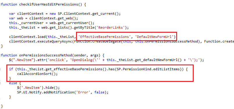
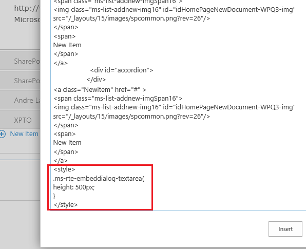
Although your inserted text takes the document formatting, you must insert HTML to do app-specific styling.

    OOXML

    In the event that you cannot insert content through any of the above methods, and if you are in Word 2013, you can directly alter the structure of the document by inserting OOXML nodes. This gets complicated fast—refer to the Apps for Office CustomXmlNode APIs for more information.

    Images

    There is no image coercion type for setSelectedDataAsync. If the image you are trying to insert already exists, and you have a path to it, you can insert it as HTML. If you have programmatically created the image or do not have a URL to include in your HTML snippet, you can insert the binary image in an OOXML node. Inserting the image through HTML is much simpler, but if your document goes offline or the image URL changes, the image won’t appear in the document. Make your design decision based on your situation and what format your data is in.

    I have a cross-platform app. How can I know what data I can use?

    “But I’m writing a cross-platform app!” you say, and, “I don’t know if my users are in Word or Project! Can I add HTML? What should I do?”

    Instead of checking the product that your app is operating in, check whether the feature you want to use is enabled. Here, we are checking if the product the app is living in can even insert data into the first place:

     clip_image012

    Once you determine that the product can actually insert content, you can check whether your coercion type is supported in your document. The following example checks if OOXML is supported by your app’s document.

    clip_image014Once those two checks have successfully completed, go ahead and insert your data.

    If you want to make sure the content is successfully inserted, you can add a simple if statement within the return function:

     clip_image016The status property of AsyncResult (result in the above code sample) returns an AsyncResultStatus enumeration, which indicates success or failure by its type.

    What about Project and Outlook?

    For now, apps living in Project and Outlook are consumption oriented. That is, they provide contextual information that complements your user’s work. While there are great apps you can write for these platforms, focus on consuming document data instead of inserting your own.

    Where can I find some working examples?

    If you’d like some working examples of app insertion, we have several examples to check out. All of the above examples are available in the attached Visual Studio solution, so you can see the code in action. Alternatively, the Wikipedia app for Office is open source – you can dig through the source on Codeplex.

    Use data in your documents!

    Apps for Office that insert content into documents allow users to gather information without leaving Office. It saves time for the user and improves efficiency. Write apps that insert data to help your users get things done!

    References

    SharePoint Samurai